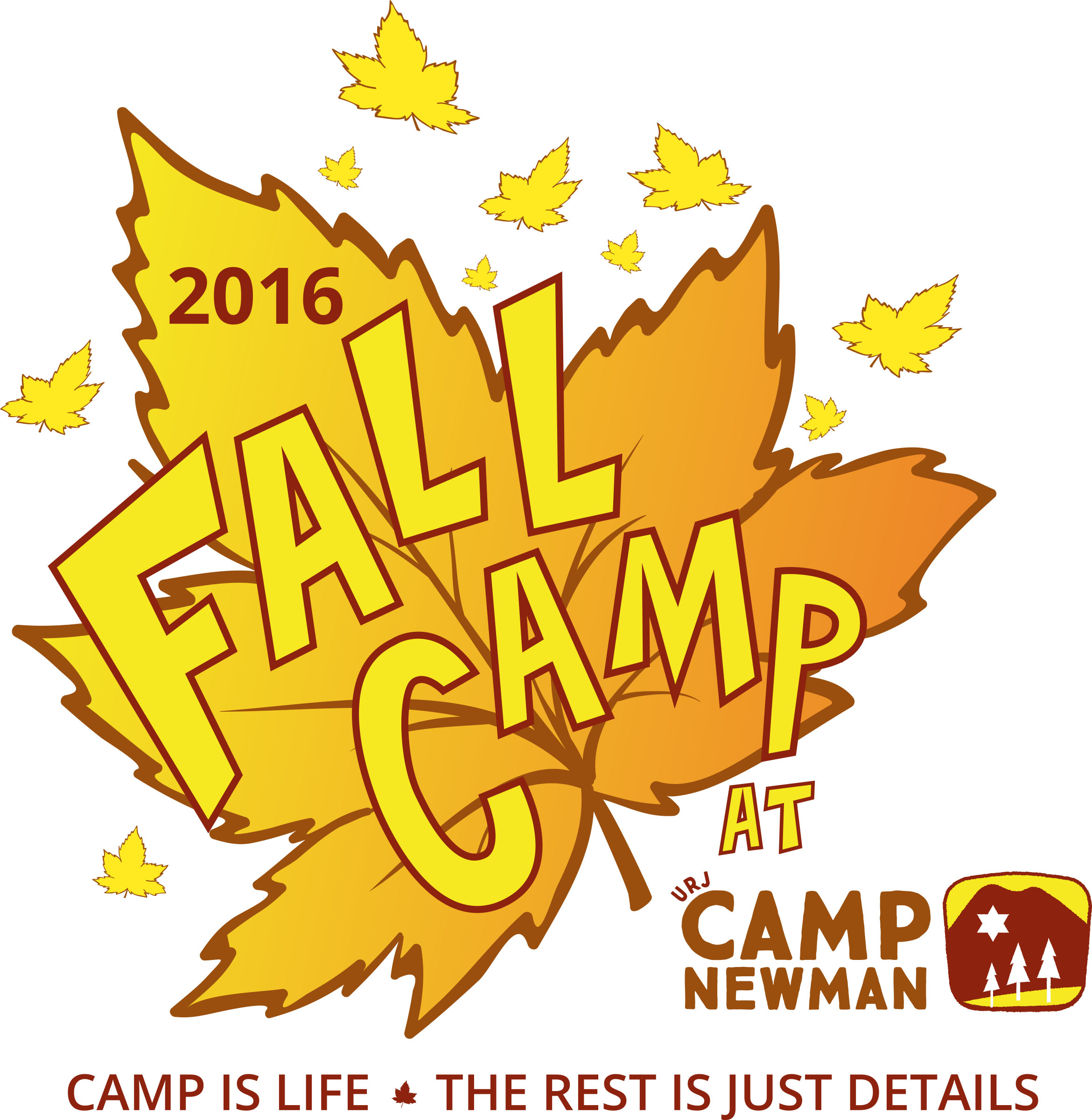
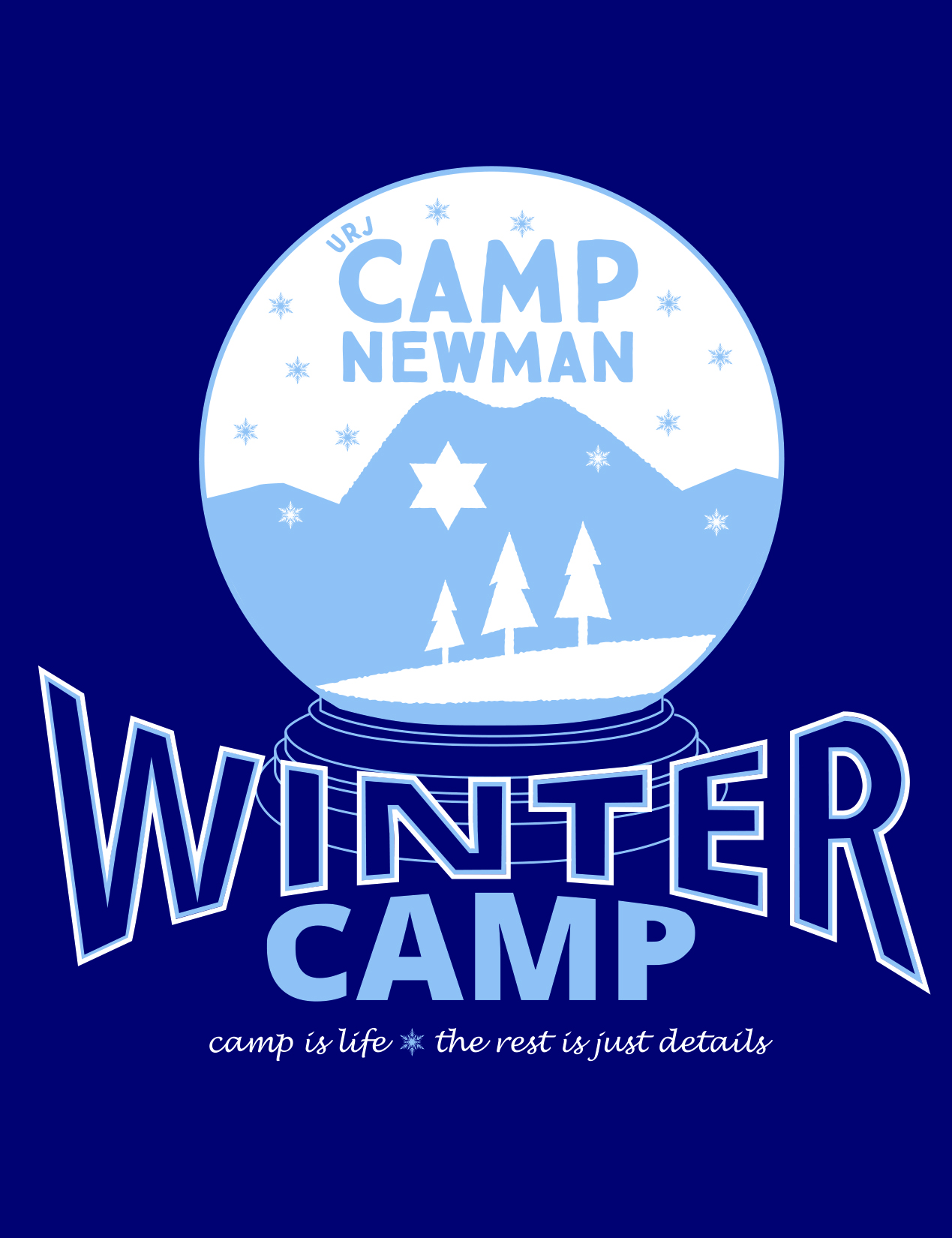
I was tasked with designing a new logo for the Camp’s Fall 2016 session, and I took to heart that we had the chance to start a new look to the camp’s collateral at that time period.
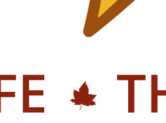
Along the way, I used the opportunity to hide little changes in the illlustration that I think add to the uniqueness of the final image. Such as the small leaf in the tag line at the bottom.
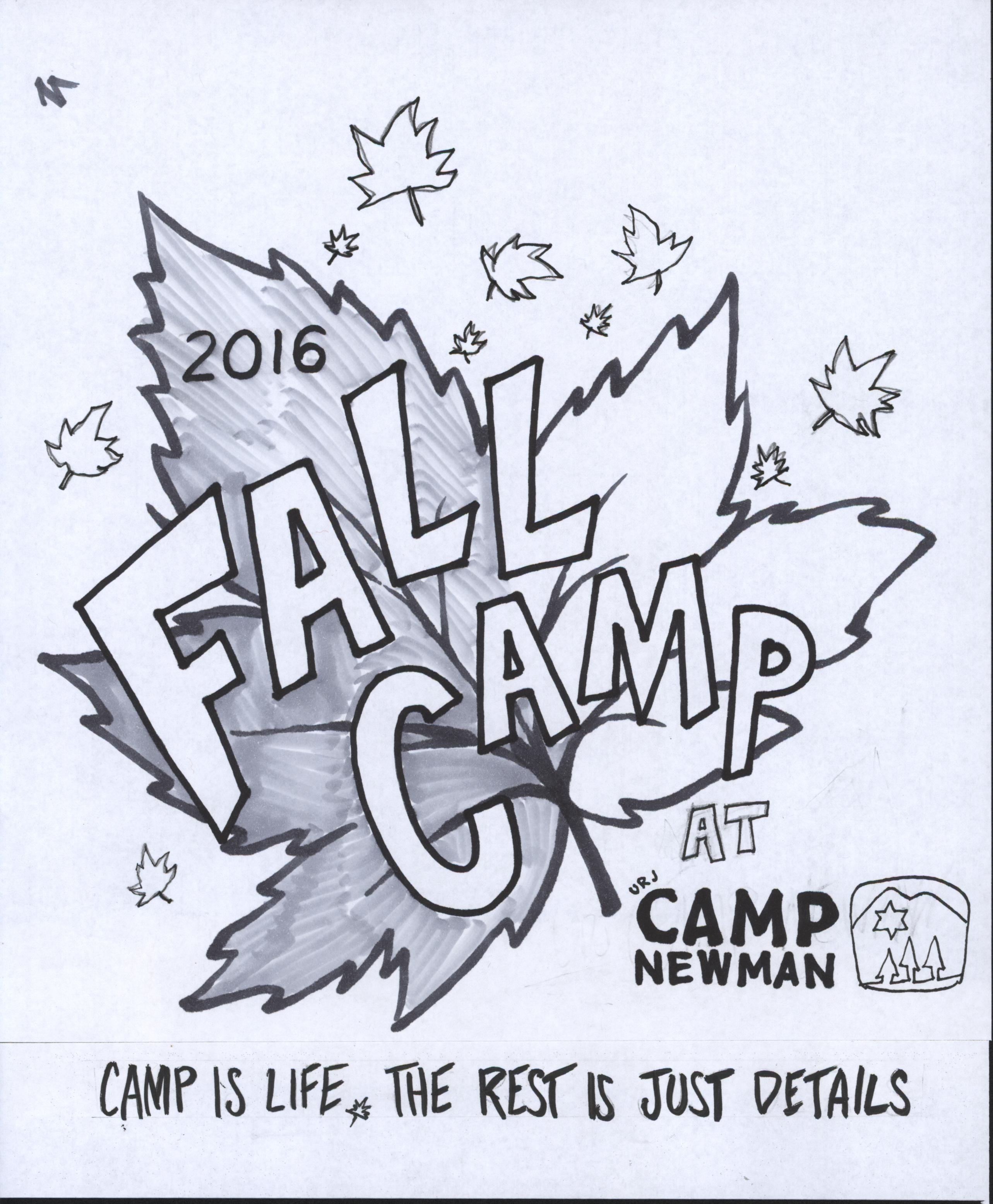
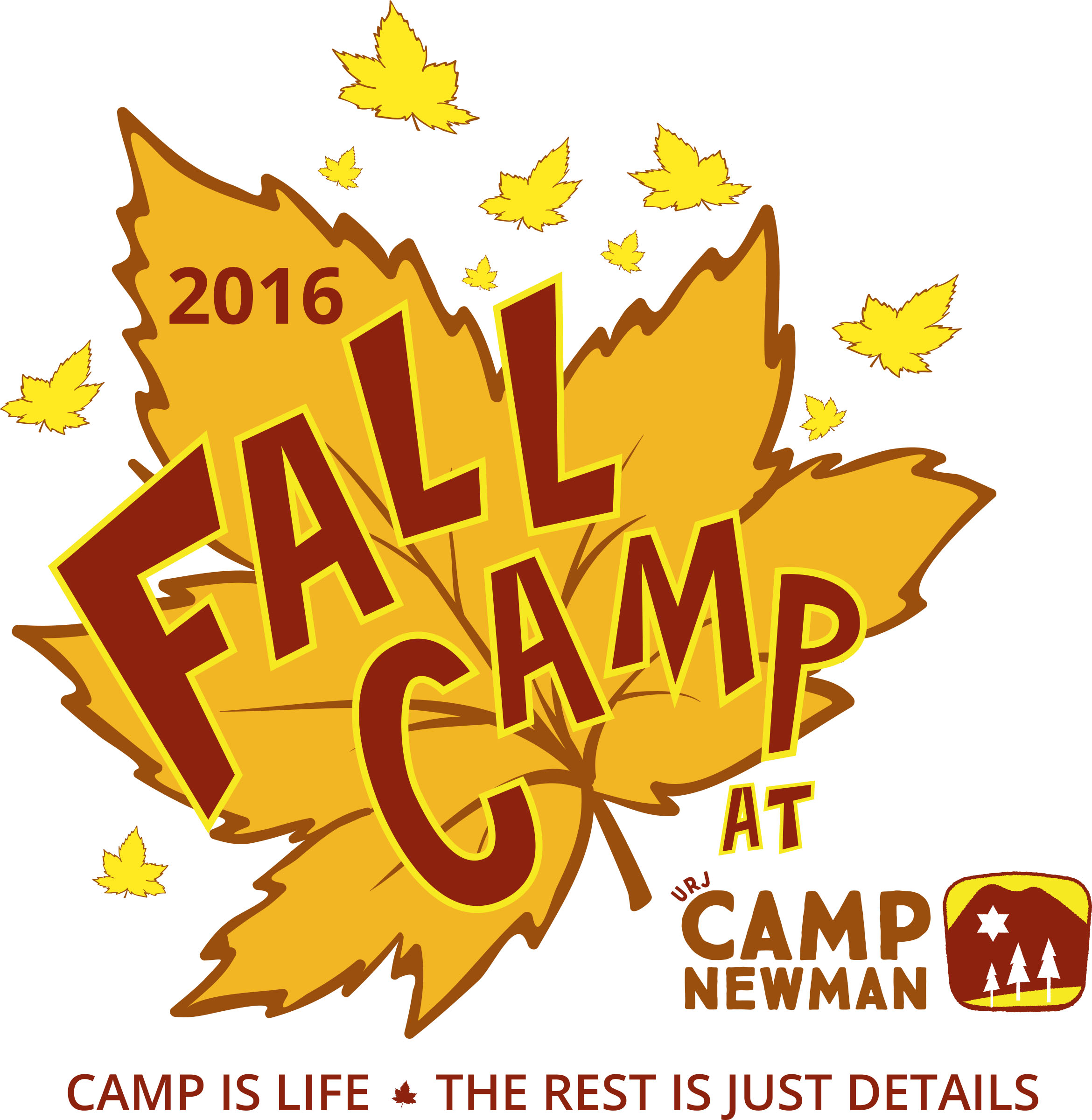
Development sketch, and alternative color scheme below. Pen and pencil comp, vector illustration for final.

Leave a Reply
You must be logged in to post a comment.