If the magazine is dead, then passion that still lives for people over recorded music will find other outlets, whether that is a photocopier, a blog, a glossy 4-color piece of print or a website.
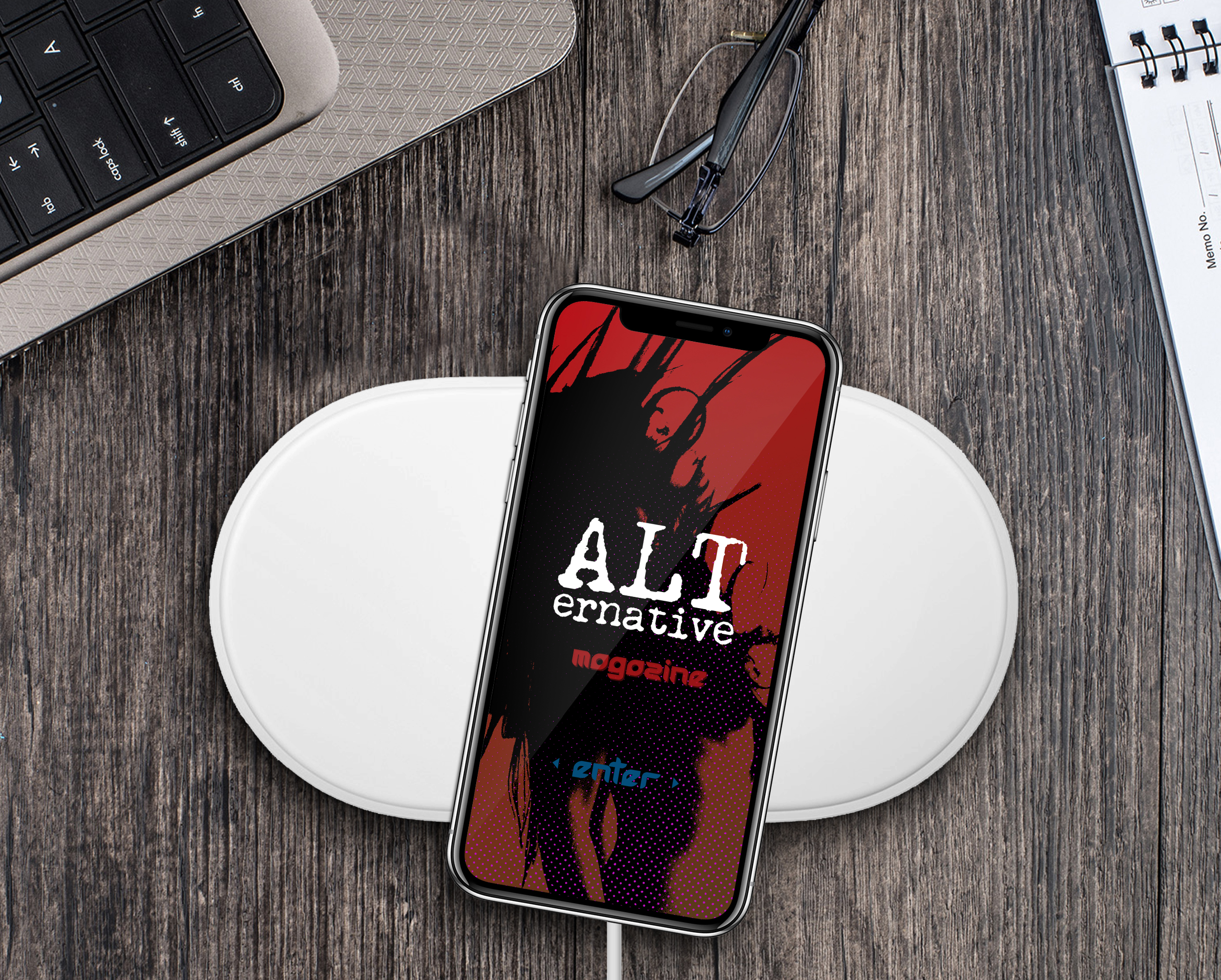
Here is a mobile prototype for a form of music that has been declared dead more times than a zombie movie: alternative rock and roll. Born form the ashes of hair metal in the 1980’s, an era when the right video could form an entire youth movement, alternative rock broke barriers and continues to be a viable outlet of rage and change for anyone with a guitar and an amplifier. Whether you find out about the sound from a zine, a website or Spotify doesn’t really matter now, does it?
This is a mobile UX prototype for online music magazine specializing in alternative rock and roll. There is so much strong visual iconography from that era, from the black and silver of Bad MotorFinger to the stark black and white of Mad Season’s debut (and only) album, and with today’s larger screens, a greater chance to do justice to innovative art direction and powerful visuals from the 1980s and 1990s.


