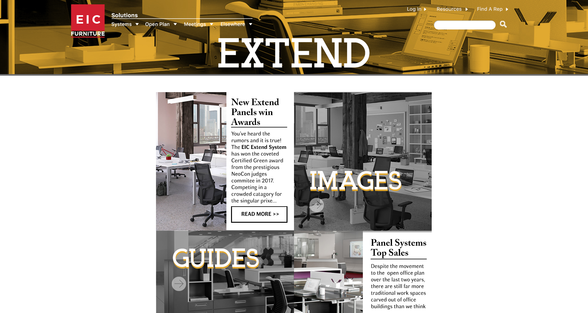
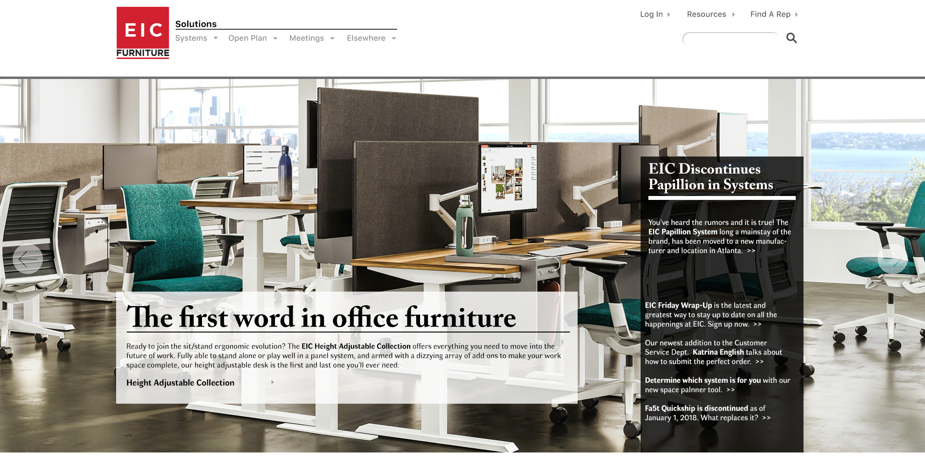
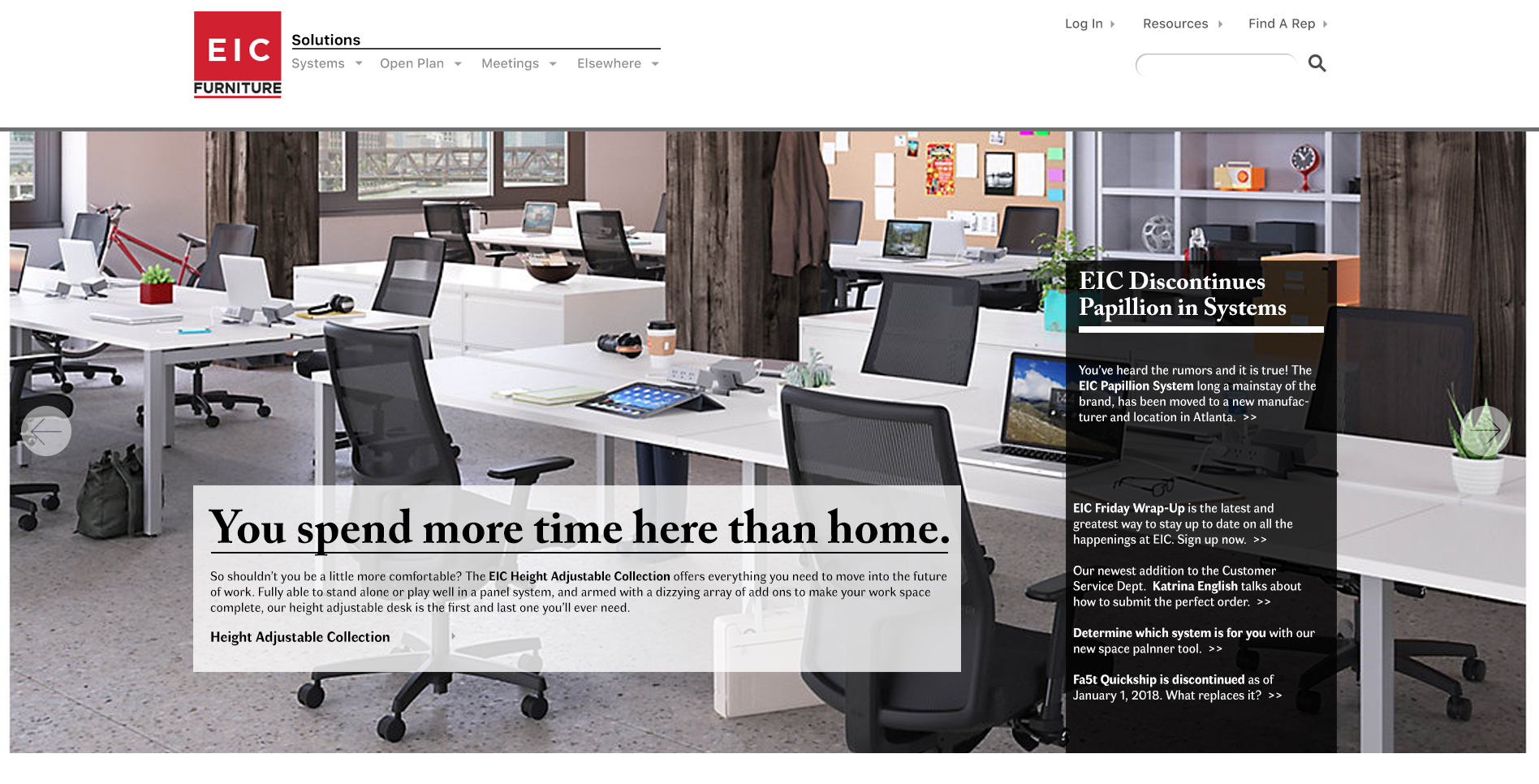
This B2B furniture webiste has been the same since 2013, needed a major refresh not just in look but in architecture and UX as well to make it contemporary for 2018. Partly this comes from their new sales initiative of providing complete solutions for facilities managers, as opposed to just products. Clean and uncluttered, with plenty of space for the furniture to shine is the design focus.
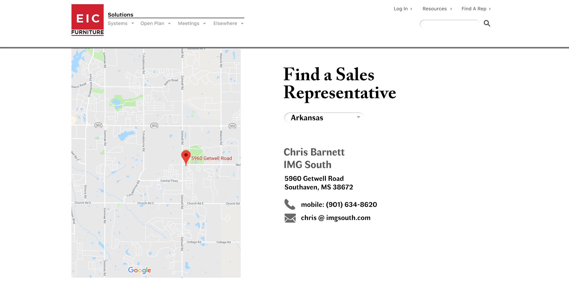
Following on over a year of interviews and discussions with independent reps and dedicated national dealers, as well as using data from a crazyegg script to determine viewer usage, the proposed new B2B furniture site shown here is built to serve as both a sales tool and major resource center, two very different uses.
Built on unequal columns, the width defined by the Fibonacci sequence, the site is designed to work two-fold:
As a sales tool: provide both visual clarity for the potential customer as well as complimentary visual guides on usage and installation.
As a resource: help customers find reps, and reps have the tools to facilitate ordering from the vast number of options available.

Leave a Reply
You must be logged in to post a comment.