The sales team approached the Accenture POD team for storytelling and collateral help with their orals presentation at a major American university. After working closely with the team to determine the strongest aspects of their pitch, and the client’s needs, we settled on the theme of Convergence.
Convergence represented the sum of the total work that the University needed… and was a step or two beyond what they were asking for.
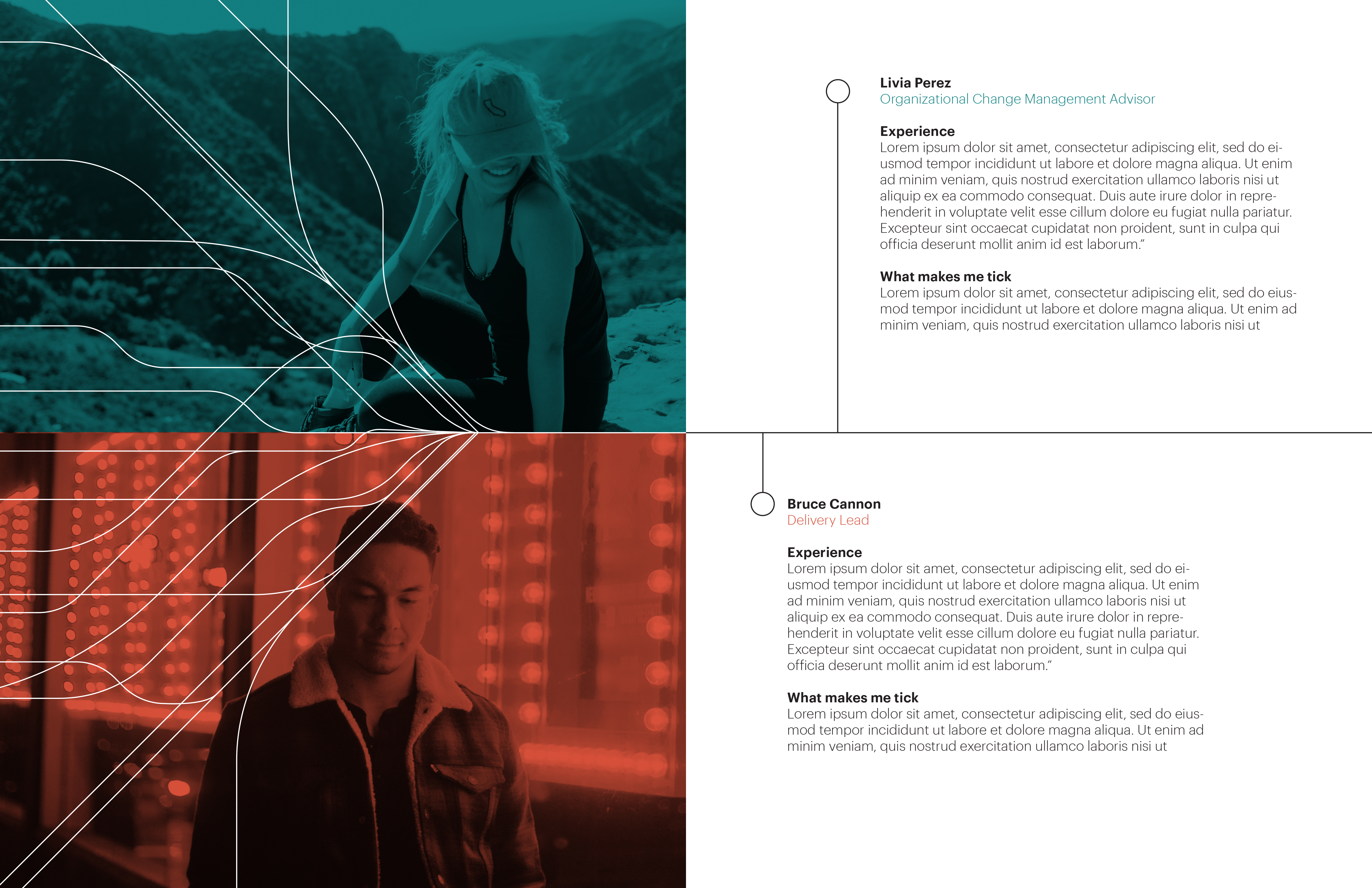
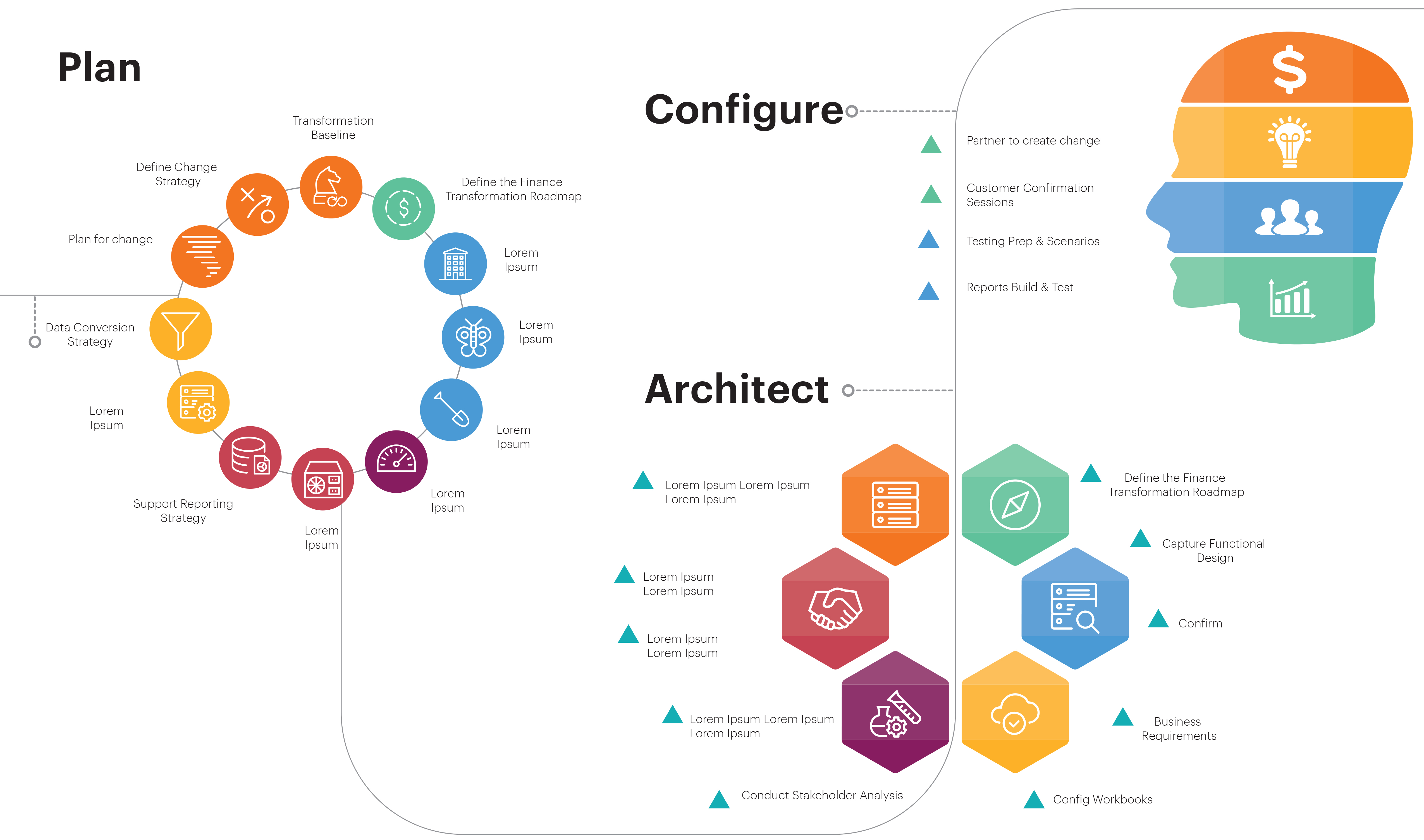
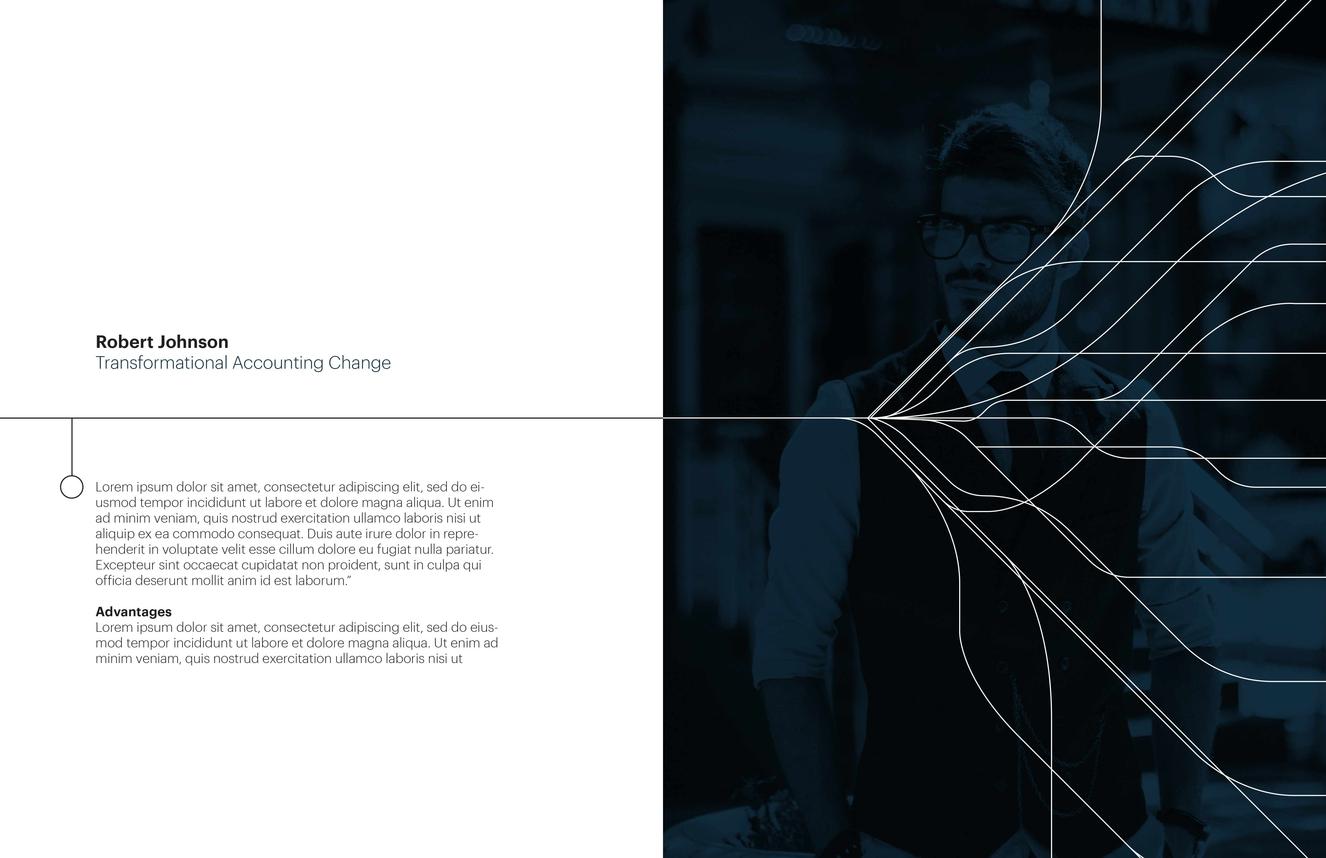
The lines ran through the entire print piece, and were duplicated upon the other pieces of collateral to keep the visuals consistent. The lines coming together and then diverging showcased the metaphor of gathering the data from disperate systems together, and once together, how powerfully it affects other systems. Consistent color coding was used throughout the piece, including on the infographic section in the middle.
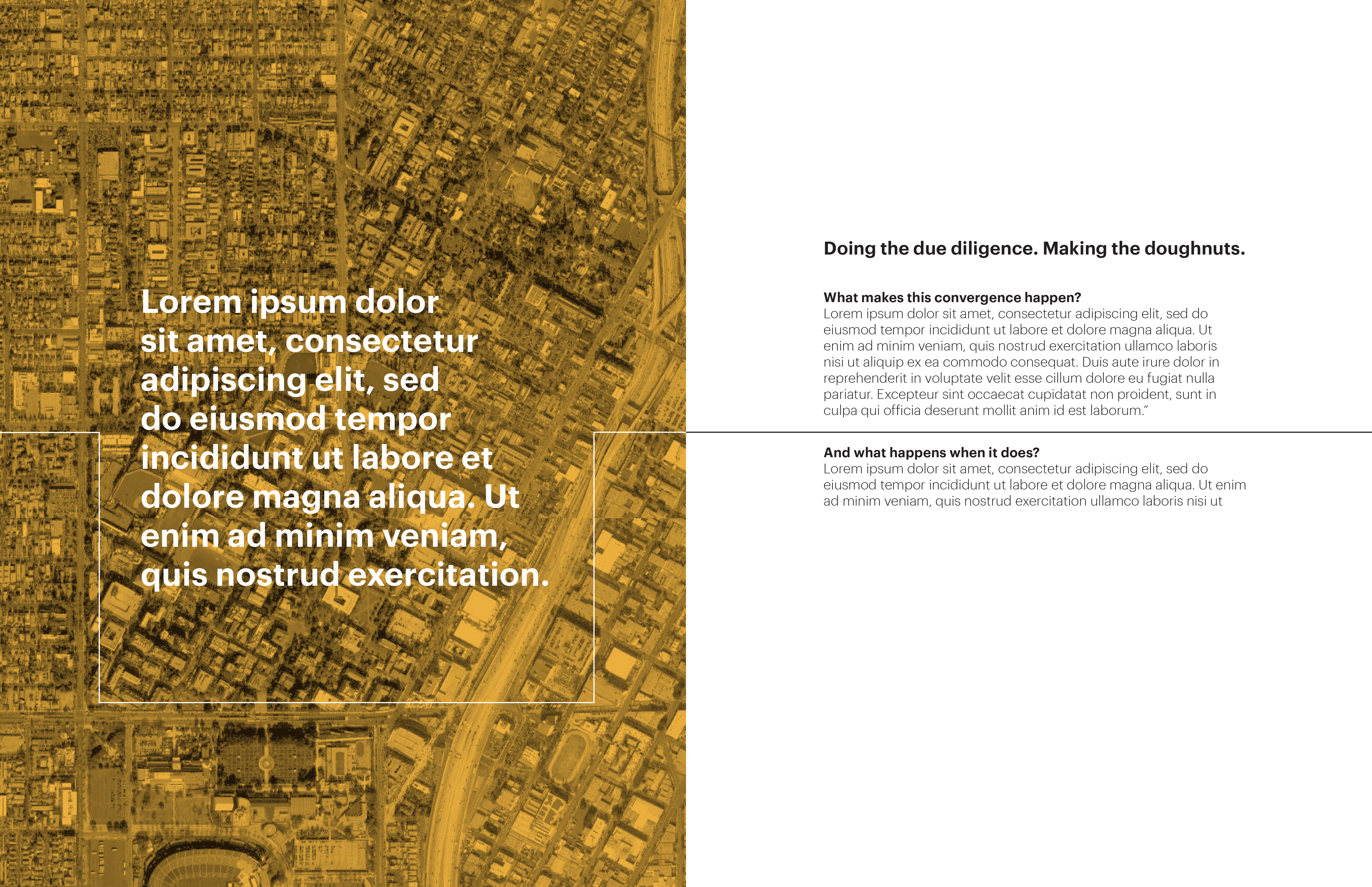
Presented here are conceptual design pieces, created as a team, that are extremely close to what was actually presented at the orals, for the print piece that was used to direct discussion.



Leave a Reply
You must be logged in to post a comment.