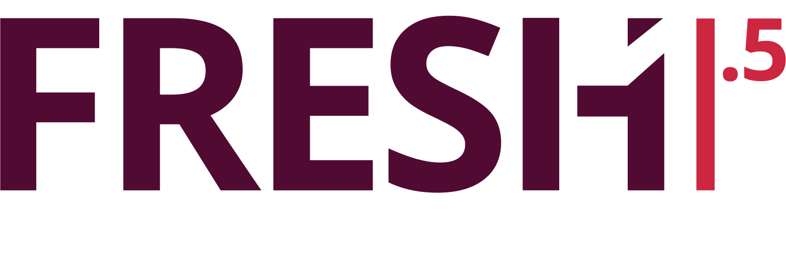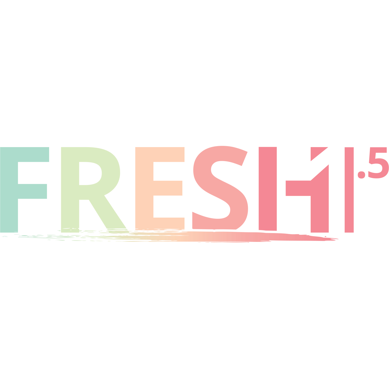
Some different versions of the logo “Fresh 1.5” (the next step in feeling fresh!) for the beauty market.
There is some neat geometry to the design (the x-width of the “1” being halved to make the right line defining it, hence the defining line is “.5” of the first width), as well as different color treatments, figuring how to make pop on a label, or make a more subtle impression.


Leave a Reply
You must be logged in to post a comment.