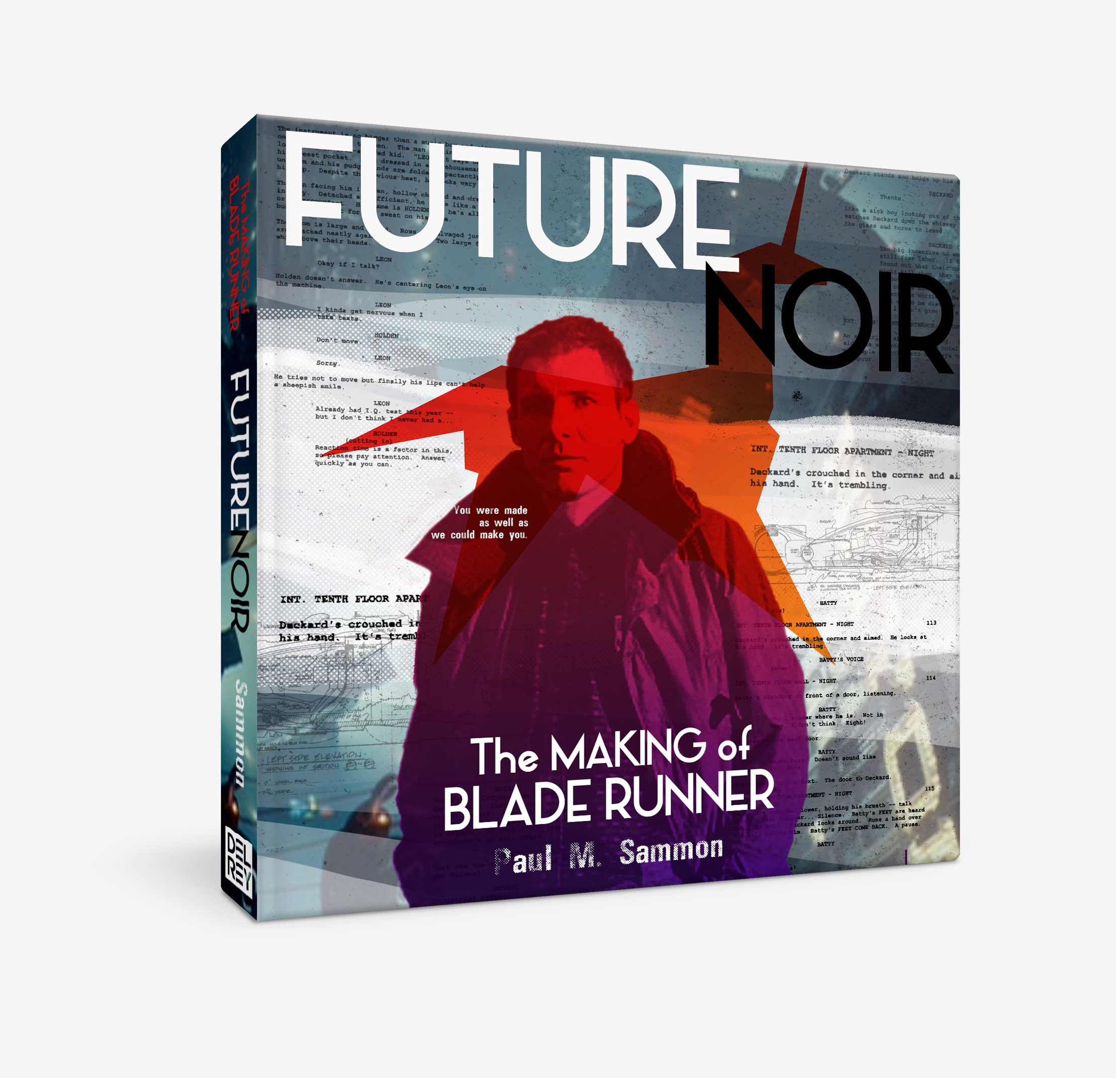
With Paul Sammon’s Future Noir book going into its 3rd printing (especially with the extra attention being paid to both the original film as well as the sequel), I thought that it was ripe for a “make over”.
Utilizing scanned pages from the original script, original photos, screen caps from the restored Blu-ray, production images from futurist Syd Mead, and one, in proper proportions, vector unicorn later, the new cover was born.
While the film is quite dark in places, visually as well as thematically, one of the over-riding elements of Scott’s film is just how much texture there is on the screen, at almost all times. While other books on Blade Runner have focused on the overly dark elements, I wanted something that would grab you from the book shelf, while staying true to the elements of Ridley Scott’s vision. In this case, it was the overwhelming visual information aspect that I took, along with previously underrated elements, like the unicorn.
The result is something that I believe takes some of the most legendary aspects of the 1982 film and both updates the book while staying true to the original.