Where is the intersection of UX and UI? Perhaps somewhere in the middle of this particular reassessment of an under-performing astronomy learning module.
I was tasked with keeping the look of the module (so that it would fit in with other parts of module which had the same look and feel), while modifying the flow of information for a better learning experience.
Original Interface
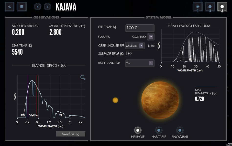
In this case, the UX component meant revisiting what was being asked of the student, and making the information flow smoother, so that their input would give them a greater chance to give the right answers, and the UI would inform that information flow, both on input and output.
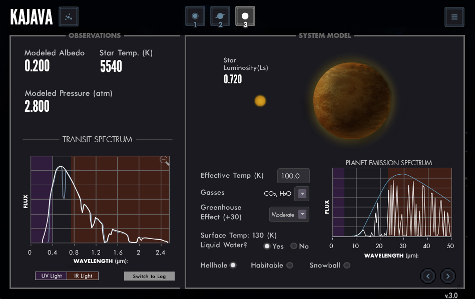
I ended up modifying a little bit of everything, from the information on the top bar (which told you where you were in the module), adding color coding to both charts to highlight important areas (such as the visible wavelength in the first chart), and swapping the graphic on right and making the flow of information input aligned for easier reading. A “Yes/No” question drop down was swapped to a radio button, making for an easier input by the student.
Optimized Interface

Leave a Reply
You must be logged in to post a comment.