The Challenge
Lively had joined the HSA space less than 3 years ago, when the pandemic of 2020 suddenly placed healthcare, specifically paying for healthcare, into the forefront of everyone’s mind.
Like most start-ups, the visual look of the company had come together piecemeal, and it was an absolute necessity to make it a full-scale Brand book, a living document, expanding into a full-scale design system.
My Role
I drove the entire project from research, data collection, user interviews, designing and leading discussions/feedback sessions with senior stakeholders from the company founders on down.
Insights
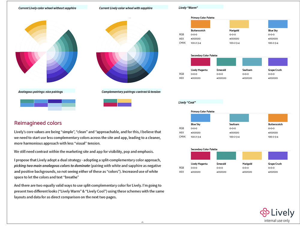
Lively’s initial visual elan was built off of a single, bright, overly-saturated magenta and bright green. The magenta was then utilized in a single gradient across both their app and website.
In a high contrast color scheme, there was little ability to create a calm brand presence and provide validation to users. A proper color scheme and better-organized palette needed to be created for a much wider variety of situations of the company and the product expanded.
Redesign
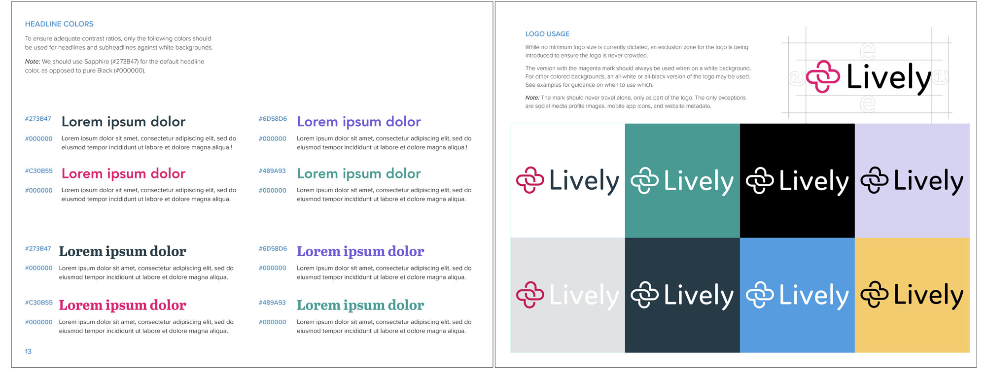
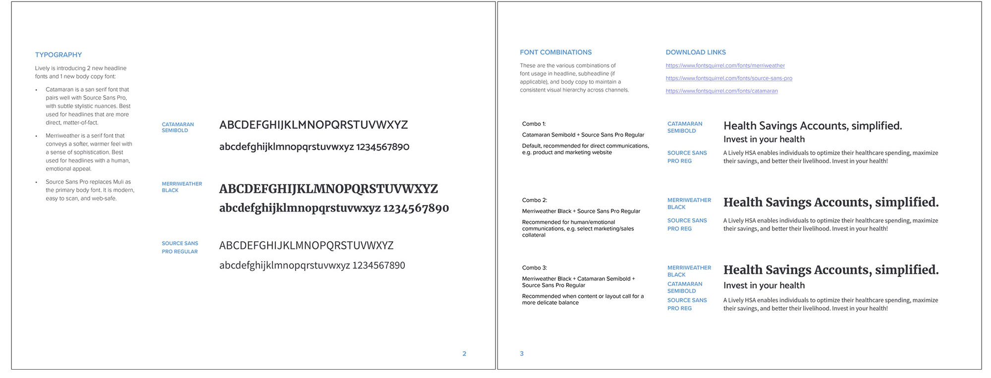
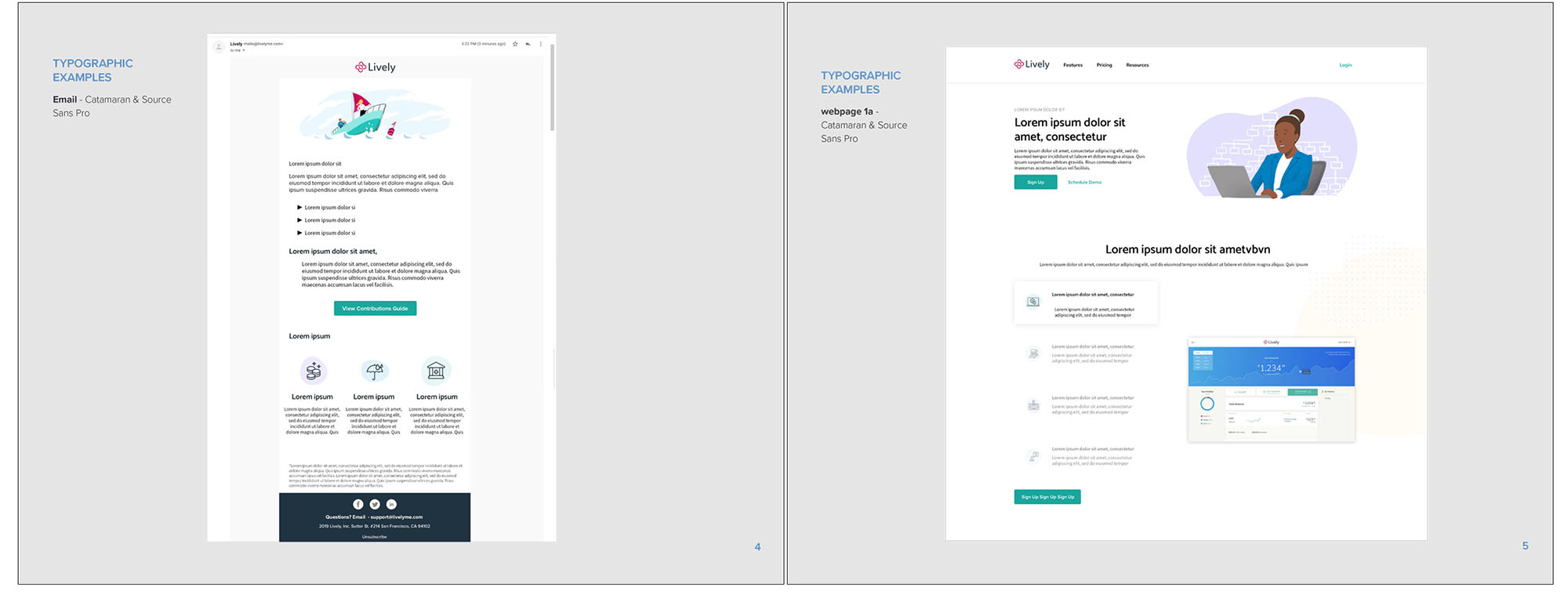
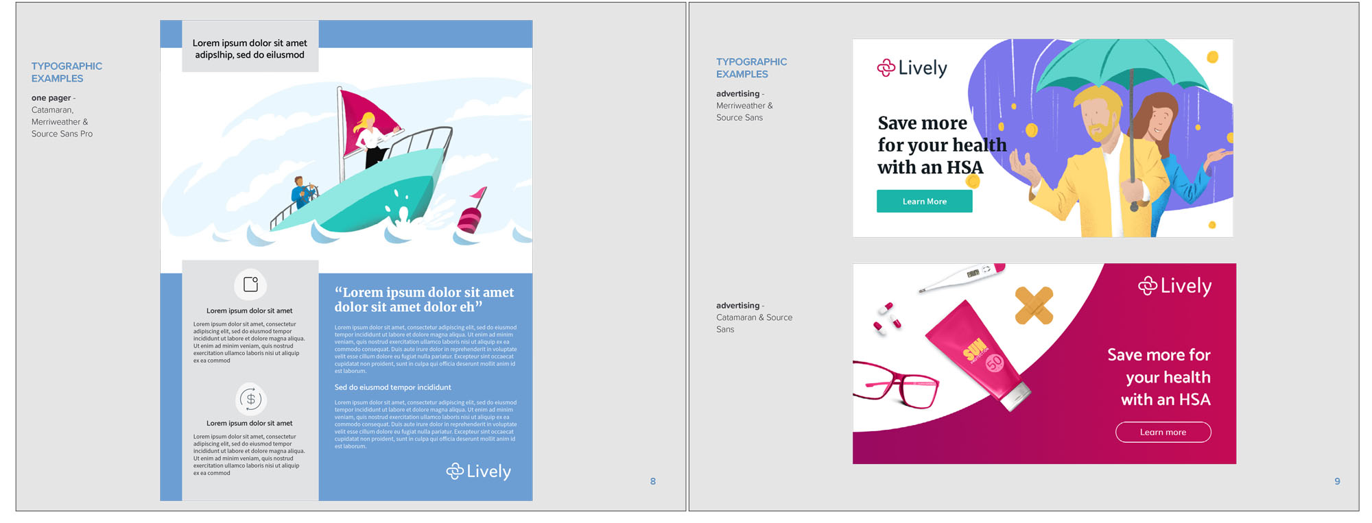
Fonts were added, and older ones discontinued, resulting in greater clarity of readability, faster download speeds on webpages (also including greater SEO since loading was not compromised by font substitution) as well as simple usability: With two different san serifs and one serif, stylistically differences could be made among simple information, emphatic statements, and emotional appeals. Clarity in branding reached new levels with these additions.
Divergent uses for the logo and the logo mark were created, branching Lively’s visual branding out into new areas.
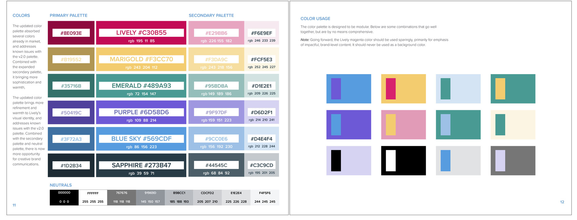
Colors were added, allowing the expanding Lively offerings to start being color-coded for additional sub-branding on the website as well on white papers, webinars, and in-app. This started to fix issues with accessibility that had plagued the app and website from the start.
Additional designs: illustrations
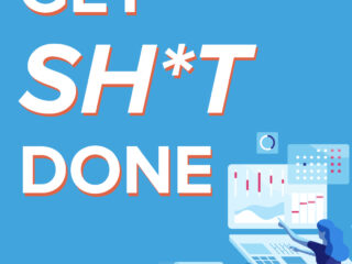
I was able to define a singular illustration style that would allow Lively to stand out among the pack of HSA and FSA competitors. Since healthcare is for all, a large and diverse cast of people were created for the site, allowing the images to reflect the diversity that exists throughout the USA. This is not just healthcare for any one particular gender or skintone, but savings for all.
Icon usage, which had been haphazardly done dealt with before was now codified into a singular line weight with common elements identified that would not create a dead-end for icons but an open set of growable options all sharing the same visual signifiers that make them say “Lively” regardless of usage in the app, sales deck, marketing website or white paper.
Logos & Social Causes
Keeping with current trends to use the company logo to stand for more than just profit, but to allow for the branding to expand to important social causes, variations such as this proposed Pride logo stay on brand while acknowledging Lively’s San Francisco roots.