The Challenge
Lively has positioned itself as a young industry leader in HSA & FSAs, and invested a great deal of effort to be the knowledge leader and maintain an NPS above 70 (when the industry average hovers around 50). Replacing an out-of-the-box Zendesk FAQ has long since been necessary. It would be coded from scratch using the Zendesk back-end but still have significantly new ways to view and search for the data.
Research
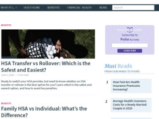
We knew what wasn’t working, but what was going to work? With our own data on search queries, we began to look at the best FAQs both in and out of our vertical. What did they do right? What did they get wrong? How many clicks did it take to get to relevant information?

Key Insights
After analyzing the process flow of both Lively’s site and a number of other FAQs, as well as search data, it was clear that multiple organizational paths were needed to get users to their answers. It was also clear that, as Lively moved further into a B2B/B2C hybrid model (as opposed to their solely B2C earlier model) that the information needed to be segregated at the outset for the user. Early designs were explored via wireframes and discreet user testing on multiple desktop layouts. Process flows were created, modified, tossed out or improved.


Early Designs
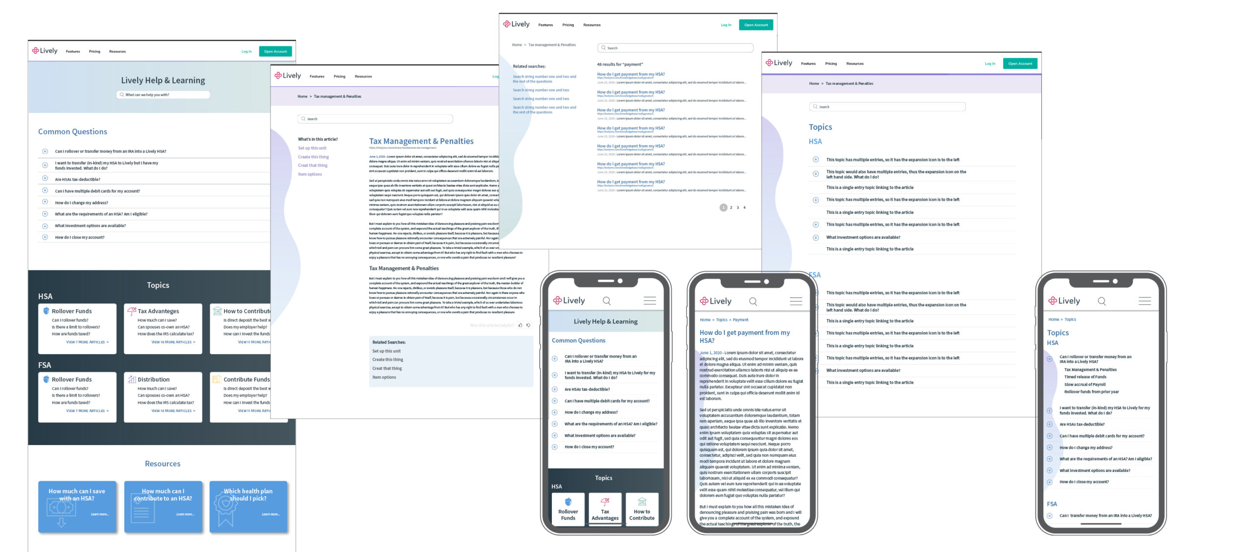
We streamlined the flow for the diagram, minimizing the number of pages to load and number of clicks necessary to drill down to any particular topic looking for increased access to the information with a minimum of friction.
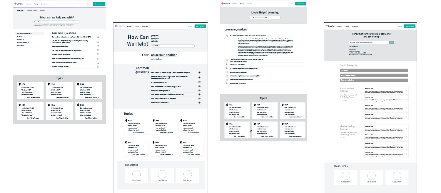
Further Iterations
We iterated on changing the style of all the pages to allow for a visual ease of flow, following our simplification of the FAQ structure.
Despite the prevalence of mobile in today’s work, usage stats showed that the vast majority of users were still accessing the FAQ portion on desktop, far ahead of mobile, so the decision was made to design and test desktop first, with an eye on mobile second.
Utilizing the color pallette that I created for Lively’s current style guide, I applied colors with an eye to balance the readability of the FAQ with keeping things “on-brand”, satisfying WCAG 2.0 accessibility and looking for a calm, measured approach to the visual design.
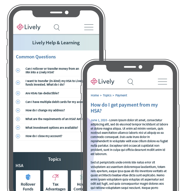
Mobile wasn’t stinted in design, and reflects the branding and continuity for anyone who is using both sites to answer their HSA questions.
Interactive wireframes were built to test the size and accessibility of the new architecture and information hierarchy.
Implementation
The final redesigned and fully reimagined Support Center supports over 450 articles to establish Lively as a true leader in the growing HSA & FSA field. Branding is fully supported and the end-user is 4 clicks or less from every support article available to answer their questions.