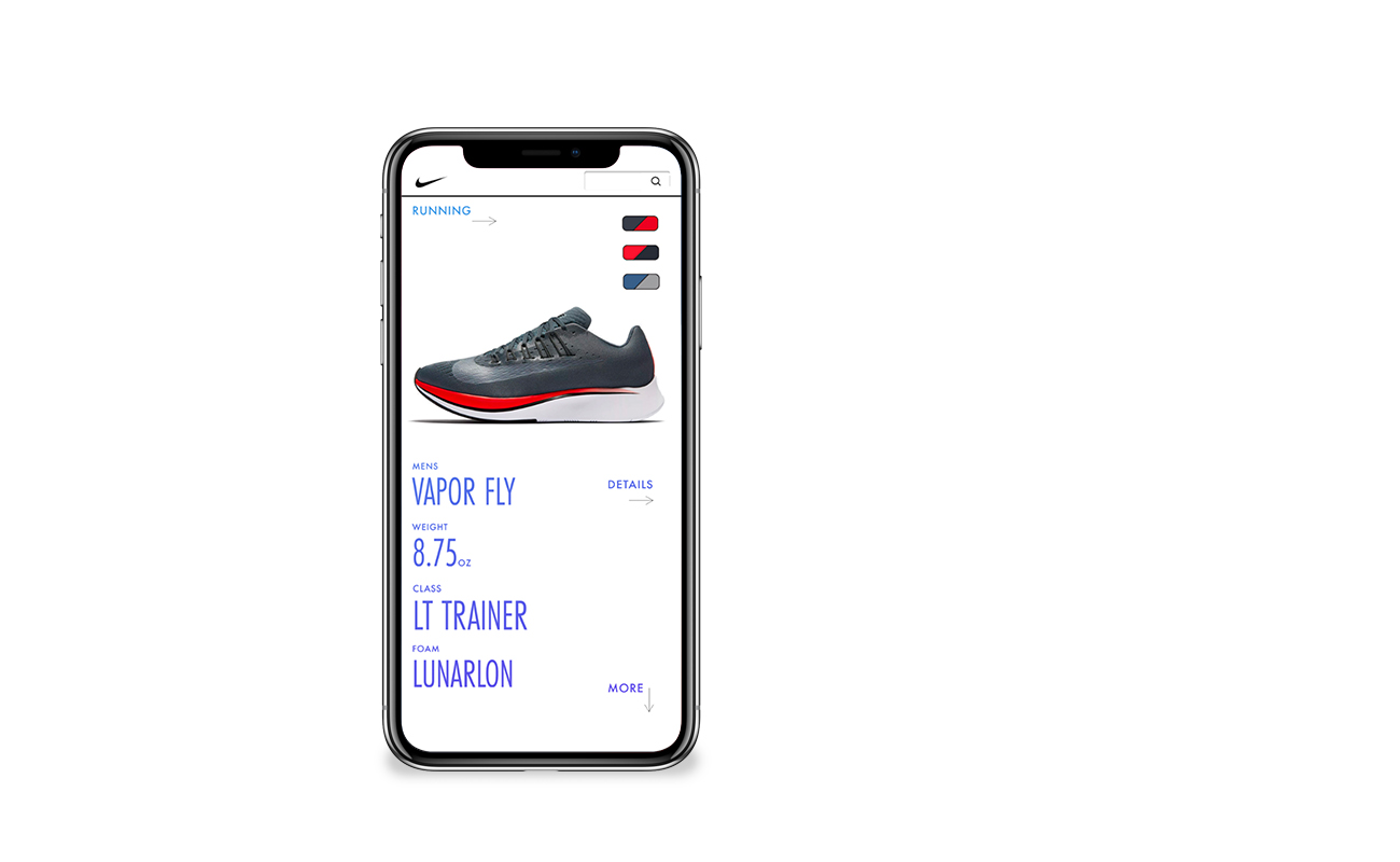
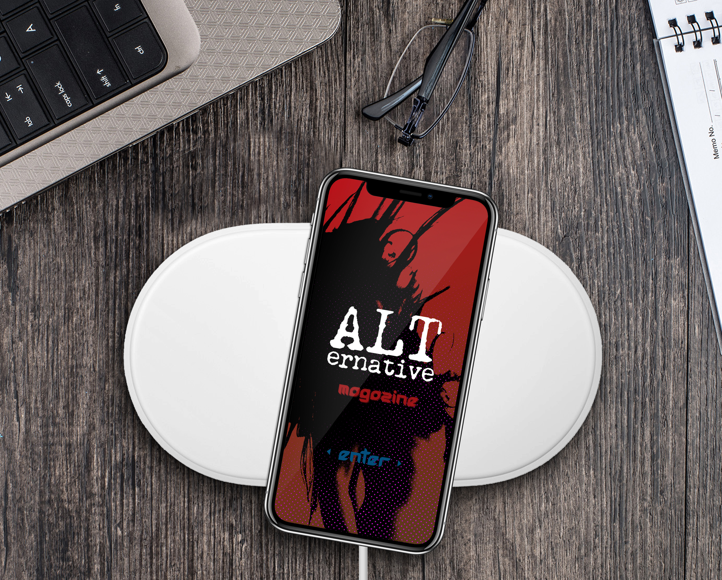
Various mobile interaction on demonstrated on the iPhoneX for choosing Nike shoes! Ensuring best practices on moving information in ways that are intuitive and organic for the user. There should always be a way to navigate back to prior information (or shoe color choice, for instance) that makes sense so that the user doesn’t get lost too deep down the rabbit hole of the app!


Leave a Reply
You must be logged in to post a comment.