Modifications made to an adaptive learning module for Smart Sparrow, an Australian company specializing in online learning. I was asked to consult after an interface had already been developed, so below the final interface you see my notes to the creative director along with the original interface as presented to me.
Notes
Phases of Water Simulation Improvement
Users: Non-science majors (who may or may NOT know all the existing terminology), university level
Process: What I am addressing and why, what approach I took, and why it would improve the simulation
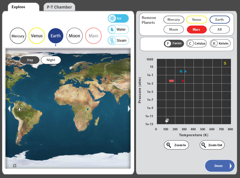
• The flow of the two halves is counter-intuitive. You have to choose multiple icons (ice, units, time of day and planets) on different places of the interface
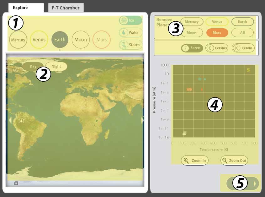
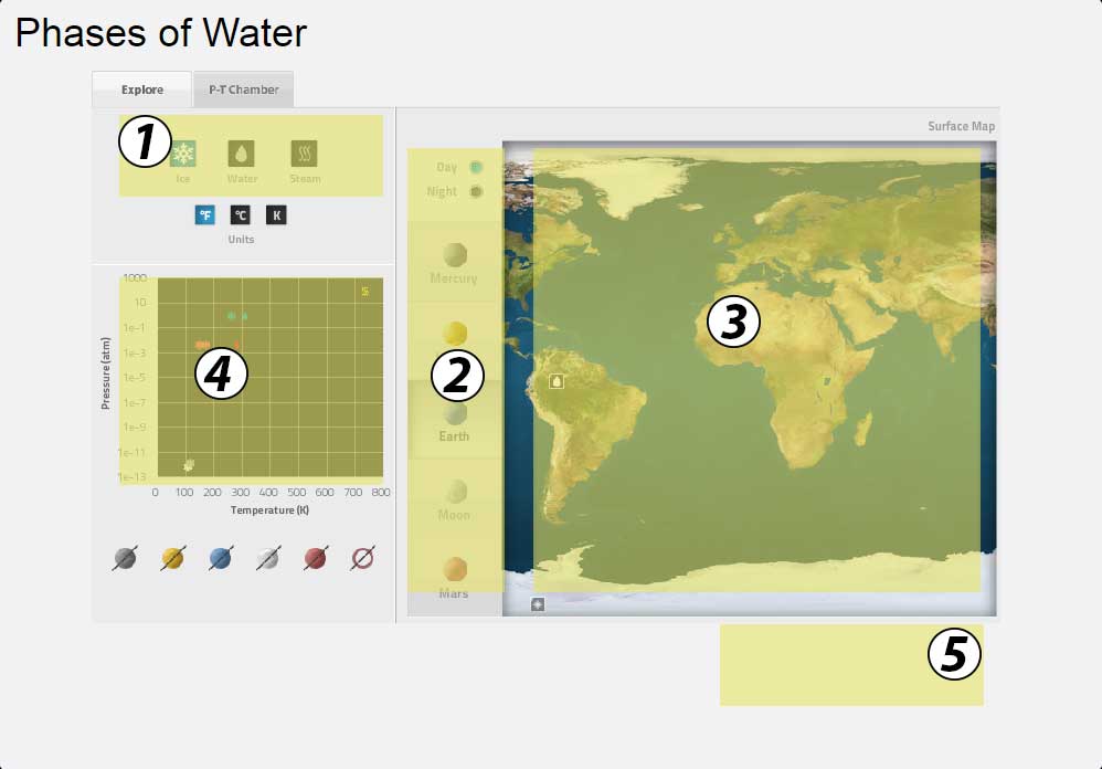
• Flip the two sections with a defined gutter and different background colors to make the separation distinct, yet use color to tie the date they generate together
• The user has to click on the planet simulations on the right leading to data points on the left, forcing them to constantly look back against the “flow” for their data
• Create a proper hierarchy of choices: correct tab → planet→ water state → time of day
• Using the “F” scanning method of eye movement, make all possible choices the user may need conform to this layout
• Tie the night/day choice to the planet surface (so once you’re “on” the planet, you don’t have to leave to make a choice)
• The tabs are above the data set, but the data area doesn’t change when you click the tabs, so the tabs aren’t associated with the actual screen that changes
• Tie the tabs visually to data area that will change when the tabs are accessed
• Only certain places are clickable on the planetary maps, leading to potential confusion
• (Note: This may NOT be an issue, I found areas on all 5 surfaces that I could not click on to get a reaction to the water state. May be my error)
• The planet deletion icons only delete the data set points, but still leave the planet exploration active
• When a remove planet button is selected, the main planet icon is dimmed out
• There is functionality that is difficult to understand until you’ve explored the interface for a while, users could potentially miss something, even in the beginning of the simulation when there are less options
• Add scroll bars to show that the planet surface can be shifted east/west
• Add highlight areas that show which parts of the planet surfaces are clickable
• Simulation comes in extremely small on my screen, potentially difficult to read for some users
• Potentially build the simulation out of SVG, so that it can resize easily to different screens
• Moving on the data points on the graph can be difficult to navigate
• Create zoom in and zoom out icons with appropriate magnifying glass icons for the graph
• Allow click + space bar “grabber hand” functionality on the graph (and include this on a screen or hover state in the first part of the simulation) OR…
• Add scroll bars on the graph once the user is zoomed in
• Shrink “done” button; (potentially remove “That’s correct” from the user feedback, as it appears, to me, that there is no way to ‘break’ the simulation, i.e. there is no way to NOT have correct data on this particular simulation)
• Question to ask: As I believe that the P-T Chamber simulation is a very effective way to show the state of the water, I don’t have any additions or changes visually. I would ask the question, given that we can see the orange data point on the graph moving as we change the state of the water temp and pressure, would the creators want to add a hover state of data that could give additional information while the animation is progressing? Is there any additional information that they would like to present there?
• Make clearer which planet is selected in button state
• Use color coding consistent on button states: solid color is active, Earth blue and Mars red are consistent throughout the simulation
• All data changing icons are different in visual design from the icons to create actual data
On the old layout, following the path of usage from 1-5 is difficult:
• The new alignment tracks better for the eye, has additional color reinforcements with the data from the planets to its plotted points on the graph:

Leave a Reply
You must be logged in to post a comment.