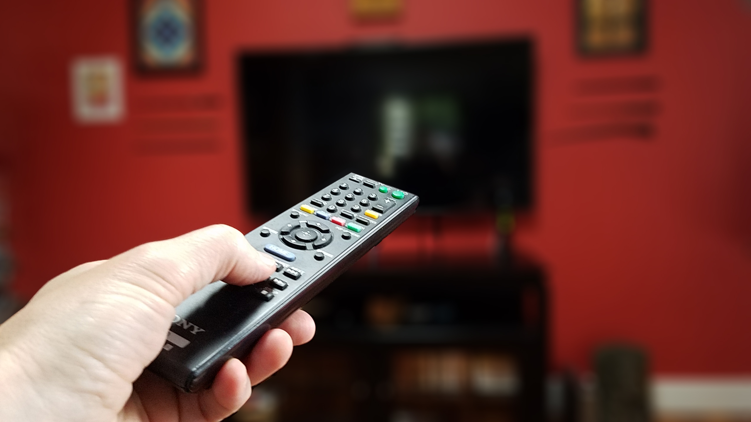
I’ve been thinking a lot about TV remotes recently.
Specifically, the four that, 15 years ago, used to clutter the coffee table (for the record: Cable box, TV, DVD and VHS). None of those designs were related to each other in any way, and each time you bought a new device you had to relearn how to get to your favorite features on the remote, and the resulting muscle memory of hitting “mute” on the older remote would sometime result in inadvertent channel switching, scene freezing, and tape rewinding while you pushed the wrong button.
Working as a print graphic designer, there were certain things that we could control, and we used those tools to their fullest effect: font choice, placement, design, kerning, colors, all while knowing that while we could do our best, we really had no control of how someone would visually “read” our piece. It was out of our hands. Translated to the web, we had no way to control how someone would use the interface on the site you just built. They would click where they damn well wanted to click.
And this is where the already fuzzy boundaries of our profession have become even murkier, where graphic designers have merged into industrial designer territory as we develop interfaces that, we hope, don’t obfuscate the mute button, switch channels or accidentally purchase an HBO subscription just prior to the advent of the last season of Game of Thrones. So what are the best interfaces? The ones that make us “ooh” and “ahh” when they boot up on our phone, or the ones that work so seamlessly that we barely notice them? There was always a psychological element to design, but now it has become exceptionally pronounced. And trackable. And A/B tested within an inch of its life.
And, for the record, we’re down to two remotes that are, on their best days, still rather obtuse. But workable.