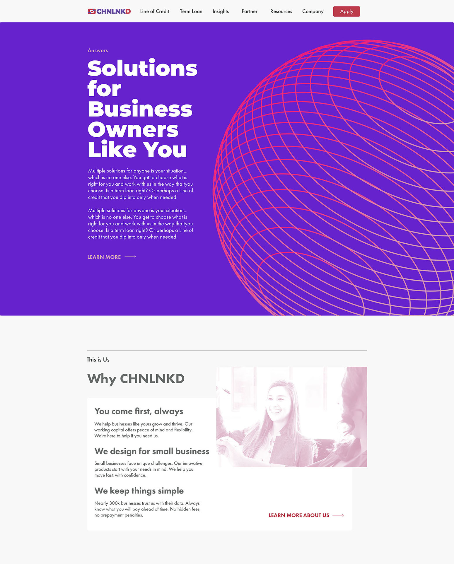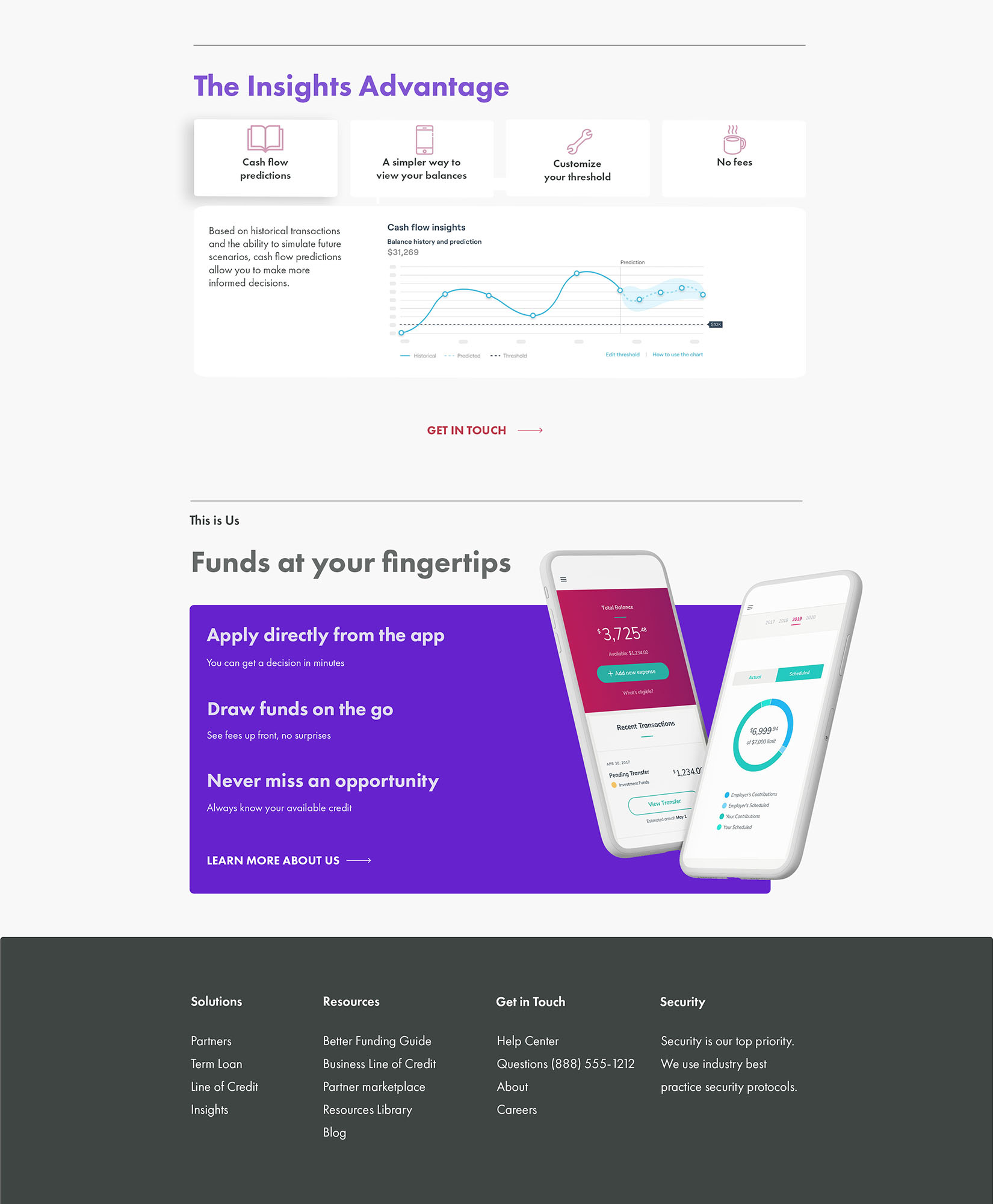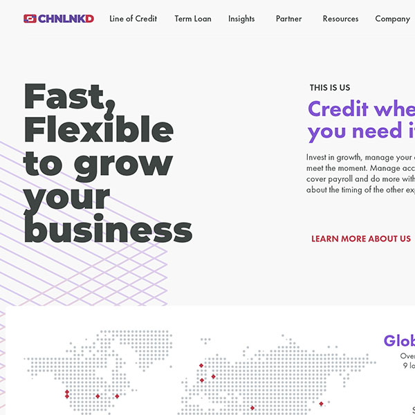
The Challenge
Create a new look and feel for a prominent San Francisco-based SaaS company utilizing content from their older website, but “reinvent” the UX along the way. The company, which strives to use micro-loans to support female entrepreneurs with easy repayment has broadened its scope from strictly two countries to a greater international focus.
My Role
Branch out from their current incarnation and branding to a more international look and feel, while retaining similar content and CTAs.
Insights
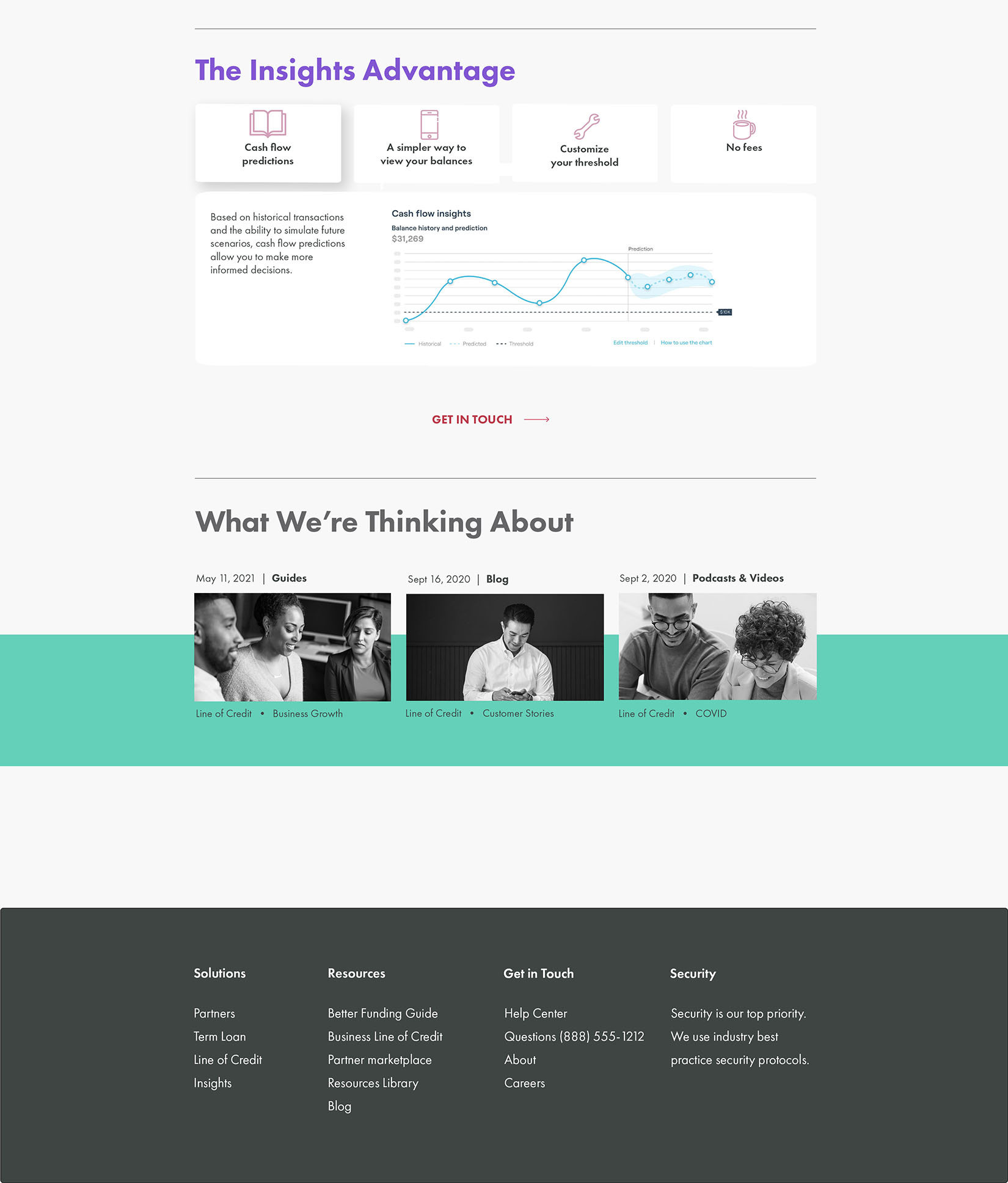
In discussion with the firm on how the older website had performed, I found out that it took a great degree of validation for many women to take a chance and sign up to learn more about the micro-loan strategy. Used to being turned down by traditional lending services, the entrepreneurs needed to have confidence that this was worth the time to explore.
Redesign
With a strong focus on minimal color, so that it was not tied to any one nationality, and continuous validation on every tier, as well as less obtrusive CTAs, this design exploration was not a minimalist reworking, but a global expansion, with a look and feel to try to match up to a modern, 2021 design aesthetic.