The Challenge
Connie Health’s mission to provide Medicaid help for seniors was just starting out, and their new content manager turned to me to provide a versatile Blog/HSA/Resource Center for the site.
Connie Health has positioned itself as a young industry leader in senior healthcare, and invested a great deal of effort to be the knowledge leader and maintain an NPS above 70 (when the industry average hovers around 50). Replacing an out-of-the-box Zendesk product has long since been necessary. It would be coded from scratch using the Zendesk back-end but still have significantly new ways to view and search for the data.
Research
We knew what wasn’t working, but what was going to work? With our own data on search queries, we began to look at the best resource centers both in and out of our vertical. What did they do right? What did they get wrong? How many clicks did it take to get to the relevant information? And, with an older, non-native demographic, what sort of adjustments would we need to make in presentation?
Key Insights
After analyzing the process flow of both Connie Health’s site and a number of other FAQs, as well as search data, it was clear that multiple organizational paths were needed to get users to their answers. It was also clear that, as Connie Health moved further into a B2B/B2C hybrid model (as opposed to their solely B2C earlier model) that the information needed to be segregated at the outset for the user. Early designs were explored via wireframes and discreet user testing on multiple desktop layouts. Process flows were created, modified, tossed out or improved.
Further Iterations
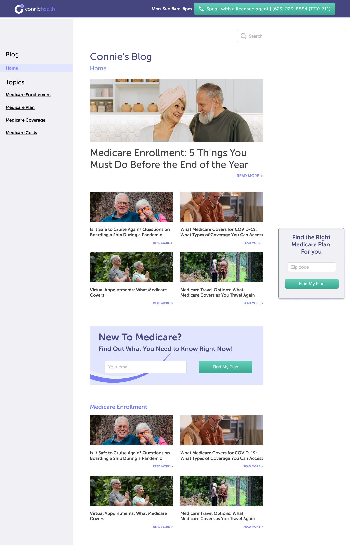
We iterated on changing the style of all the pages to allow for a visual ease of flow, following our simplification of the FAQ structure.
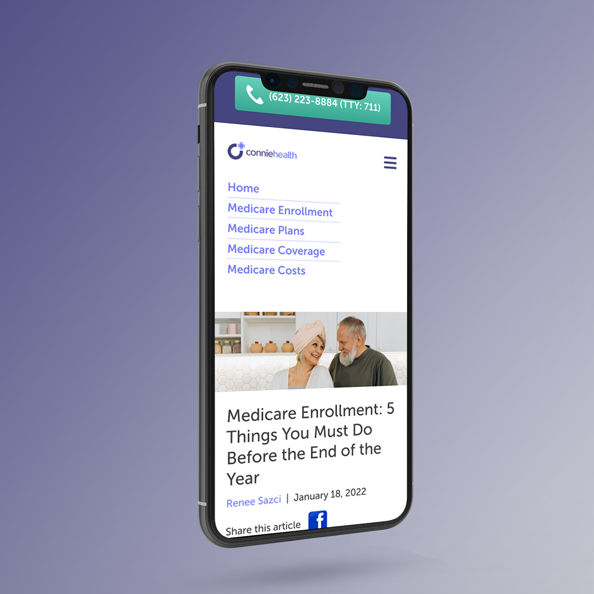
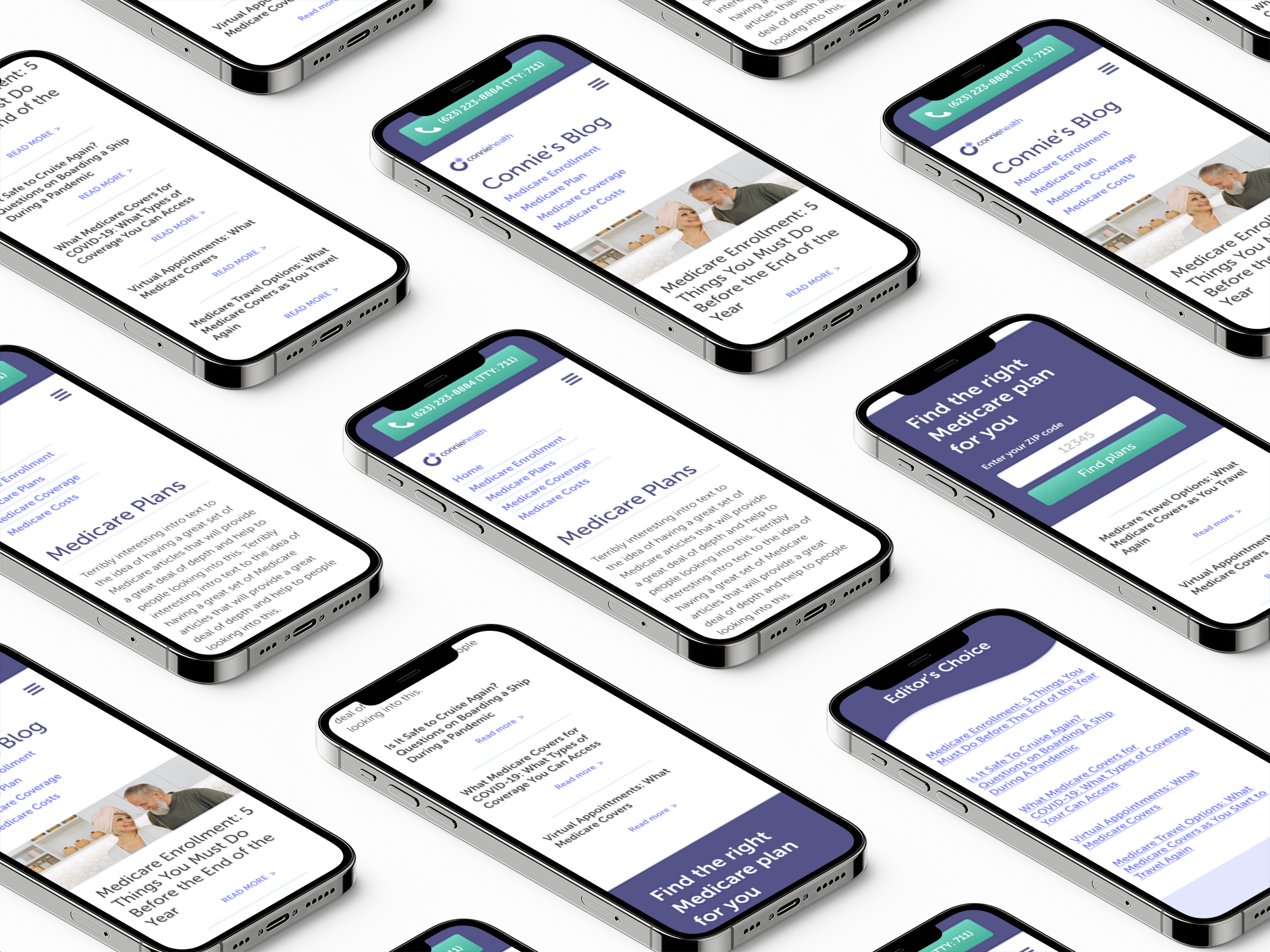
With metrics showing an almost 50/50 split on device usage, mobile vs. desktop, we needed a design that was clear, clean, easy-to-read, and transferred easily from one device to the other. Often, research showed that reading and researching by the customer was done on a mobile device first, and then followed up by final activation on desktop.
Utilizing the color palette that had been created for Connie Health’s current style guide, I applied colors with an eye to balance the readability of the FAQ with keeping things “on-brand”, satisfying WCAG 2.0 accessibility and looking for a calm, measured approach to the visual design.
Implementation
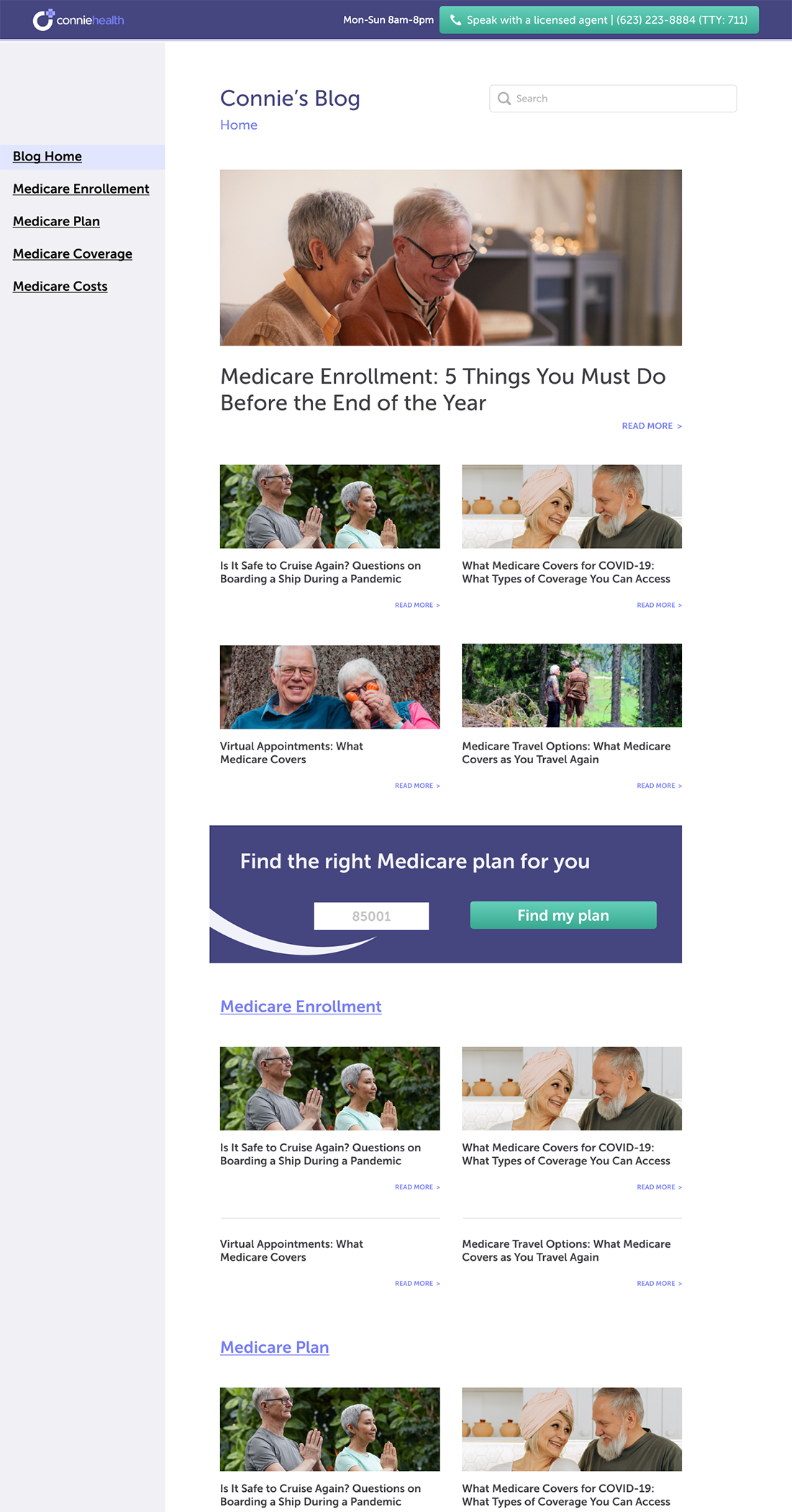
The final redesigned and fully reimagined Support Center supports over 450 articles to establish Connie Health as a true leader in the growing Medicare Healthcare field. Branding is fully supported and the end-user is 4 clicks or less from every support article available to answer their questions.