Overview
Tasked with building a multi-media effort for Strategic Sales at IBM, this was spearheading the effort of supporting 8 hours of oral presentations for an RFP.
To achieve this effort, multiple pieces were created, including a microsite, a specially designed presentation reflecting current PepsiCo branding, and a short-form video.
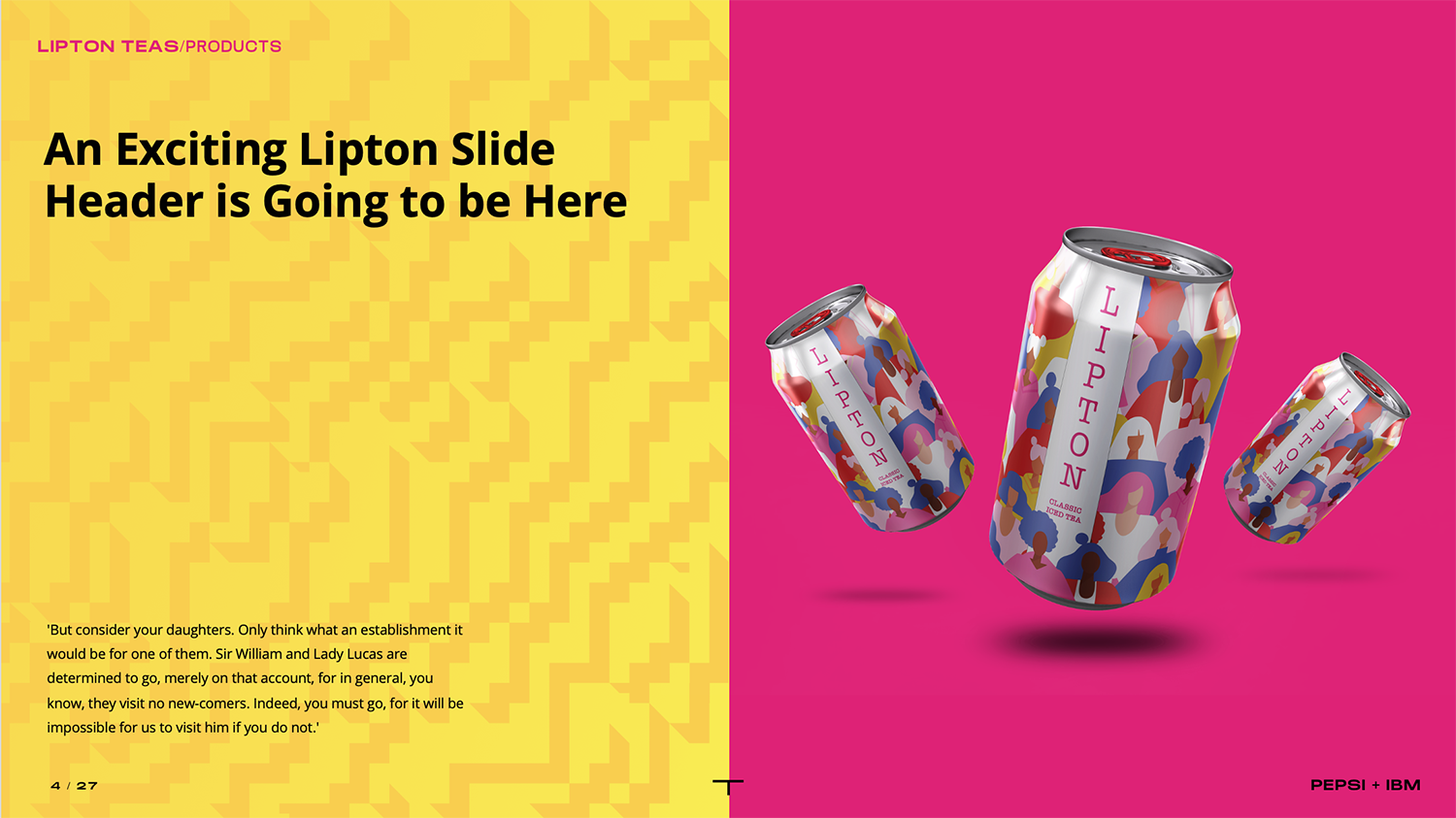
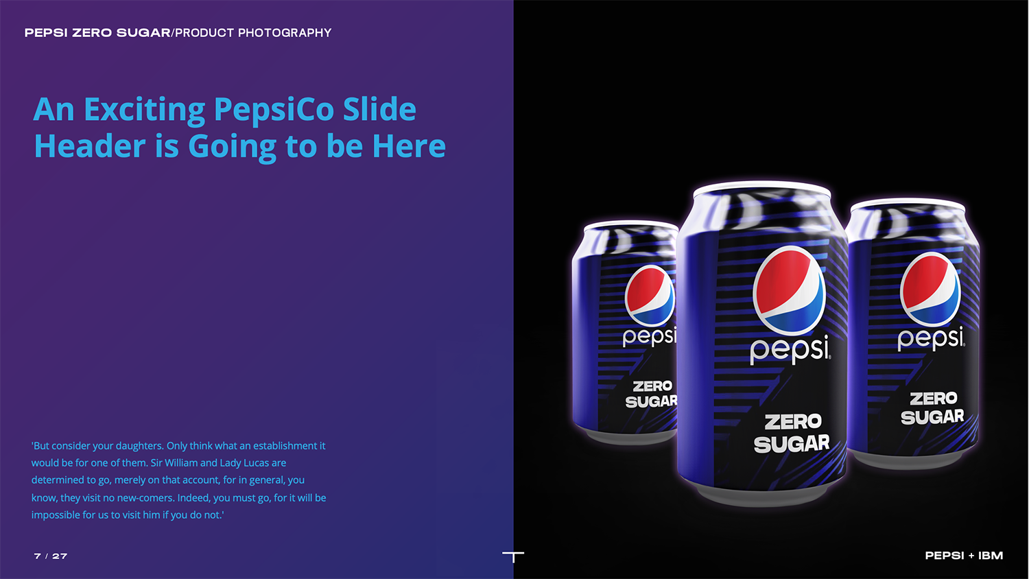
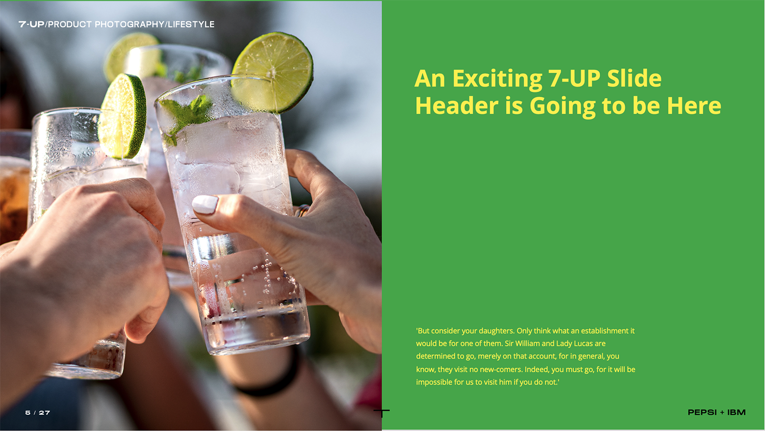
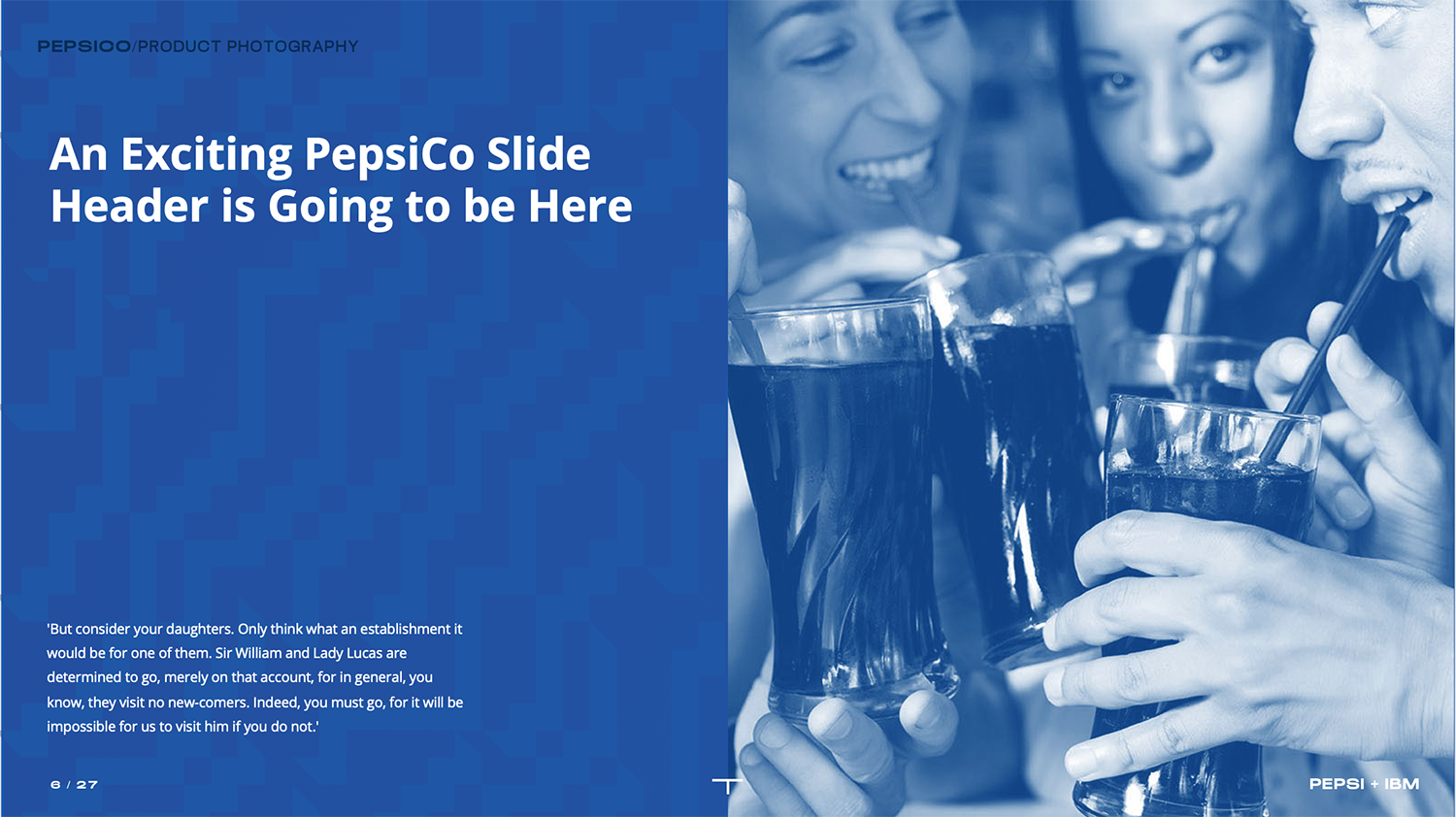
Please note, this is the initial version utilizing dummy text. However, in an effort to reduce spellcheck and my boredom with Lorum Ipsum, I have replaced the sales copy with a passage from Jane Austen’s Pride and Prejudice.
My role
Creative Direction
Design Lead
Visual Designer
Year
2023
Providing motion to the static
Creating a sharting point for a sales presentation that was undergoing continual evolution provided a certain set of complications that needed to be addressed. There were going to be mutliple components to the RFP and they needed to dovetail and become cohesive, but not focus solely on a single division of PepsiCo’s products.
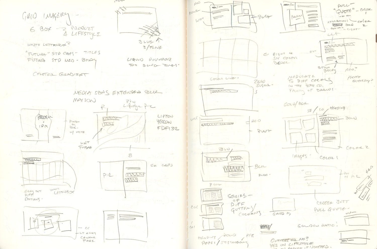
Notebook: thinking this through
I will almost always go to my notebook and start to think though the process before going digital. It provides clarity to the problem and is quicker to jot down ideas.
Considerations: what are the objectives for this particular orals session? Who is the audience? What pain points will IBM potentially be solving for PepsiCo? How varied is the necessary validation data that will be presented in this presentation? What data will be carried over to the microsite?
Answering these questions, even if not definitively, gave me the opportunity to start to conceptualize the layouts that will be used on the slide masters of the presentation, as well as how best to mirror the data on the microsite.
Clear needs:
- A video was going to be needed to introduce the microsite, and we wanted to acknowledge that we were aware of the coming shift in logo and identity for later in 2023
- There was a need to wrap the presentation around PepsiCo’s current brand as part of the larger umbrella that covered so many different products
- While identifying the details in the opportunity, we could not, at this stage, get too granular… yet
- Flexibility in design and approach was necessary for the speed with which materials were being generated
- In-person and remote participation needed to have equal amounts of “pop” to keep interest and make the sale
Final Designs
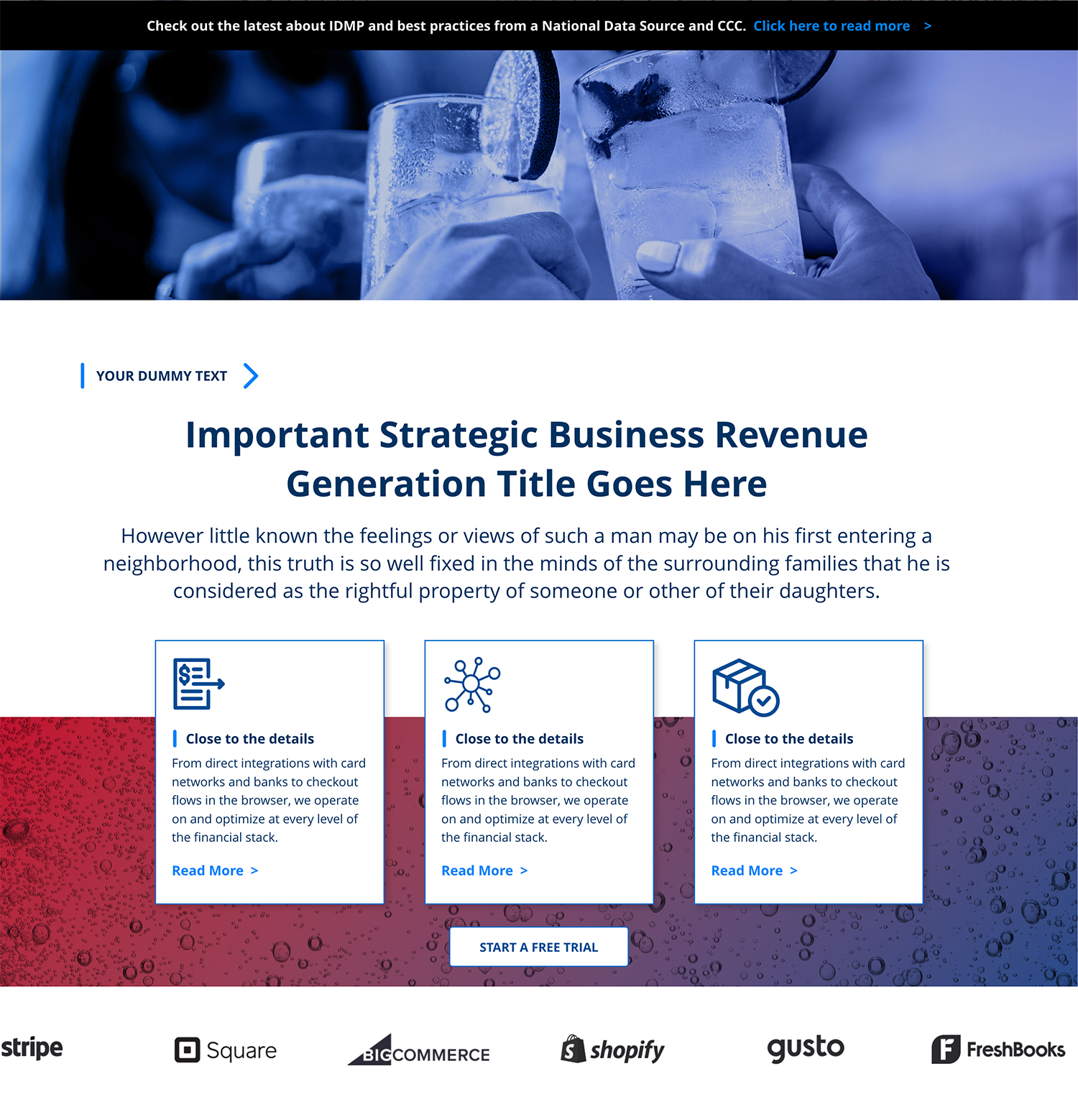
Maximum flexibility in the layout gives us the ability to expand easily to encompass as many divisions of PepsiCo as needed.
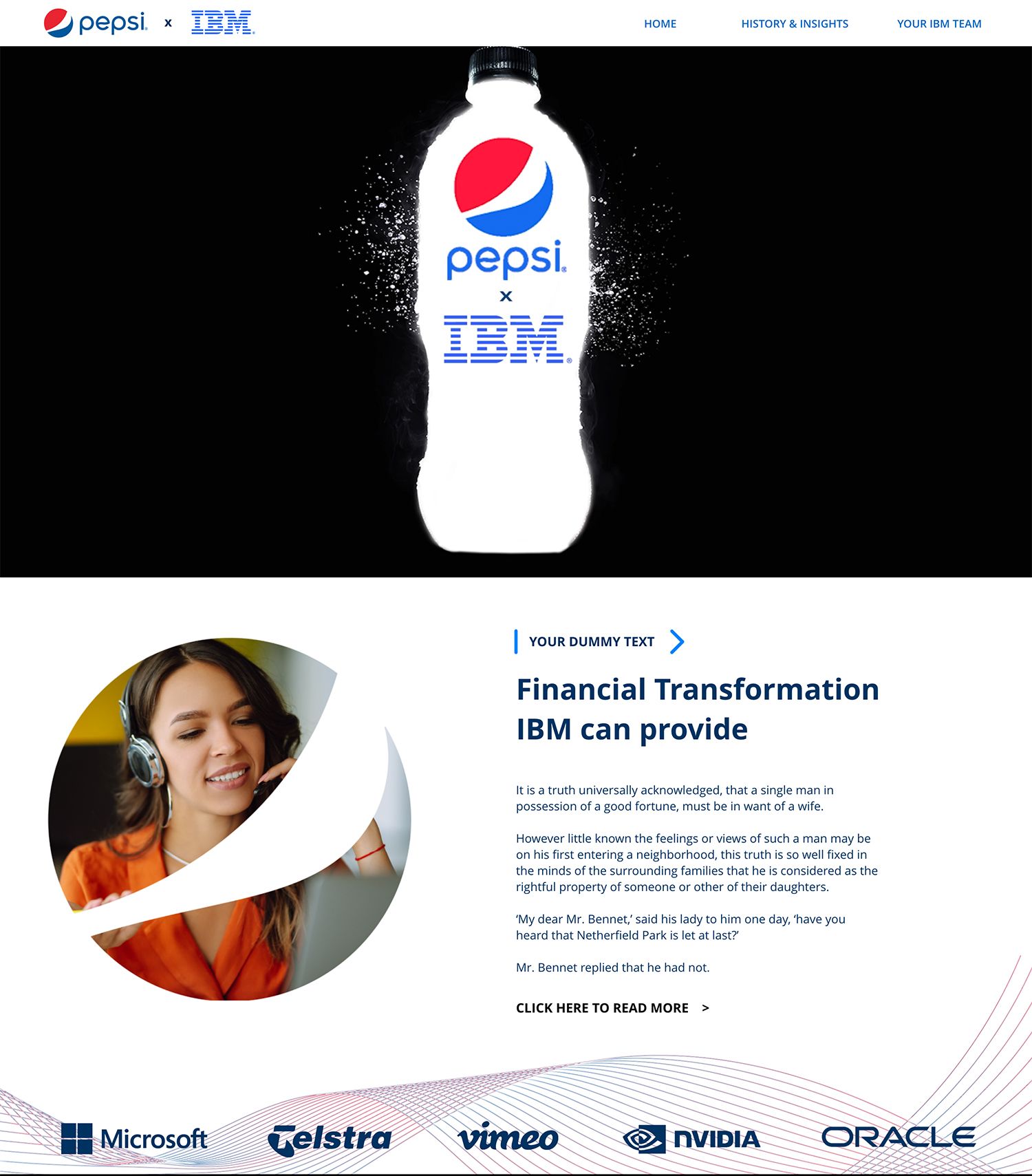
Microsite Development
To view the microsite with video, follow the link and use your arrow keys to navigate the comp:
https://xd.adobe.com/view/6189b6ff-393e-4d11-bfeb-a74dc5ced7d1-34da/?fullscreen
The microsite needed to convey a smaller subset of the brand principles: bold colors, patterns, and equal division of space, all tenets of PepsiCo’s corporate approach to the different products under their umbrella.
Similar image treatment was given to the stock photos used, and subtle parallax motion was introduced in the scroll the enhance the feeling of movement. When final text would be introduced, obviously heights and spacing would be adjusted for maximum visual impact.
Please note, this is a shell for design exploration purposes, this does not indicate that IBM and PepsiCo have entered into, or are considering entering any deal or financial arrangement either now or in the future.
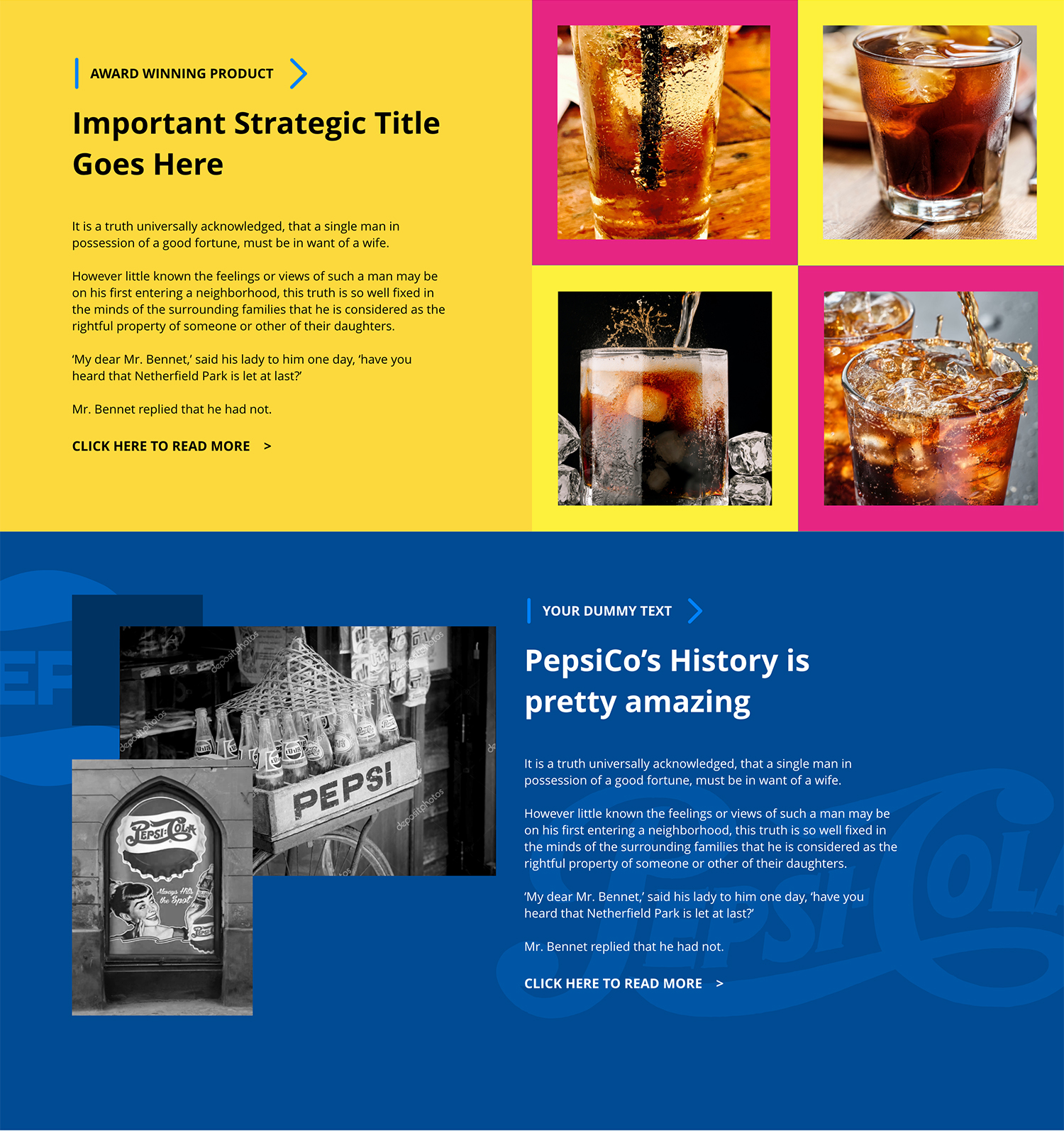
PepsiCo’s brand is progressive
Mirroring expansive visuals to show understanding on the breadth of PepsiCo’s core businesses
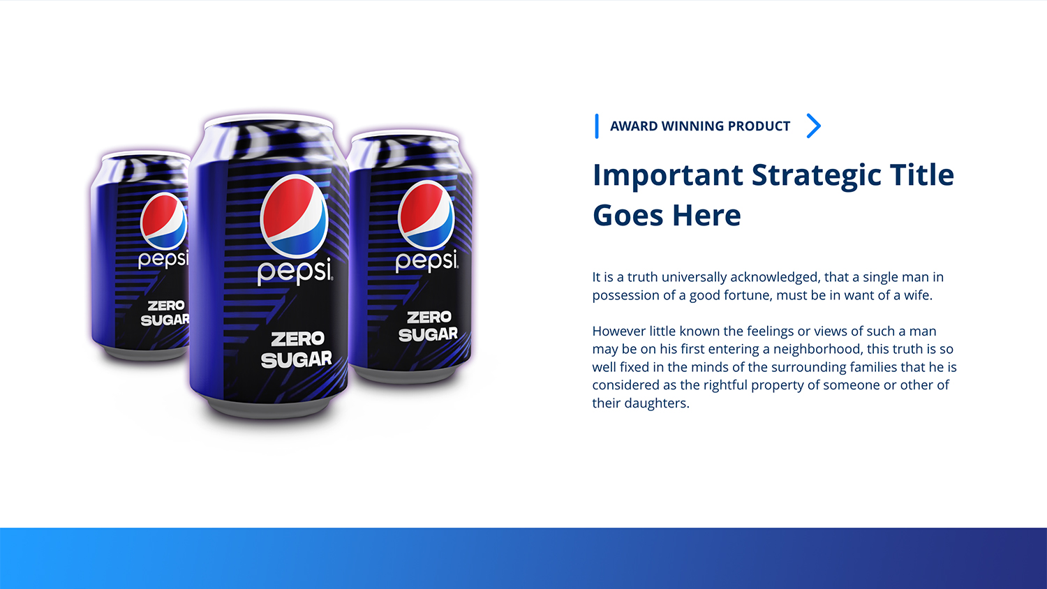
Brand, brand, who has the brand?
Proprietary font substitutions were made for the presentation to keep it “on brand”.
Not corporate and yet “corporate”
Working to emphasize how expressive the corporate brand is for Pepsi, and for the additional products under their corporate umbrella, a key ingredient was to not be shy on using iconography that they would recognize. Strong, bold, colorful patterns are a large part of what the brand is, as is appreciating the HD 4K textures that make you want to reach into your TV or computer and feel the salty goodness of a Cheeto, or the cooling exterior sweat of a Pepsi can on a hot day.
Working from available sources, and shooting some new pieces with my camera, I was able to build some black and white texture pieces to incorporate into photoshop with gradients and layers. With Pepsi’s strong display font in both solid and outline form, we had titles and separators that jumped off of the page, and templates that would carry the different color schemes from the Lays products as well.
“Not corporate” as a theme. We’ve all seen a million (give or take) Powerpoint and keynotes, and yet, when the corporate entity that you’re working with has a design group that makes extremely bold choices, it would be a grave mistake to show up with a boring set of media. I created a presentation that would have fit well into their brand book, but with my spin, and new photography included.
Introductory Video
The video fwas created with a mix of graphics that I created, as well as some of Pepsi’s official material and created to stand as a great, eye-catching, intro the microsite. While making the video, Pepsi announced the teaser of the rebrand for Fall 2023: a new variation of their ’80’s logo (a personal favorite of mine). I made changes to incorporate some of that into the video (max length: 10 seconds) as a nod to the current brand, but what we could be working on going forward. Various bits of Adobe stock were also used in the creation of this. No After Effects work was done on the video.