Overview
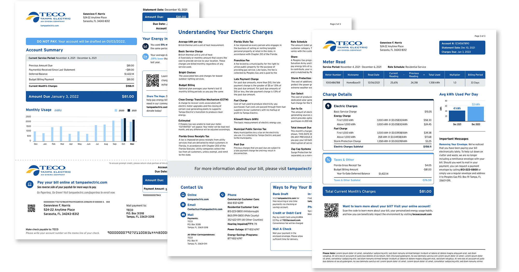
TECO, the Tampa Electric Company, had already engaged IBM to redesign their paper bill. Now we were asked to create a new interactive bill for the TECO customer incorporating not only the new bill design, but a host of other features. From research to 3rd party developer hand-off, I was design lead on this multi-tiered build-out.
My role
Creative Direction
Design Lead
Visual Designer
Design System
Year
2022
Problems
TECO has a legacy web portal that connects with multiple databases for both account data storage & billing. This portal will not be sunsetted until well past MVP state of the new site, so multiple technical hurdles are included in the change management side of design and development.
We identified multiple issues:
- Incorporating data and calculations complicated by multiple legacy database sets
- Some print bill elements didn’t lend themselves to interactive adaption
- Doesn’t encompass the current or future state of the utility
- There were no components that directly showed you how your bill was computed
- There was a distinct lack of communication from the utility regarding safety issues, outages, work being done, or weather-related issues
- There were no provisions for additional advertising
- There was a lack of cross-over on Gas and Electric accounts
- Business accounts were unable to access the information they needed to keep track of multiple locations with same owner/umbrella account, much less multiple locations with different controllers
- And many, many more that we would address en route…
Voice of Customer
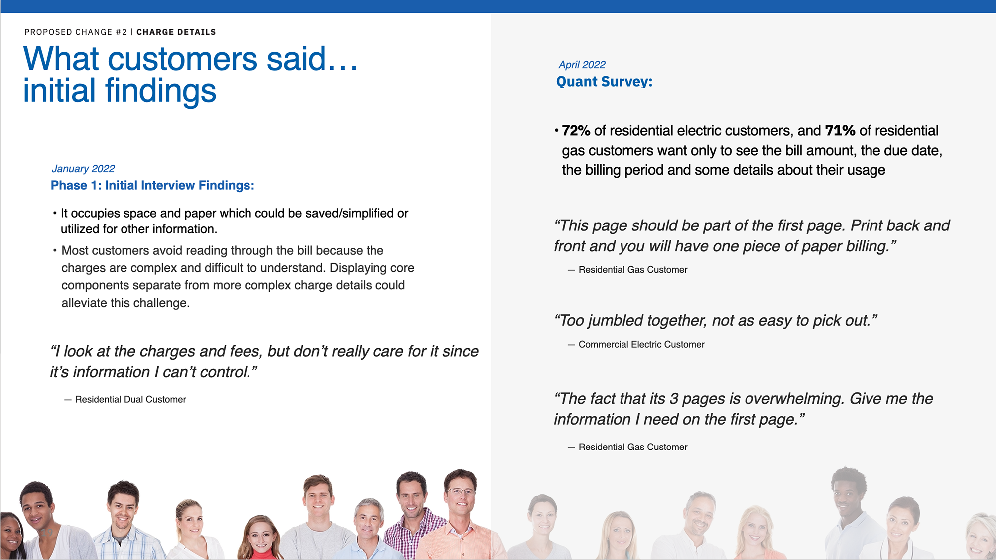
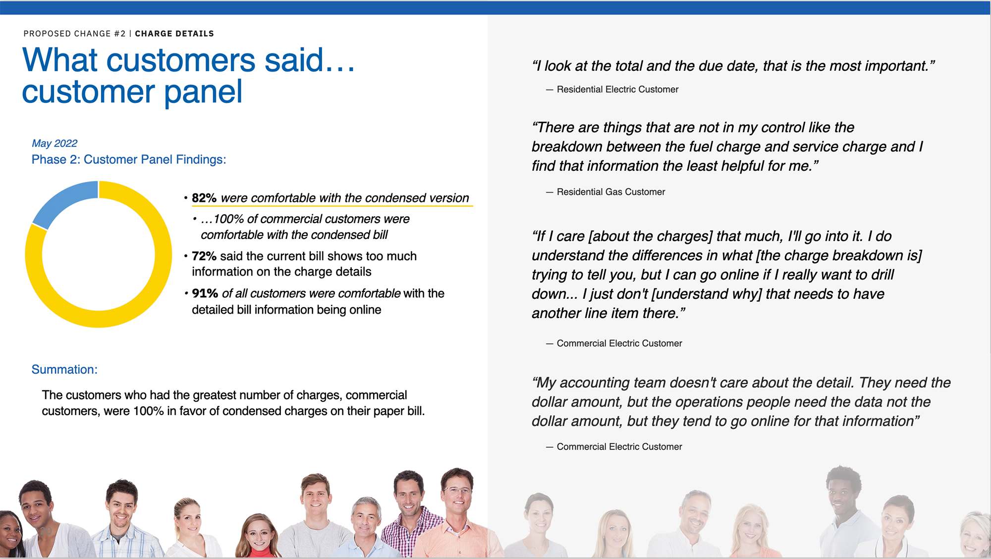
Multiple rounds of research with TECO customers and industry best practices have been done, giving us guidance on the TECO user base.
VoC Research
A diverse set of customers meant that there was a lack of uniformity in what the TECO customer’s main focus was for their online experience. Older “snow-birds” who lived there part-time had different needs from younger, tech-savvy, more eco, year-round residents. And being able to build features to satisfy both was complicated by technical limitations.
Because this was done in the age of COVID, we held two different interactive Mural board sessions with electric and gas customers, a range of activities from voting on multiple ways to read and understand simple-to-complex information, how to different customers prefer to “read” their bill, and find out, beyond flipping the light switch, what customers actually want from their utility company.
Collating research and creating our ‘North Star’
Collecting the research, and parsing the numbers gave us very specific actions to work on, as well as knowing how our decisions would affect the diverse TECO customer base. We prepared a large deck to use to not only support our design decisions, but also, internally, to align the IBM team.
After facilitating the workshops, I took recordings, and online polls and started crunching numbers and quotes. What seemed like somewhat excessive work would turn out to be anything but: we referred to this deck many, many times over the next couple months as our baseline document to make sure we were on the right track of addressing, as much as possible, our customer’s pain points in ways that actually answered their requests.
By The Numbers
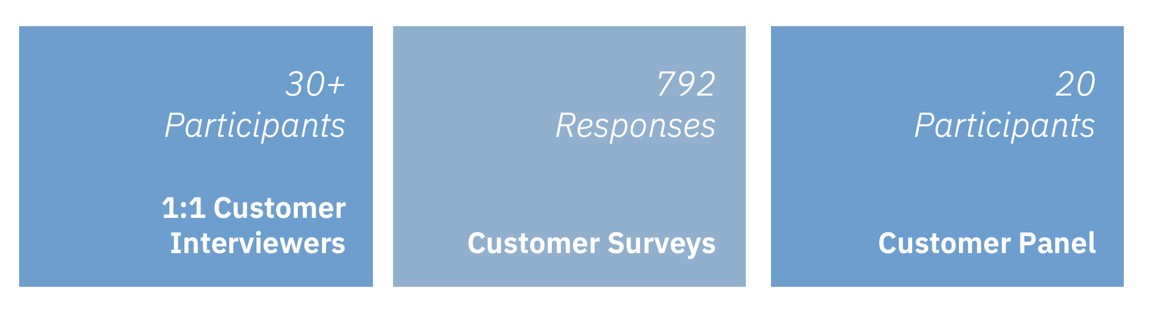
Findings
We discovered a multitude of areas in ways we could make significant gains for the TECO customers – but they were often different for each customer segment: Older versus younger, residential versus commercial, traditional power versus renewable energy, full-time residents versus part-time. And a confusing array of billing programs that started to become apparent the more we dug into our billing components.
There were multiple areas to improve, but we would need many, many rounds of understanding not only the complex flows we would need to create, but also the technical hurdles of what information we could get, and the calculations we wanted to have done for the app.
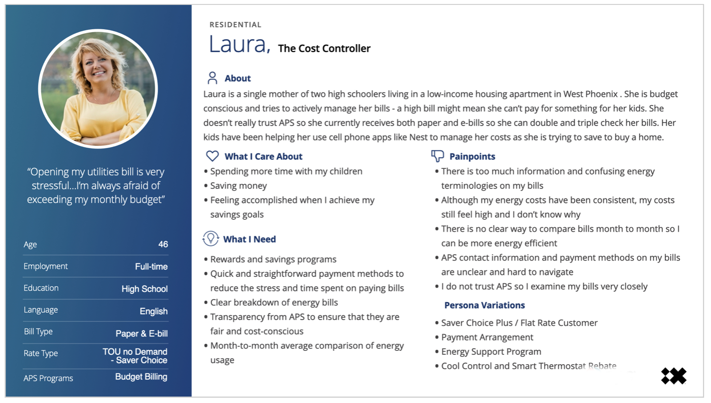
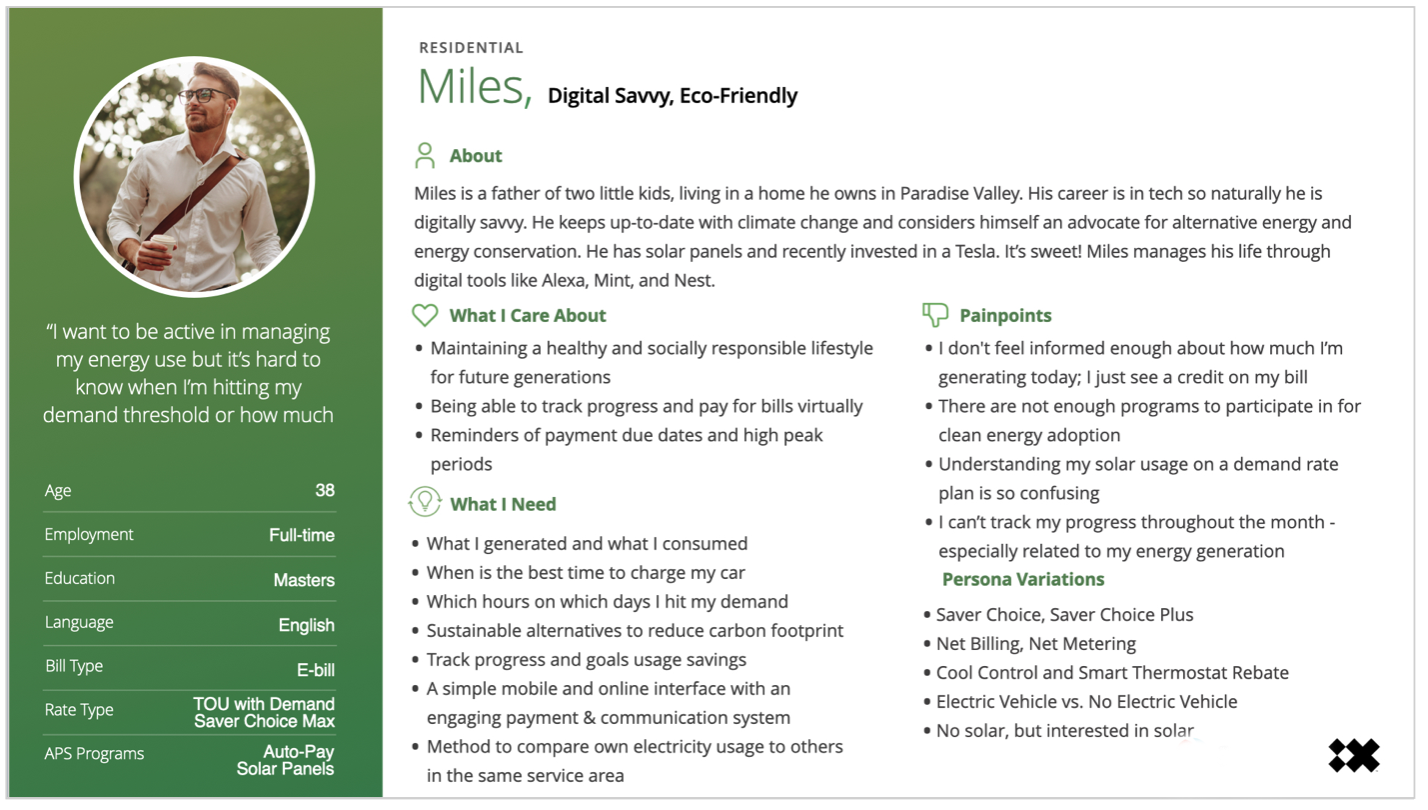
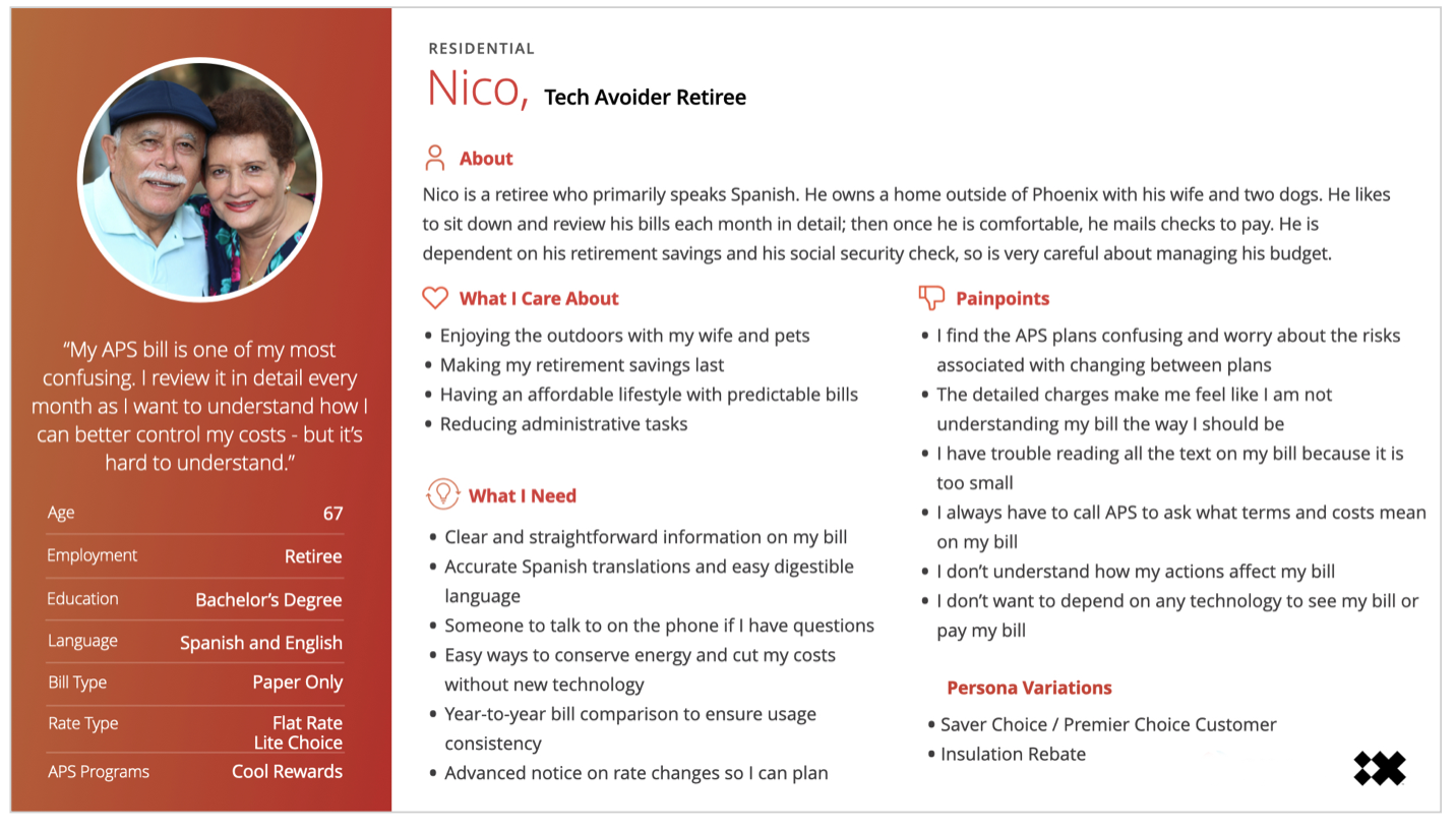
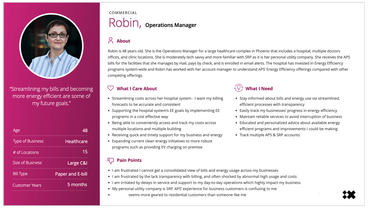
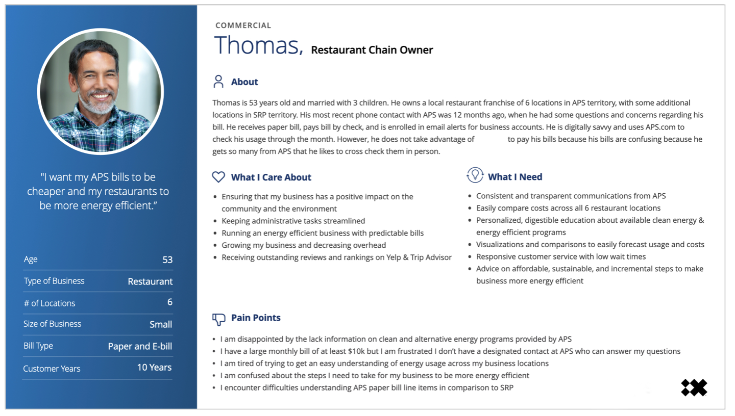
Personal Personas
We developed solid, deep personas starting with some fairly standard “people” but specifically added to and attuned to the particular demographics of their area of Florida, as well as a great deal of information gleaned from the UX Research.
Initially set up as a four-persona project, I argued that we needed to include a fifth, to encompass the differences in the business sizes and details. The small businesses were operating with a very different set of needs from the large businesses. It was agreed and a fifth, large business persona was added.
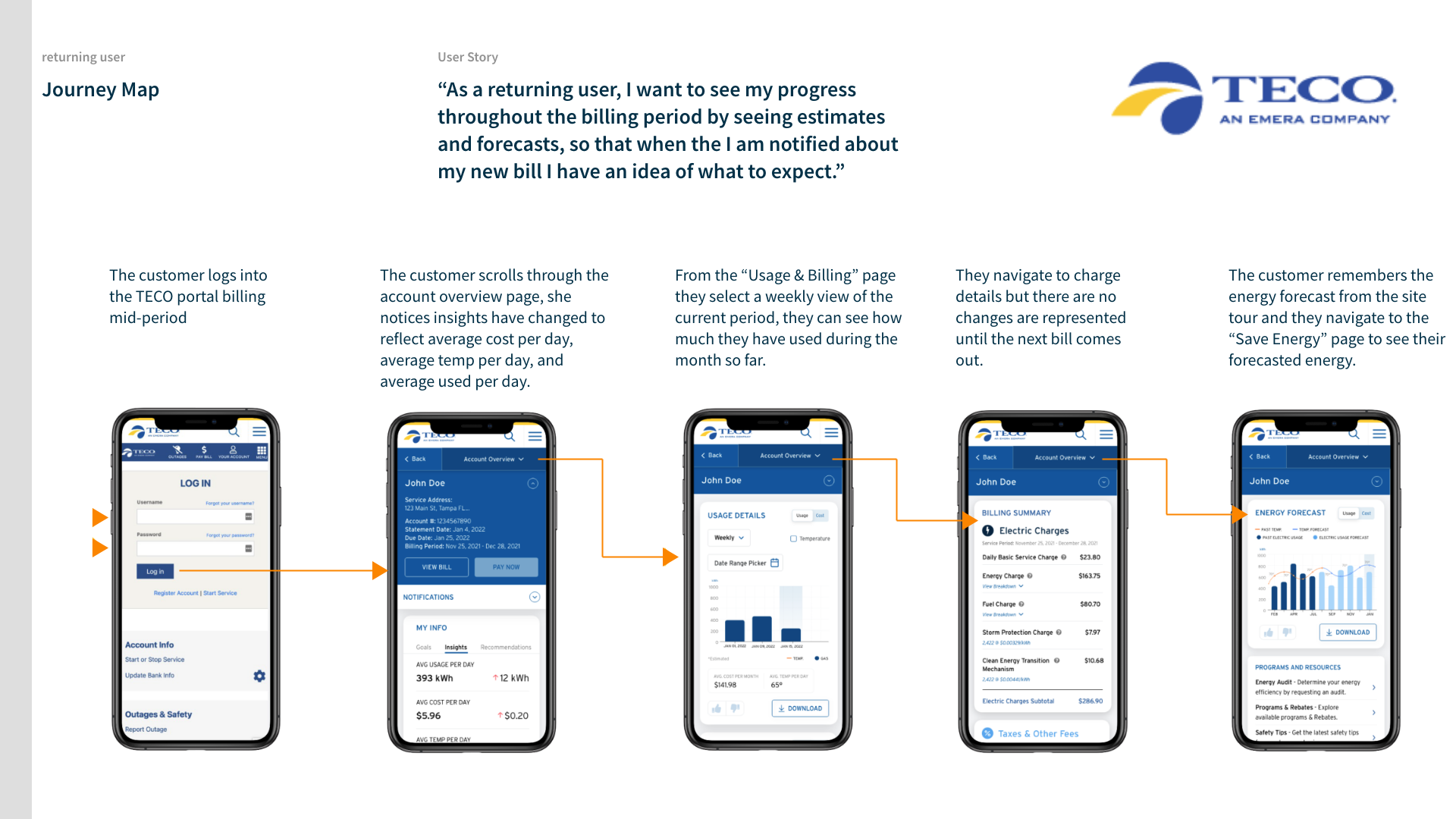
Journeys
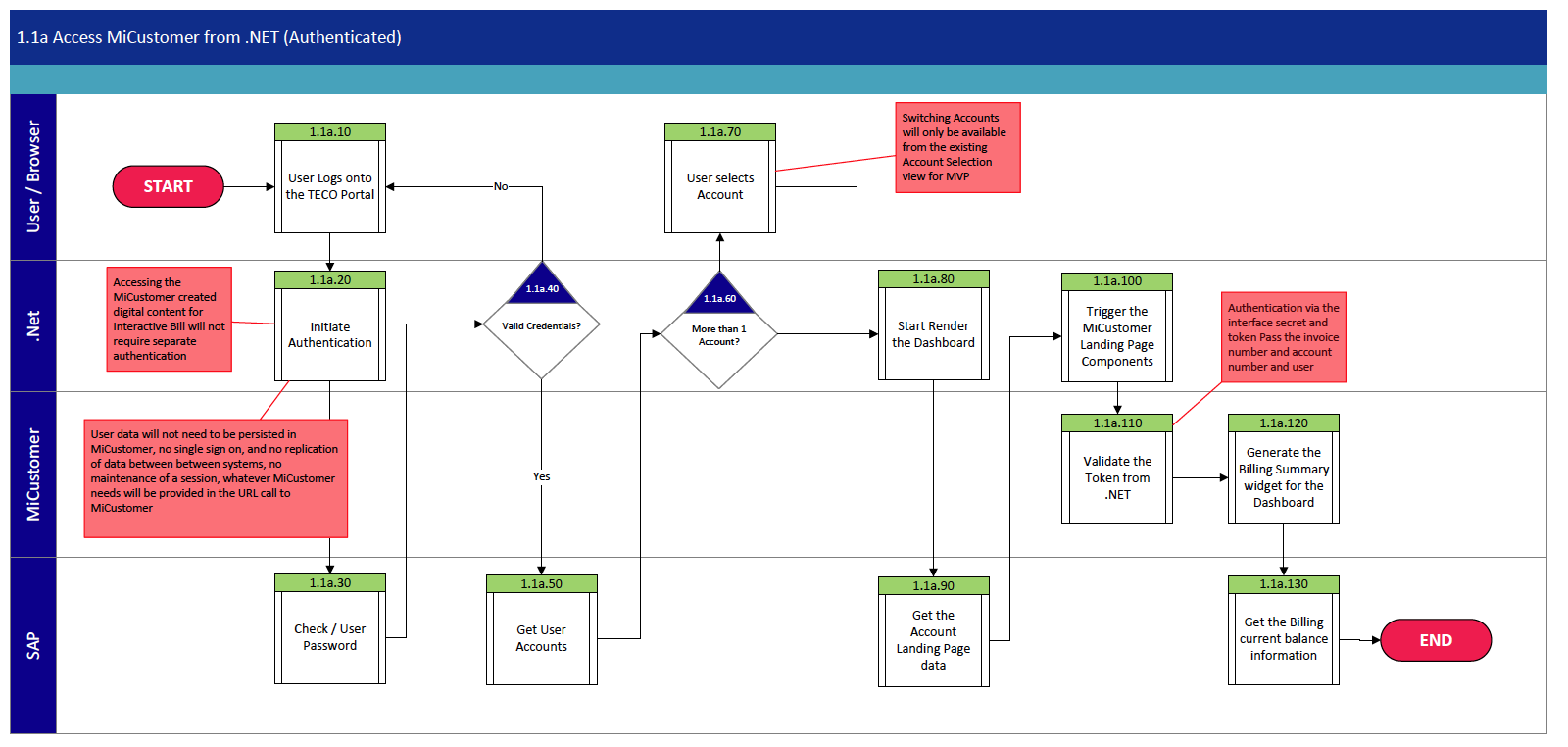
I great number of journey maps were developed to show just HOW our individual personas would interact with the various screens we were devising.
And a key part of this was working with our business development team, who were in constant contact with TECO’s technical folks, over exactly where we would be pulling our data from and how it would be processed. The process diagram on the right shows not only the decision flow, but specifically what database would be serving up the material for the XML to display. Concessions were made to accommodate data being pulled from the SAP database as opposed to calculations made at the .NET level. This was a key sticking point in understanding some of what we were going to be able to serve up to the customer in terms of recommendations and insights on usage.
Process Flows for All Occasions
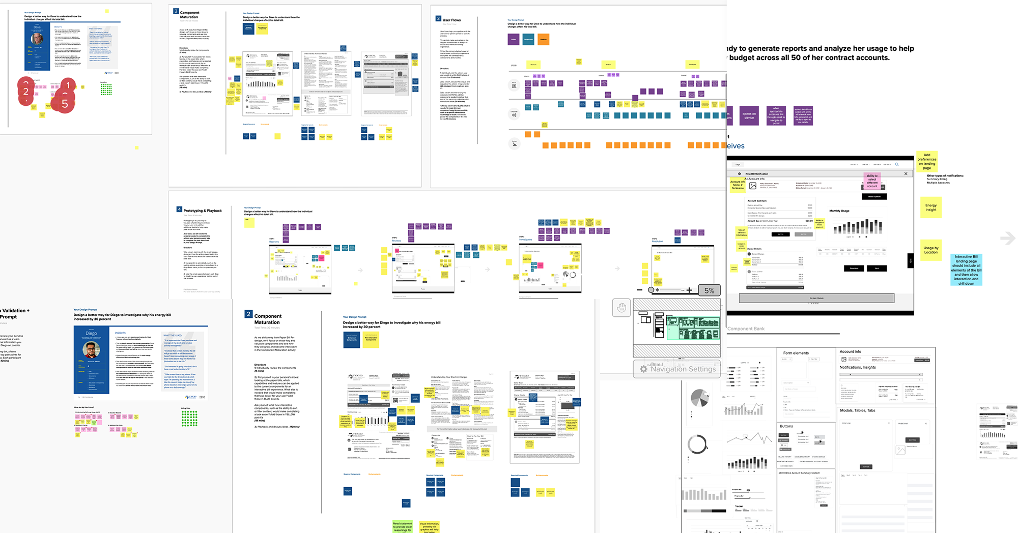
Taking the components and the changes in state that would be required to be vetted, our business analysts compiled process flows where we could start to work out the logistics of where the information would be pulling from, which as important as what we would be pulling; the utility industry is notorious for having multiple legacy database issues. We had a series of in-person workshops to validate our designs. The first one did not go well. The stakeholders couldn’t “see” the choices in the wireframes we wanted them to validate, and didn’t connect the flows we were presenting with minimal visuals.
It was a reminder that not everyone thinks the way we do. The stakeholder pain points were our pain points. With 24 hours in Florida before the next scheduled session, I proposed a series of XD canvases, each with flows showing the actual components and the decision tree, with text at each juncture for confirmations and decisions made.
A day later, with the TECO stakeholders, techs and subject matter experts (SMEs), three of us facilitated in round-robin fashion and got sign-offs on the visual process flows we needed. We not only made up for the lack of decisions from Day 1, but were able to finish Day 2 with all but one set of decisions in place.
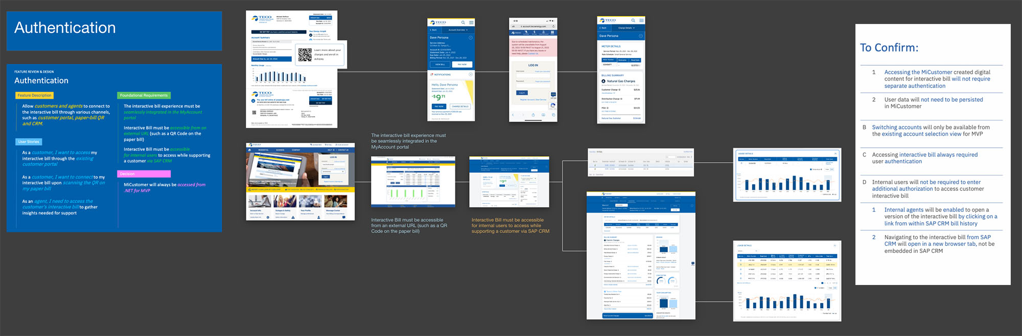
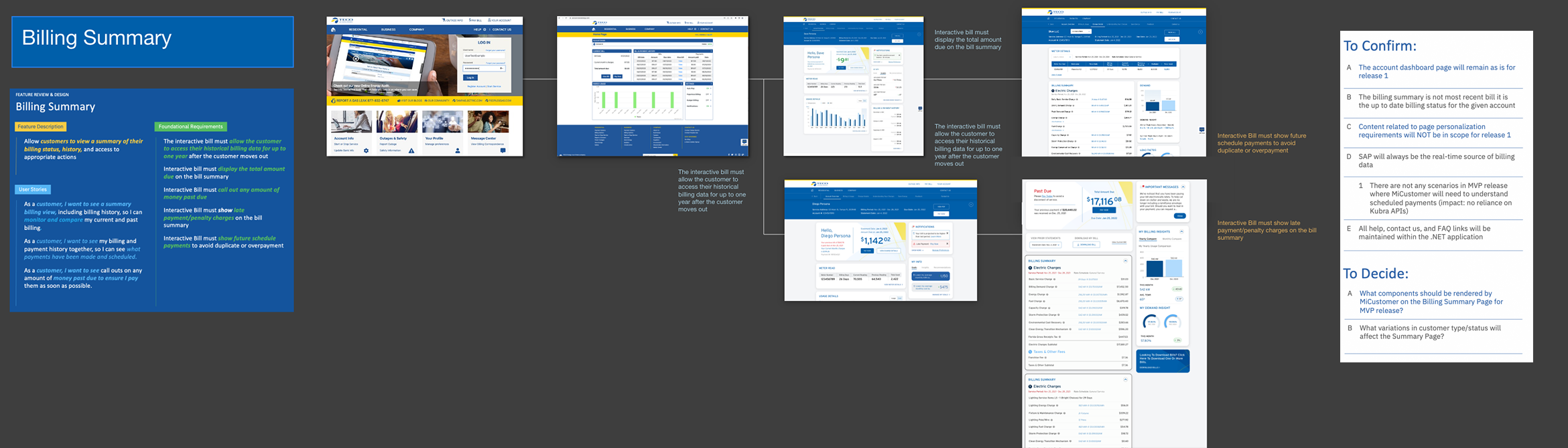
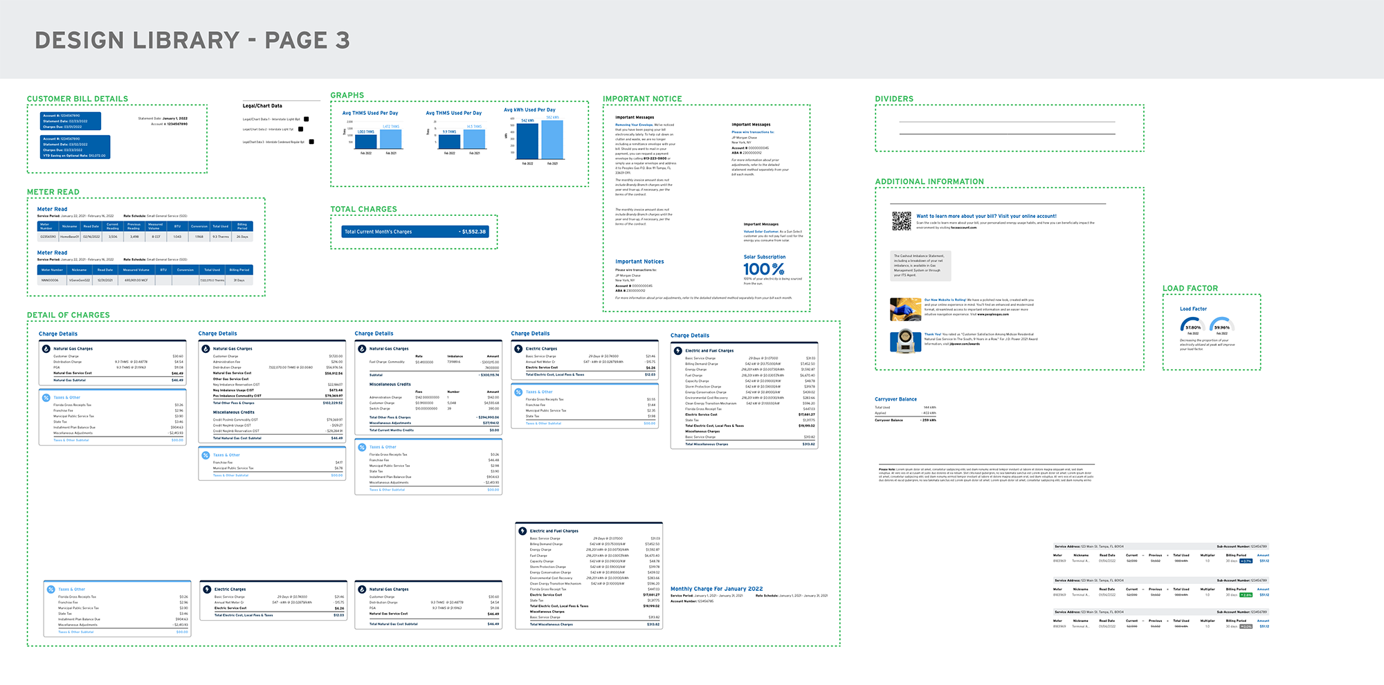
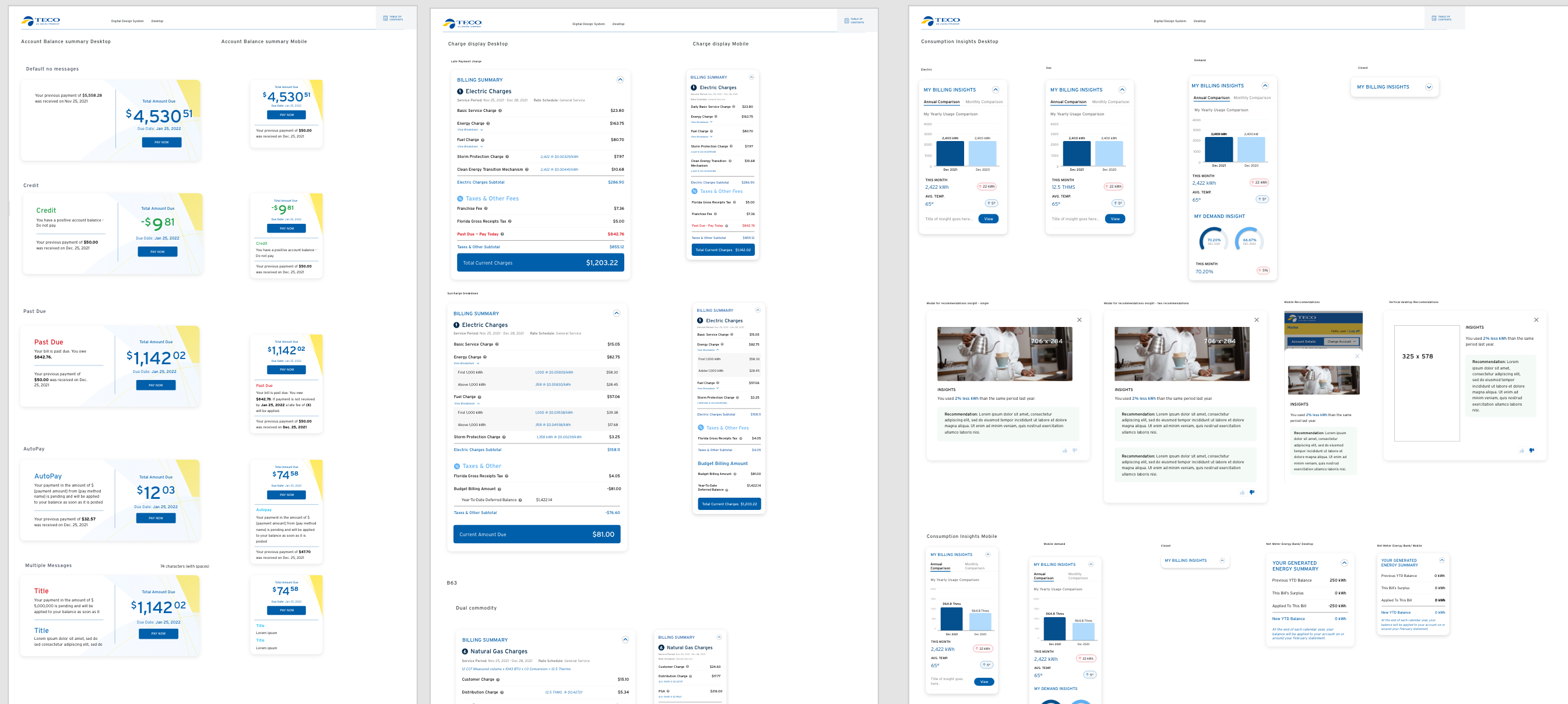
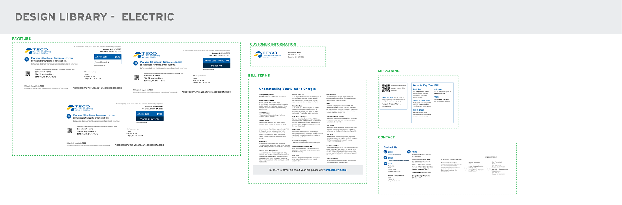
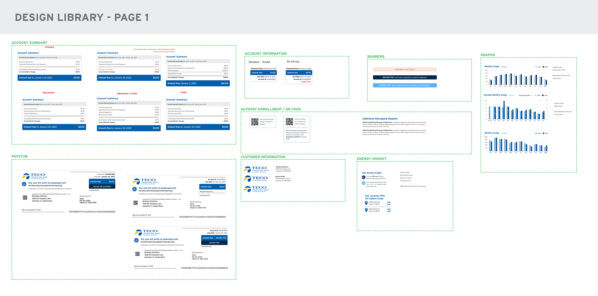
Design System
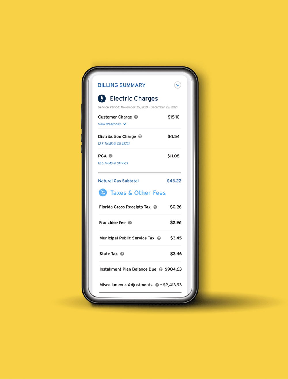
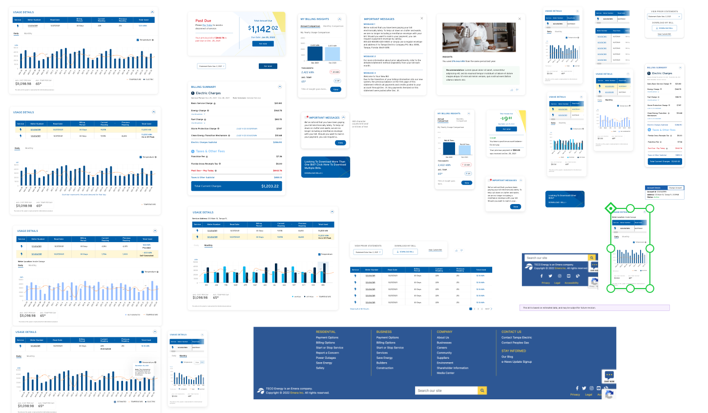
A fully developed design system was created to ensure that our expanded branding from the print bill redesign was carried over to the interactive experience, ensuring consistency of experience. To aid the developer, we comped up as many bill component options as necessary to make sure that we had all bill scenarios covered. This diligence would make for interesting design changes later during the project.
Pixel-by-pixel care was taken to ensure proper data hierarchy, readability and spacing. Full documentation was created to ensure as much of our data visualization could be preserved as possible during development.
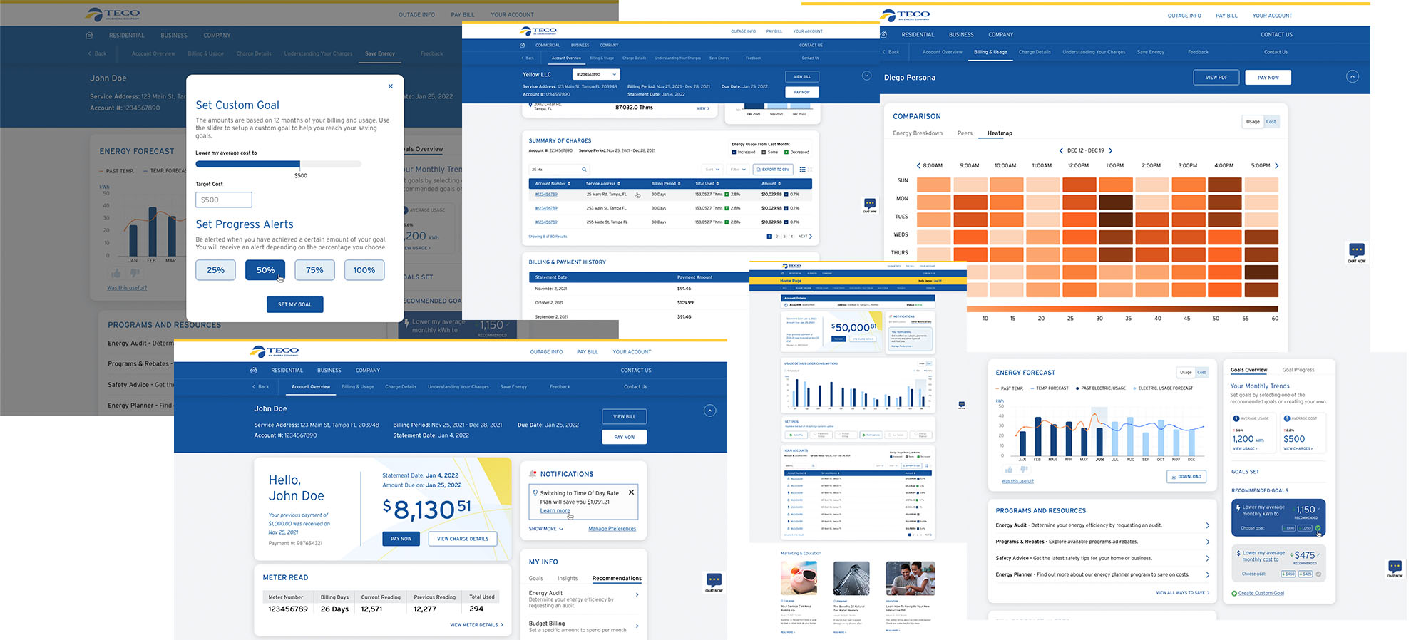
Deeper Insights
Creating a truly great interactive experience for the TECO customer, as opposed to simply reiterating the paper bill on a screen or only adapting the experience to match with previously used technology, was our north star.
With that in mind, we ideated far and wide to not only give the users what they were asking for, but to expand those pieces of information into the next level: combining data into actionable insights for the users.
While a number of ideas that had been proposed had to be shelved from the MVP til round 2 or 3 due to complexity, the fact that they were not cut but simply moved until technically feasible shows that strength of the research on our side, and the depth of the ideation.
Component-based system provides ultimate flexibility
Ultimately, what started as a project billed around a certain number of bill “types” became an ever growing set of modular components designed to flex to accommodate as many of the different bill types and their individual billing data fields as possible. As much as possible, the same look and feel was used, and as much code as possible was re-used to save money and time on the developer’s side.
Why was this important? Because, the further we drilled down into potential billing scenarios, and the deeper the involvement of the SMEs on TECO’s side went, the more we realized it wasn’t 12 different bill types needed. That wasn’t even close to what was needed.
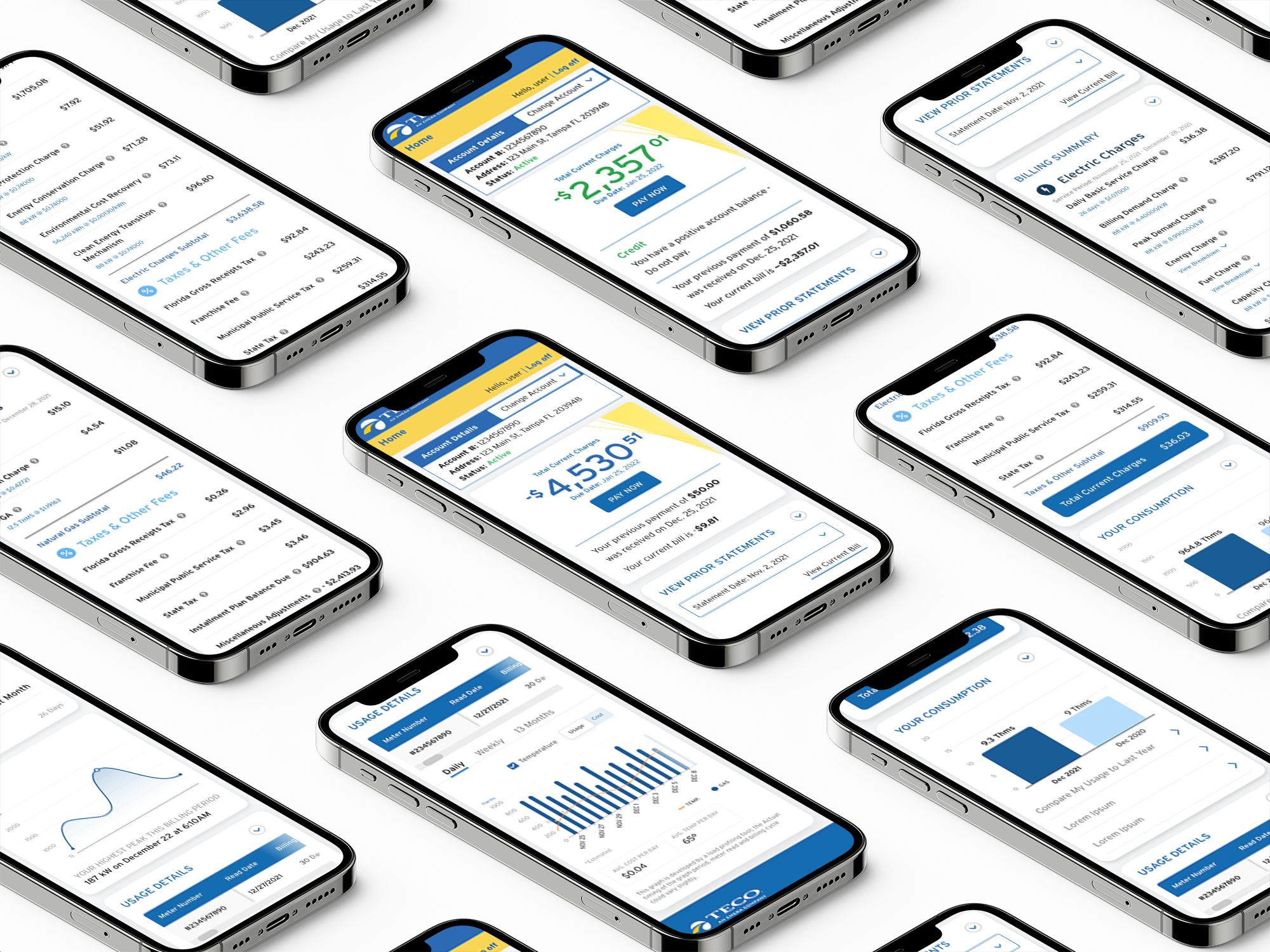
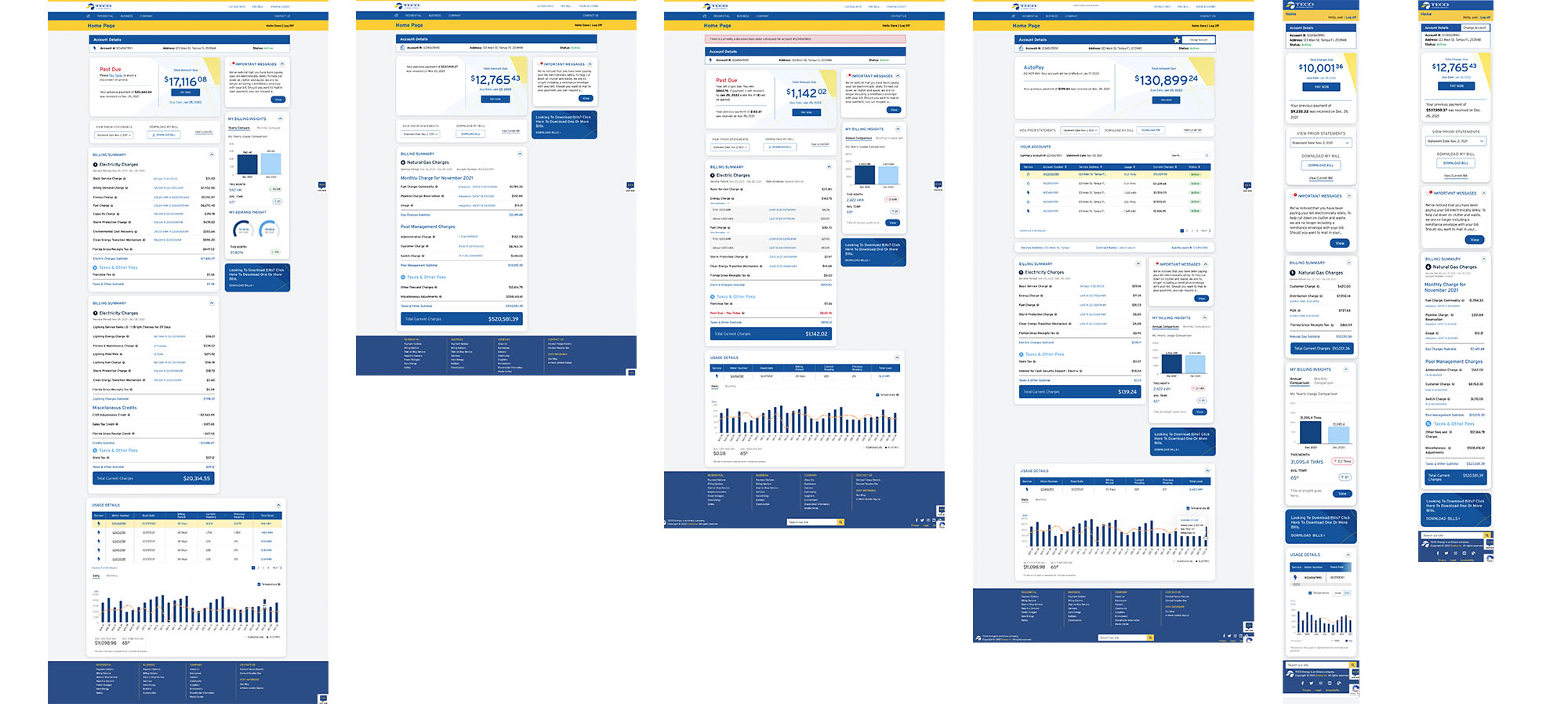
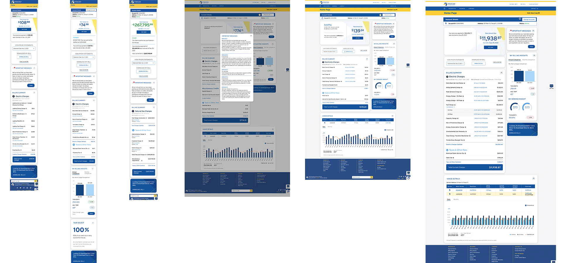
In the end, we developed the necessary components for, and comped up, over 20 different bill types both desktop and mobile, creating over 40 diverse user flows.
Final Designs
The final designs incorporate as many features as we can fit into the MVP release, and sets the stage for future releases.
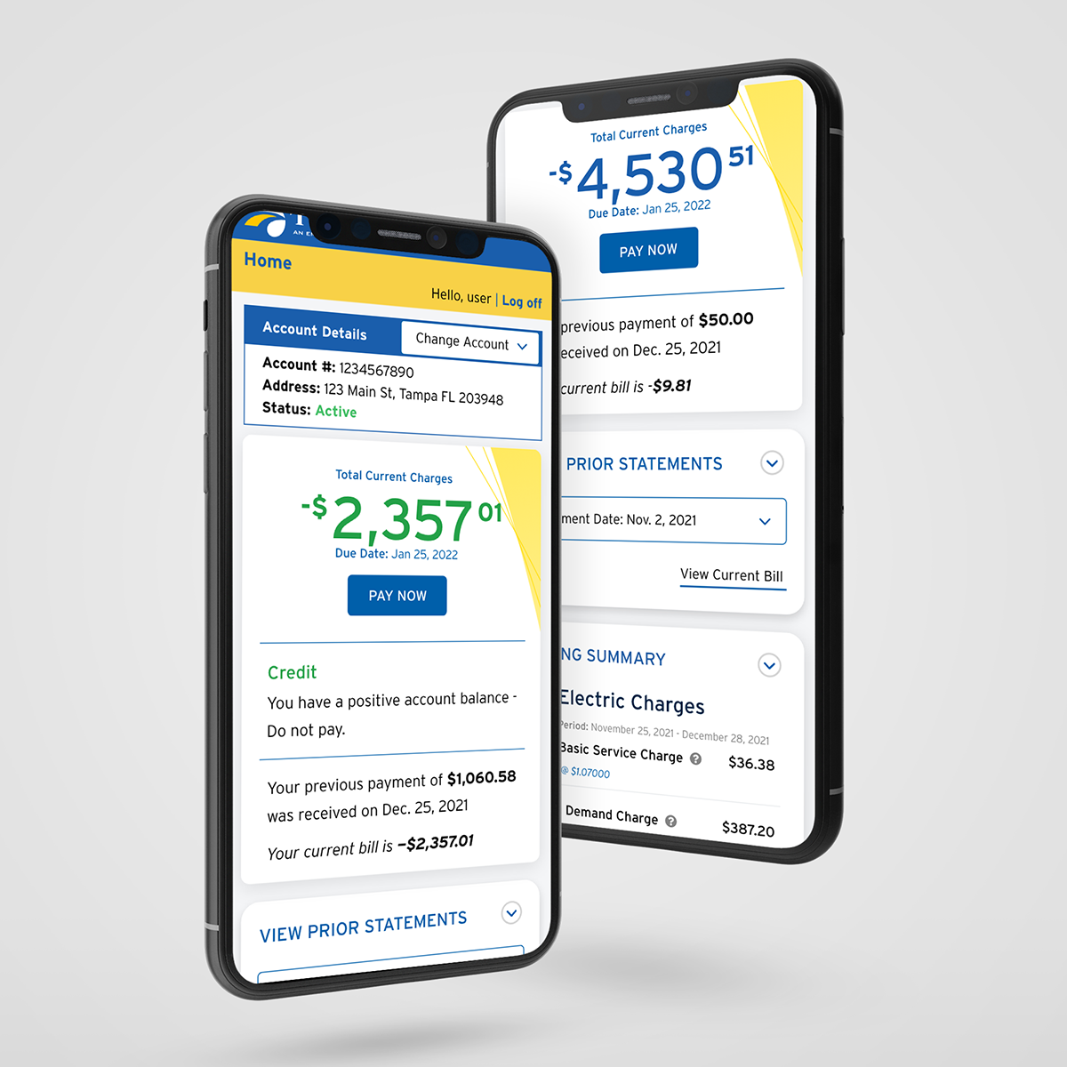
The MVP release of the TECO interactive bill is a significant step forward from their current online representation, but it just scratches the surface of what will eventually be possible for the TECO customer. All customer types are included in the new release, and we even designed a marketing piece triggered by the scan of a QR code on the new paper bill showcasing some of the new features for the customer. With over 20 different bill types represented interactively, a small number of variations are shown on the right.
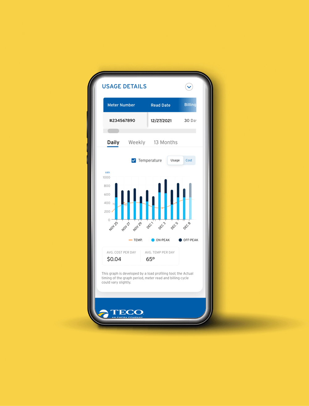
TECO’s new, multi-tiered app provides a multitude of services on-the-go that their users have never had at their fingertips. Designed for both desktop and mobile alike, the ability to pay your bill, monitor your usage and receive specialized weather warnings make this app a tremendous upgrade in service and safety.