An Accenture sales team was preparing for a 2-day orals presentation at a major American airline carrier and needed a theme, as well as pertinent sales collateral for not only the opening session, but 9 different breakout following sessions.
What was unusual for this oral presentation was that the primary audience was NOT the C-suite decision makers, but the “rank-and-file” workers who did the majority of the day-to-day work.
With this in mind, these design concepts presented here convey my theme “from the ground up”, with all materials shown utilizing a blue collar “field manual” visual. Each field manual, using cloth binding on the edge, unfinished, heavy uncoated stock for the cover, exploded engine diagramatic, has a different color belly band indicating which breakout session they will be used in.
It would have been easy to over design this, and the trick was to NOT do too much, but to make each and every piece of collateral tie to the theme. Each book will have bookmarks set to the section most pertinent for that breakout, as well as information positioning Accenture as not just an over-arching consultant company, but one used to working in the trenches, making things better for the whole organization.
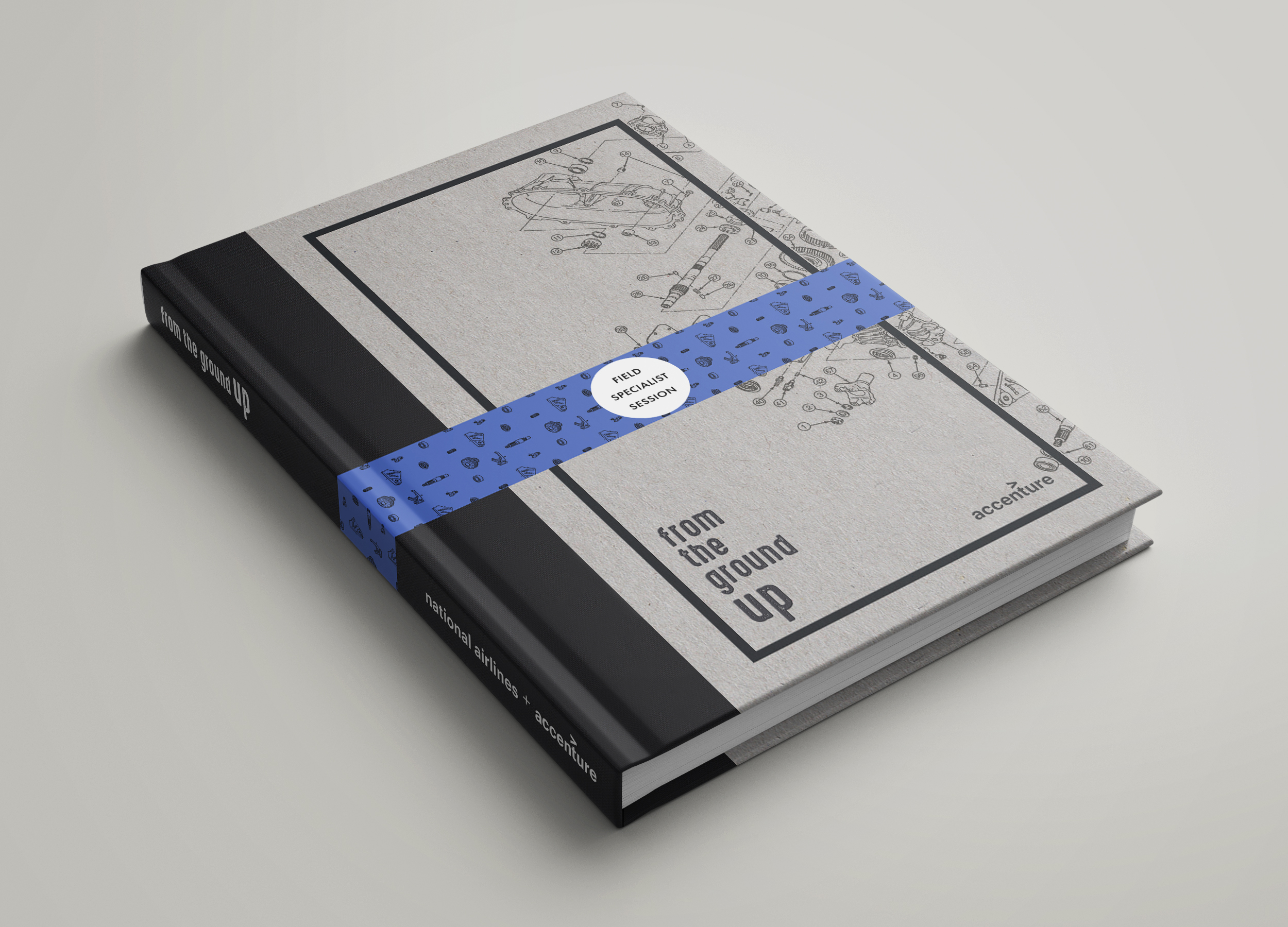

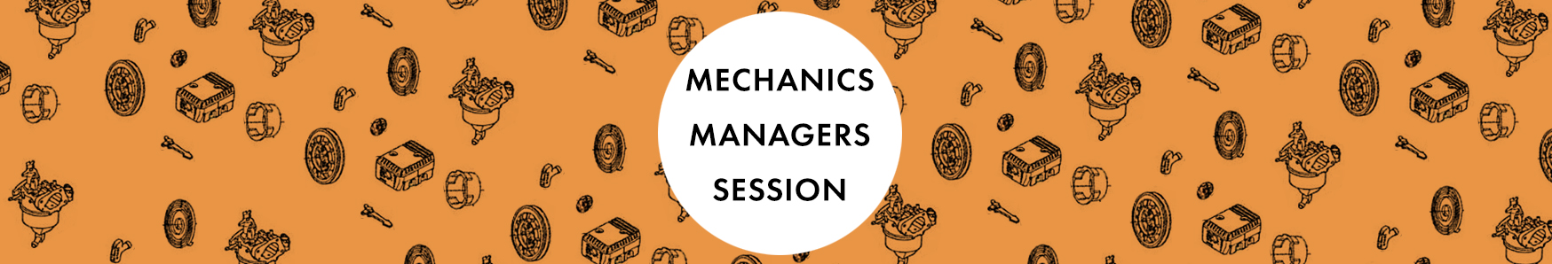
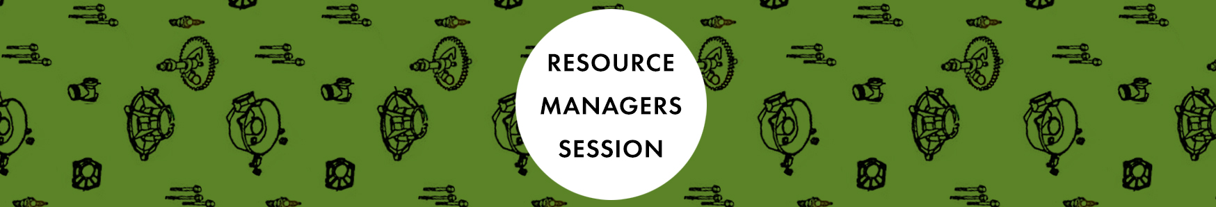
Color-coded belly bands, with different parts patterns on each, helps to differentiate the sessions. Here are three different ones for examples. The interior of the field manuals was constructed like a workbook, with room for notes during the session, to help prep for the end Q&A. A separate QR code was included to minimize overly detailed powerpoint during the session – the material could be accessed securely post-session if need be.
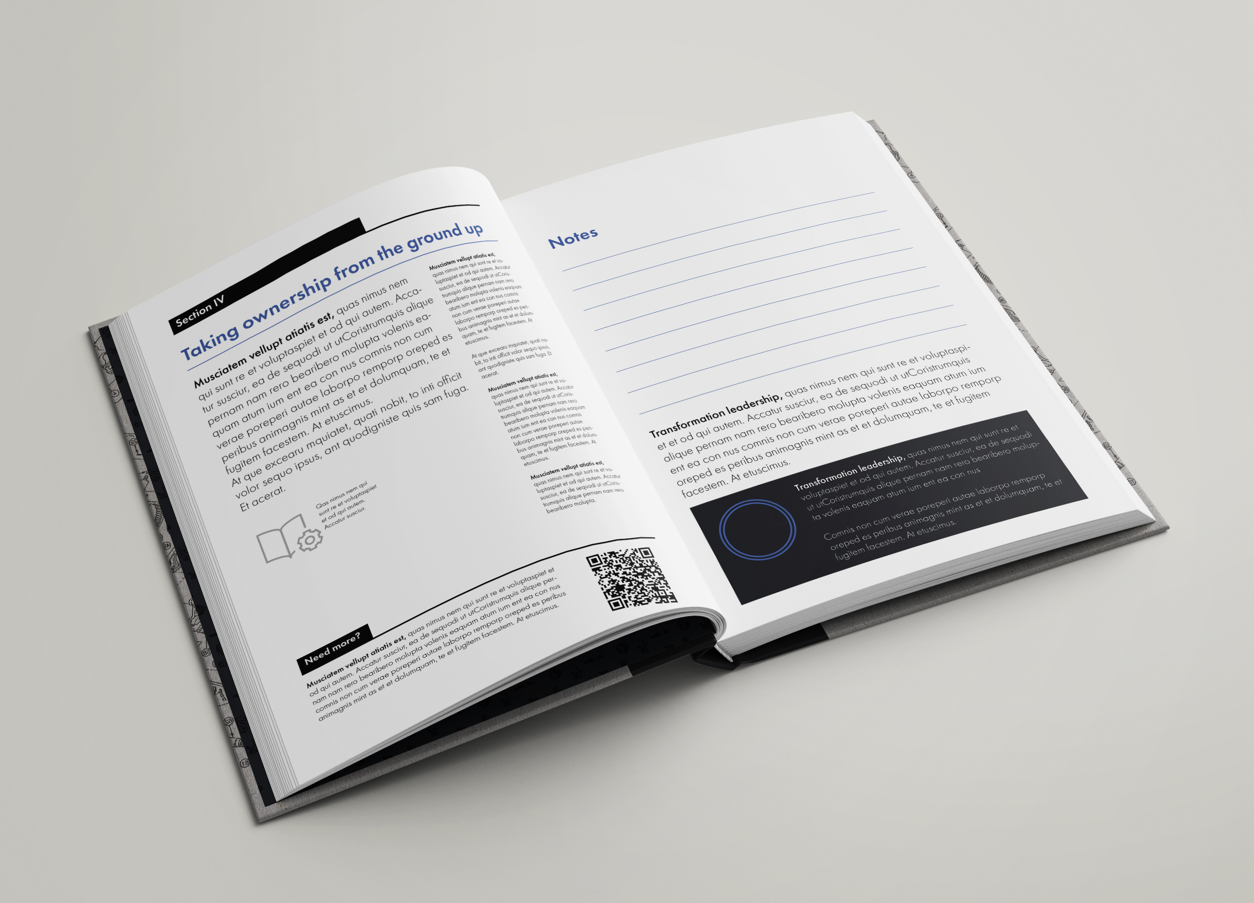
Great consideration was given to make sure that the interior of the book matched a field guide style, while still presenting information to make the breakout sessions accomplish their goals: allowing the specialists to make a deep dive into the minutae of their profession, and reach assurance that the proposal works on all levels.
A number of logos were considered, before the slightly rough, distressed san serif font and lock up was chosen. Shown here are a number of different options that we considered and discarded.

Leave a Reply
You must be logged in to post a comment.