The Challenge
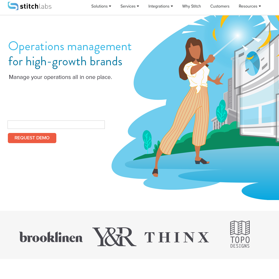
Stitch Lab’s home page is the main gateway to the site. However, heat maps had shown that practically no one scrolled past the first tier on the prior home page. A great deal of information that would communicate the varied roles that Stitch’s software could help with was being lost.
How to get users to scroll down further and tell the story of Stitch’s time-saving, money-saving, vital software? How to tell the story better?
My Role
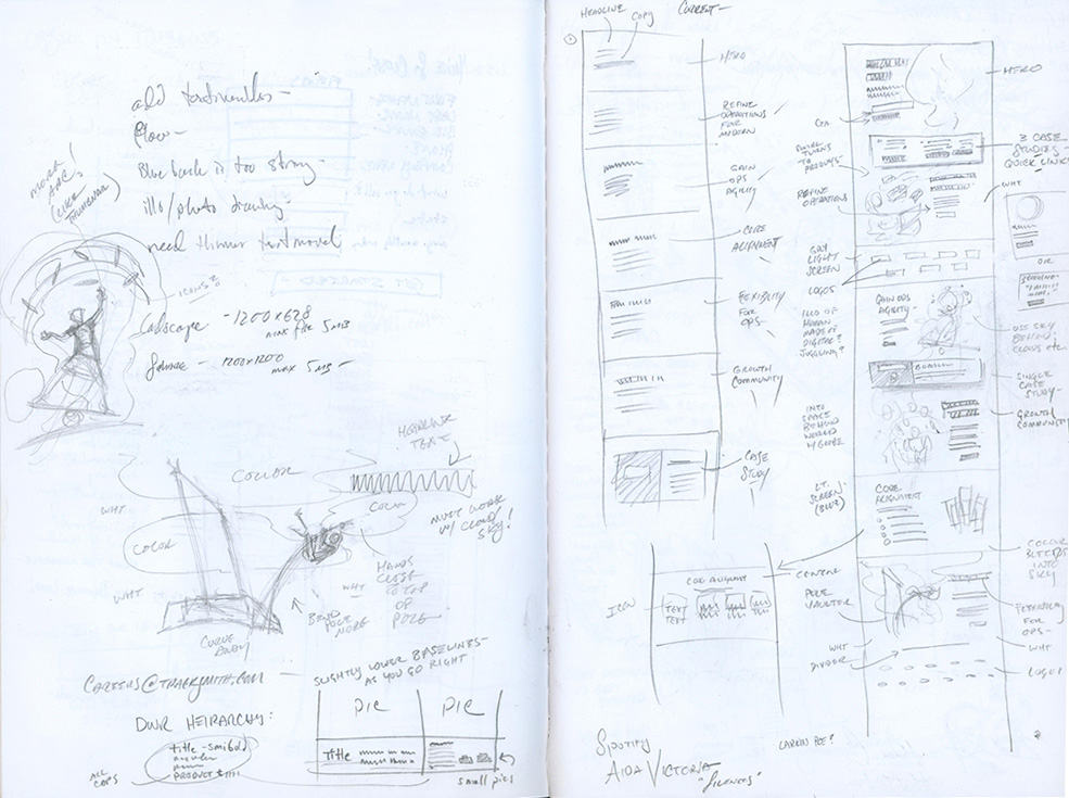
Redesign the home page from scratch, utilizing new branding elements in color, typography, and illustration to tell the story to a broad range of users coming to the page… and get them to convert.
Key Insights
Fully 20% of the traffic inbound traffic on the site directs to the home page first. The next closest page is less than half that percentage, so when modifying the home page to encompass the new brand style (Illustrations in place of stock photography, Brandon Grotesque in place of Proxima Nova on headlines, bold new brand colors) great care was taken to enhance the SEO qualities of the page, as well as incorporate new findings on validations that could increase conversions.
Redesign
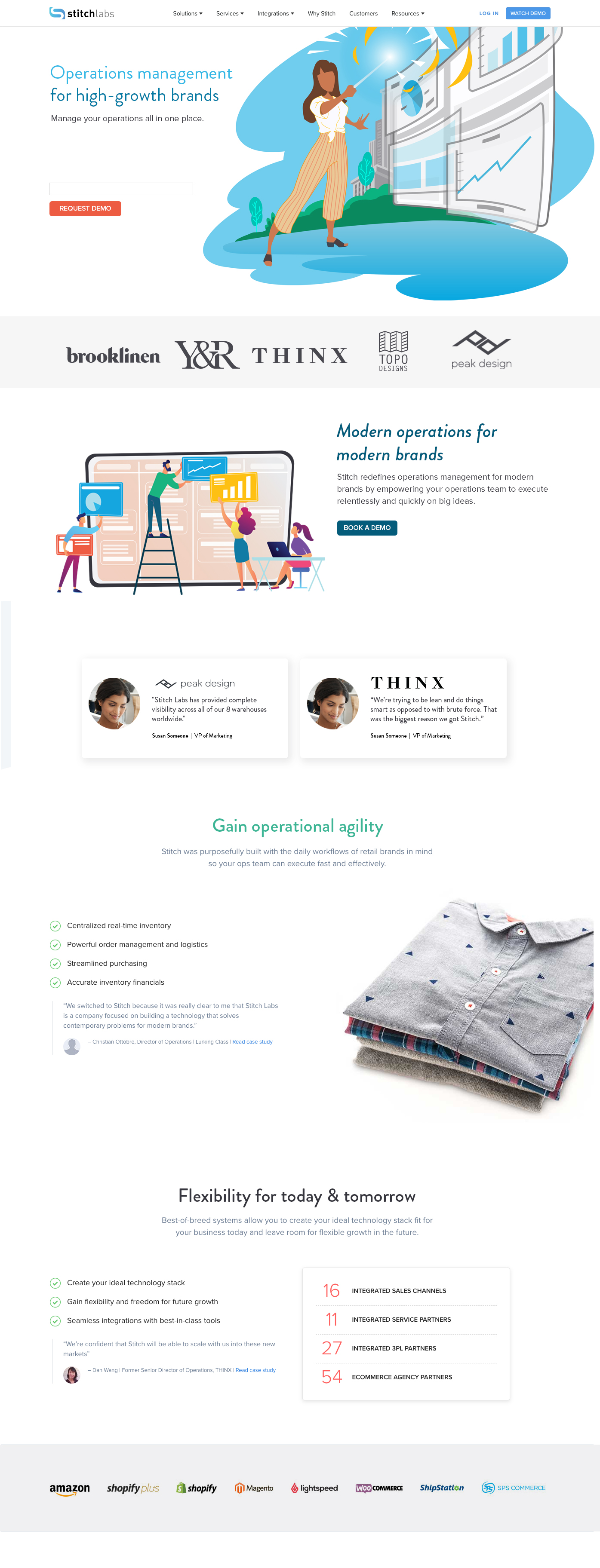
Top tier changes encompass all-new branding concerns: (color, illustrations, fonts) and direct calls to action for immediate conversion.
Second-tier modifications convey multiple validations, as well as defining a style palette for case study quotes that will be reflected throughout the site, providing additional storytelling without sacrificing the main message of the tier.
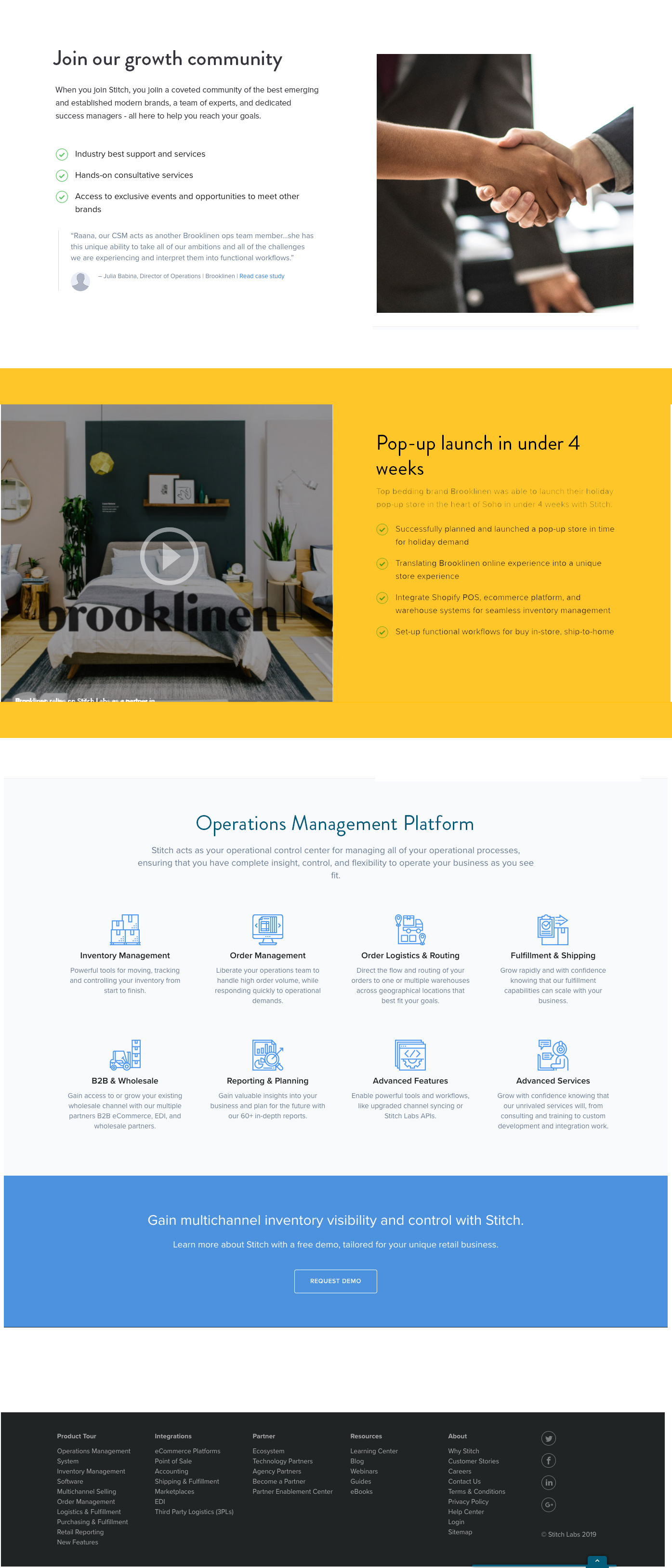
New copy and modified order of lower modules change the story being presented to the viewer as part of Stitch Lab’s new brand positioning.
Great care was also taken to ensure that the mobile version of the new home page had increased loading speed, less visuals, with an emphasis on maximizing the mobile experience.
Leave a Reply
You must be logged in to post a comment.