Getting the assignment to design Stitch Lab’s “Retail Therapy” Newsletter (spun out of discussions at hosted live events in New York and San Francisco) was an enviable task. The tricky part was figuring out how to make the pun of the name not be too literal or concrete, making sure it spoke the high-growth, native digital brands that Stitch Labs focuses on.
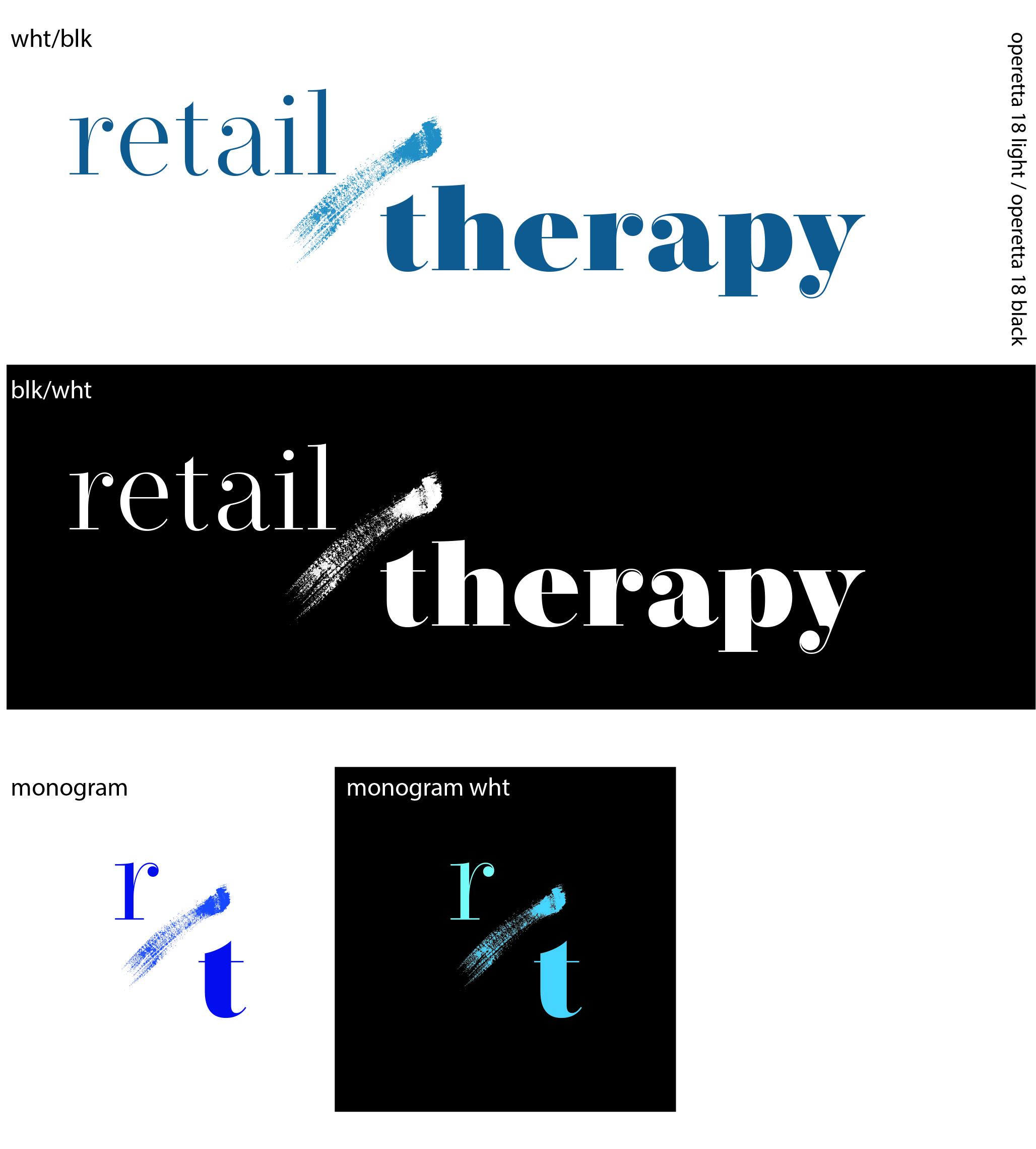
In final development, I created a logo that lent itself to the rough and tumble operations and entrepreneurs (i.e. “the people who get shit done”) with its analog “slash” both uniting the pun inherent in the logo and dividing the two different verbal aspects.
Shown here are a number of pieces of collateral developed for the newsletter:
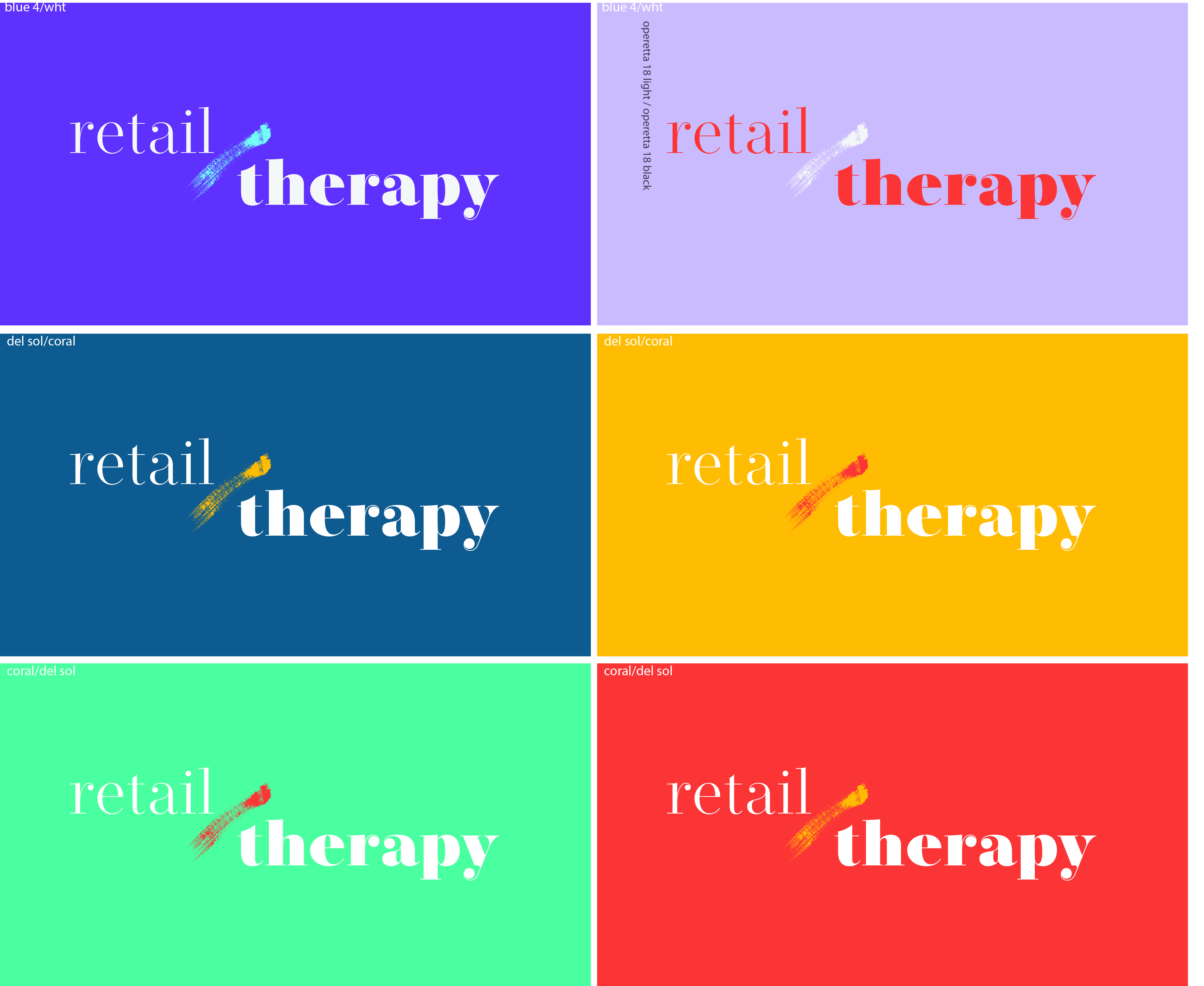
- Multiple versions, in branded colors, of both the final logo and the monogram version, allowing for very different “temperatures” and emotions, increasing its usage across multiple channels
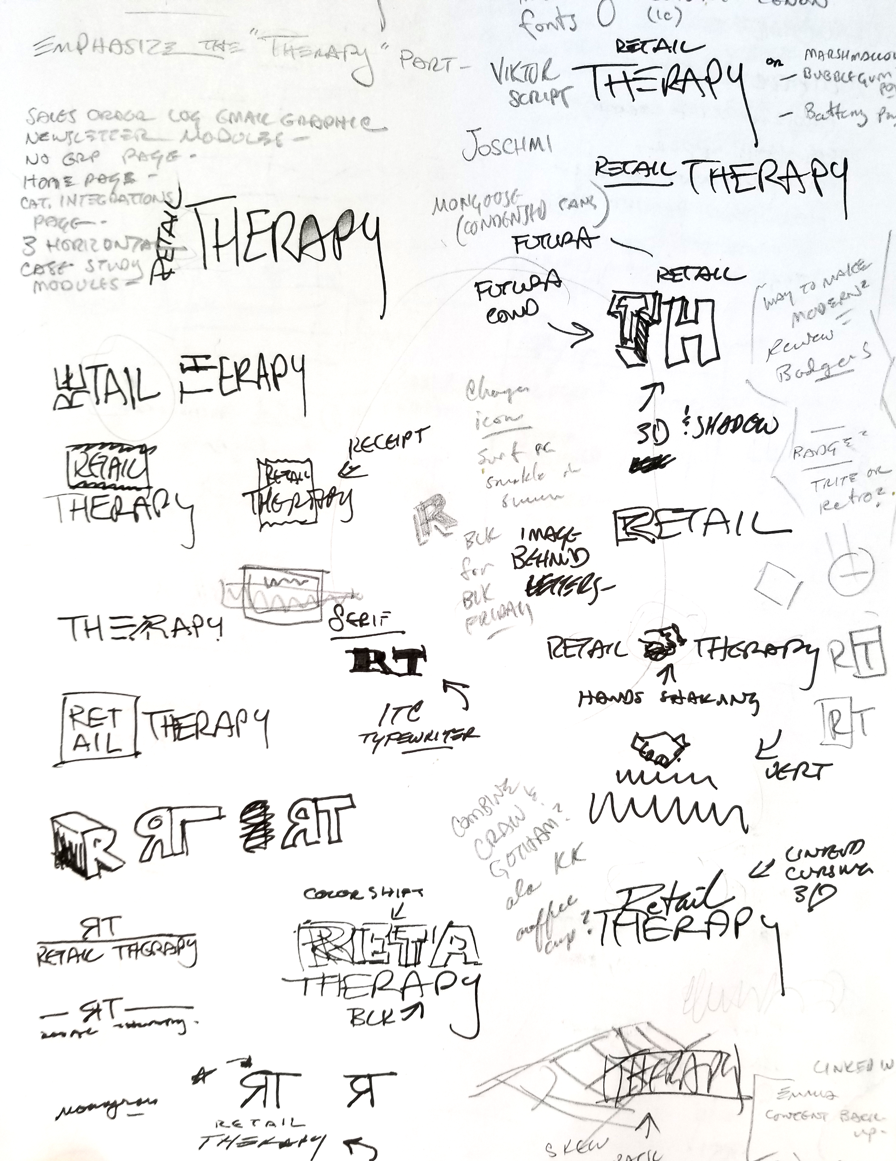
- A page of sketches, encompassing a large number of variations and ideas built around the themes of “retail therapy”
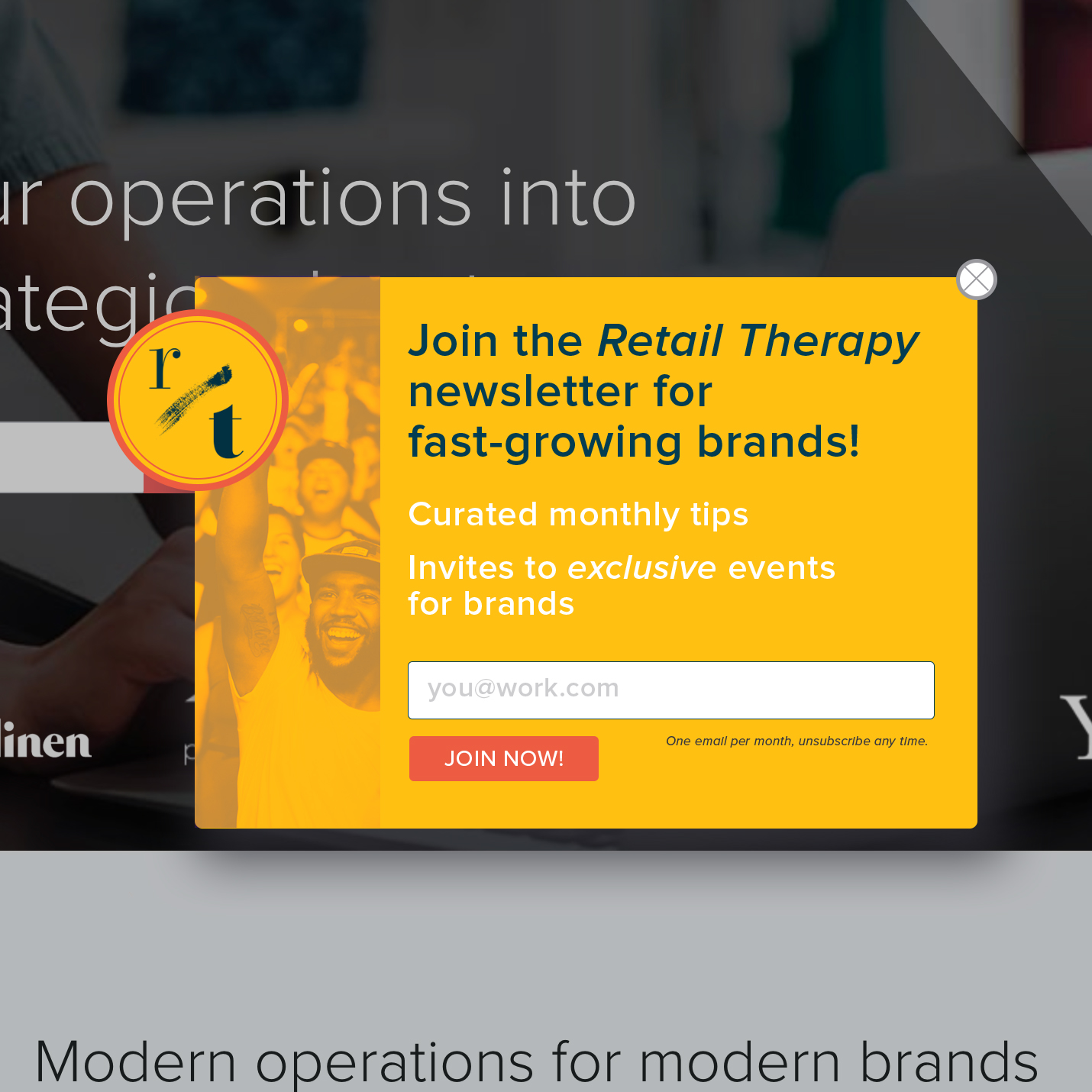
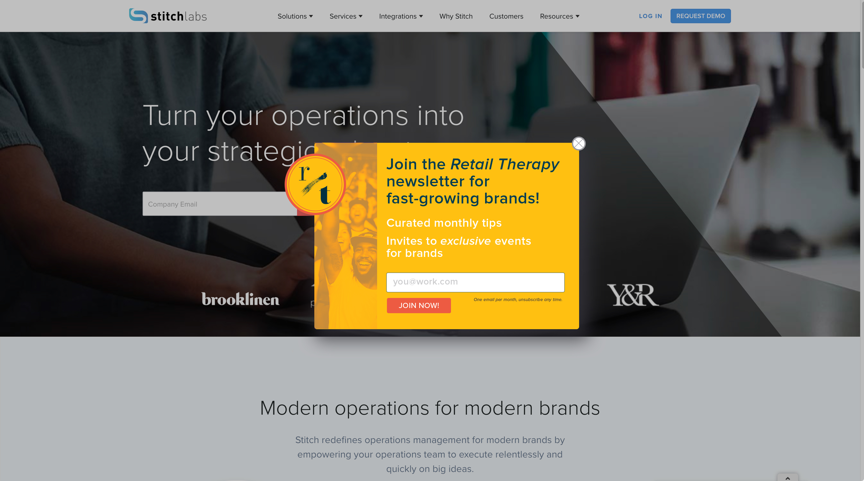
- The final Retail Therapy pop-up, splayed across the Stitch Labs desktop site, which generated almost 3x the number of sign-ups from the industry standard.
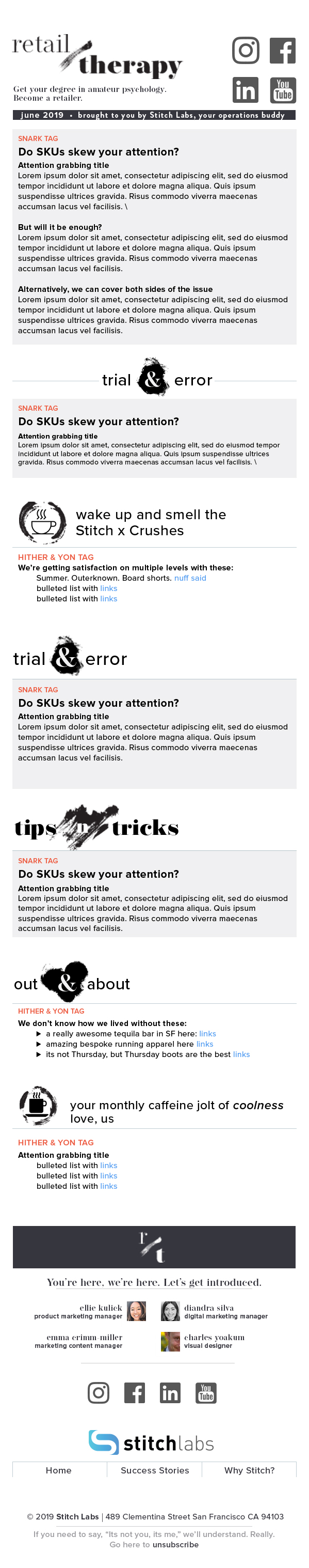
- The Retail Therapy newsletter format itself, with a wide variety of digital “analog” headers for different sections, continuing the irreverent look & feel, matching the writing style of piecs.
Leave a Reply
You must be logged in to post a comment.