H2
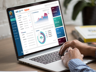
This furniture company lost over $100,000 in waste and mistakes every single year while using an antiquated manual ordering system. I set about to change that with a single app.
Body
While doing upwards of $80M annually in sales, there is a tremendous amount of waste and inefficiency within the industry. This is one industry that is, to use a cliched phrase, “ripe for disruption.”
Order taking was done over the phone, with dedicated customer service agents, who have to input every single order by hand, with complex code numbers for parts, finishes, fabrics, styles, and accessory modifications. Time-consuming and error-ridden, this was done this because, as I was told, “It’s always been done this way.”
Body
My role:
- Research
- Ideation
- Wireframes
- End-to-end design
- Testing before handing off to 3rd party development.
H3
Research
Body
I started with some initial assumptions on how the app could operate, and “sold” the idea of exploring this to the senior stakeholders on the idea of cost savings. With the idea in place, I started to ask questions, looking for the true pain points of the people in the field.
Given the hybrid B2B structure of the business: acting as a manufacturer and wholesaler to distributors as well as retailers, with a network of separate installers around the country, meant that there was a great deal of disconnect within the chain.
Quickly, I realized no one had ever asked the questions that I was asking. I was receiving not only validation on some of my initial ideas regarding how to smooth out the order process, but additional suggestions and information that would extend the scope of the app significantly, benefitting everyone in the system
H3
Initial Designs
Body
Initial design focused on getting the catalogs up and allowing for the interactivity of ordering the various parts. (On the manufacturer’s side, there already existed software that would supply the connecting parts necessary to match the order of large panels ordered.)
But it came that very often the mistakes in orders were not clerical orders between customer service and the reps, but that the orders didn’t match the CAD files used to design the office systems. Suggestions and different approaches for validating the order versus the CAD until I proposed what seemed obvious: what if everyone had access to the CAD files and everything could be matched digitally? I set to work designing the interface.
H3
Iterations & Additions
Body
I tested a couple versions of the interface with sales reps, the most notoriously “un-techy” people in the industry, and we settled on an upload that would allow them to choose products from the catalog and “assign” to particular parts of the CAD drawing.
H3
Financials
Body
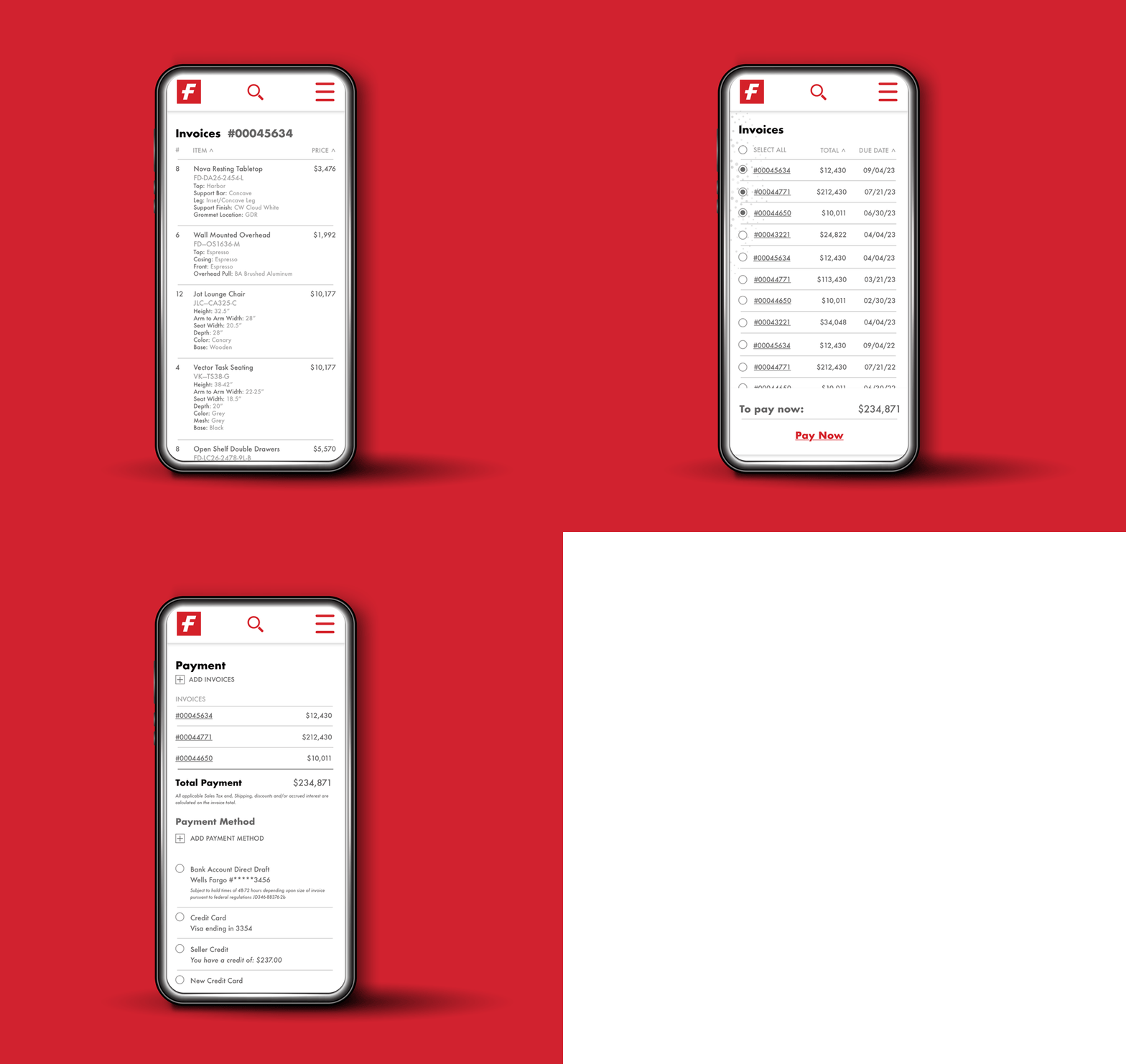
Once we had all the orders and invoices sorted within a system that allowed for different vendors, if needed, to have access to the jobs, while segregating the financials to the particular ordering entity, it was almost a no-brainer to include a bill payment system within the app, digitizing fund collection from variety of possible sources. This was the easiest of the aspects to add to the app, since electronic payment has become such an invaluable part of our every day lives.
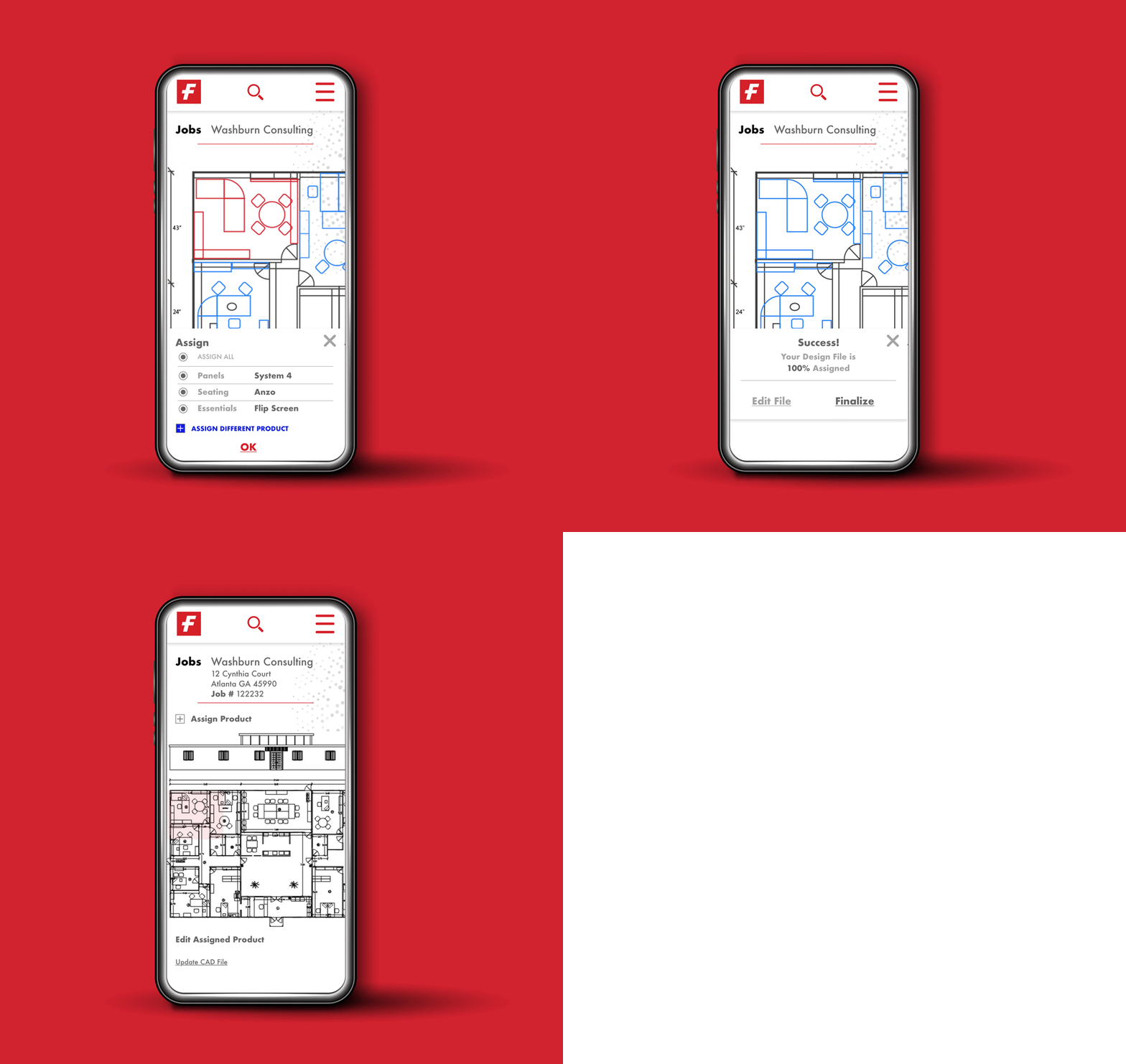
What had started as an ordering app had grown in scope into an indispensable tool for those in the field to keep on top of their business while on the go. With the B2B Hybrid business structure, the addition of the “jobs” category as an umbrella to organize orders and invoices gave a structure that connected and benefitted everyone.
