H2
This bank was going to start transferring over 2,000 employees to a new HSA/FSA system. How were they going to administer all of those options for all those employees? I set about to make it easy for them.
Body
And this was not just a transfer, but a significant upgrade in the offering for their employees, however the number of choices, and accounts that they would need to keep track of was not the only change here.
Offering their employees these new options, the senior stakeholders of the bank wanted significantly more engagement into the Healthcare financials, and looked at that as part of KPIs. The stakeholders wanted to be able to track their engagement levels to see if they were meeting their mark.
Body
My role:
- Research
- Ideation
- Wireframes
- End-to-end design
- Testing before handing off to 3rd party development.
H3
Research
Body
I started with some initial assumptions on how the app could operate, and “sold” the idea of exploring this to the senior stakeholders on the idea of cost savings. With the idea in place, I started to ask questions, looking for the true pain points of the people in the field.
Given the hybrid B2B structure of the business: acting as a manufacturer and wholesaler to distributors as well as retailers, with a network of separate installers around the country, meant that there was a great deal of disconnect within the chain.
Quickly, I realized no one had ever asked the questions that I was asking. I was receiving not only validation on some of my initial ideas regarding how to smooth out the order process, but additional suggestions and information that would extend the scope of the app significantly, benefitting everyone in the system

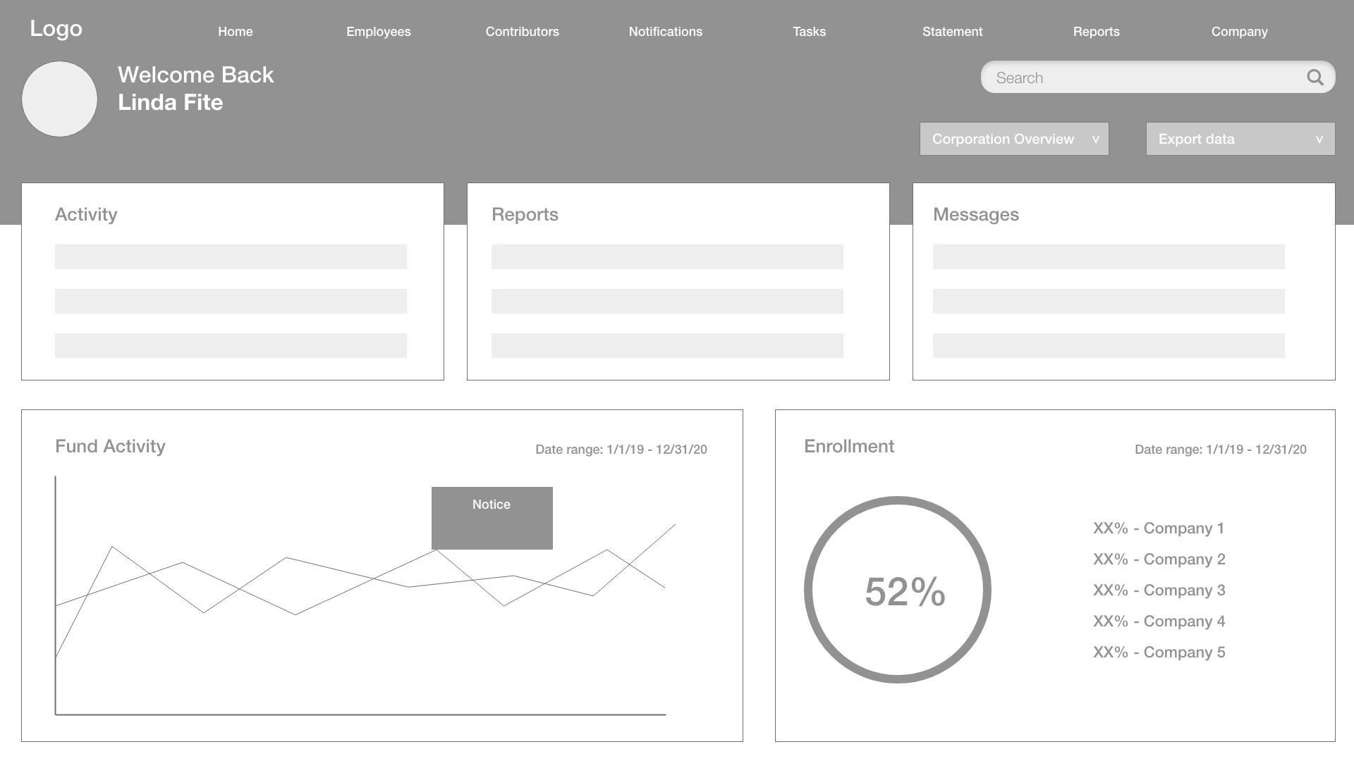
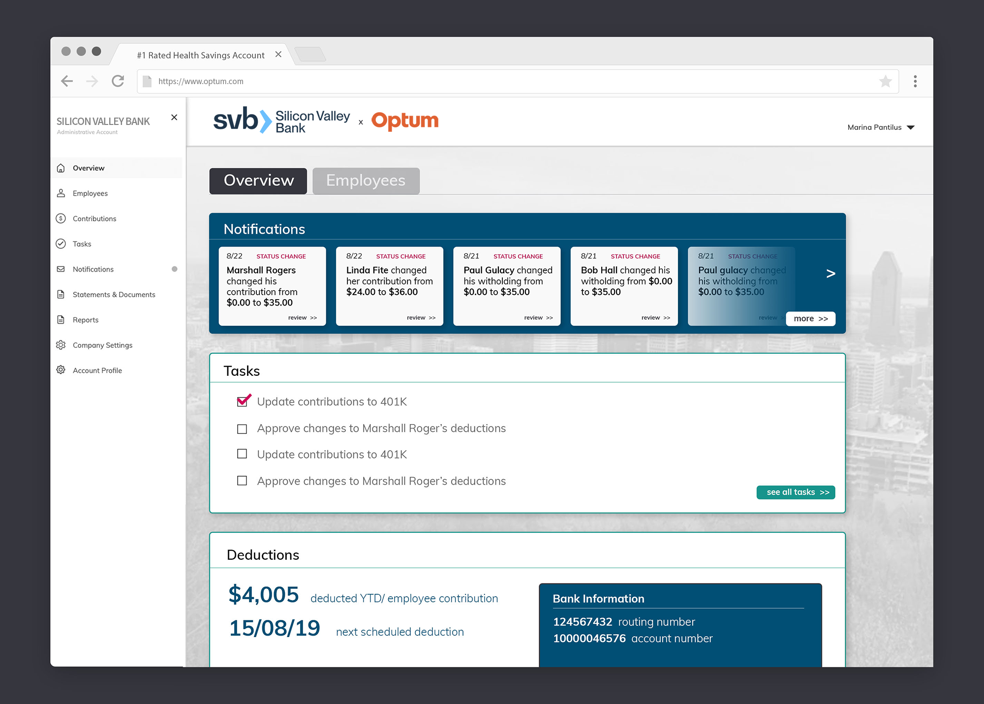
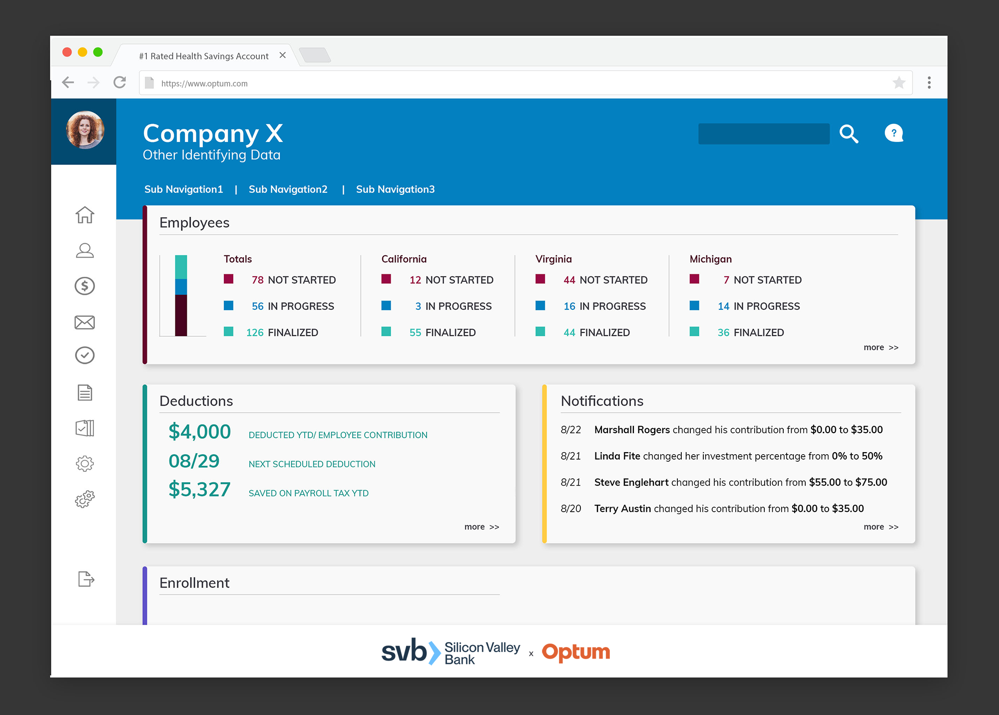
Initial Designs
Initial designs and flows started with the most immediate process flows we had identified, but digging deeper into the business structure, and how employees are categorized, we realized that there were a number of wrinkles that we needed to account for.
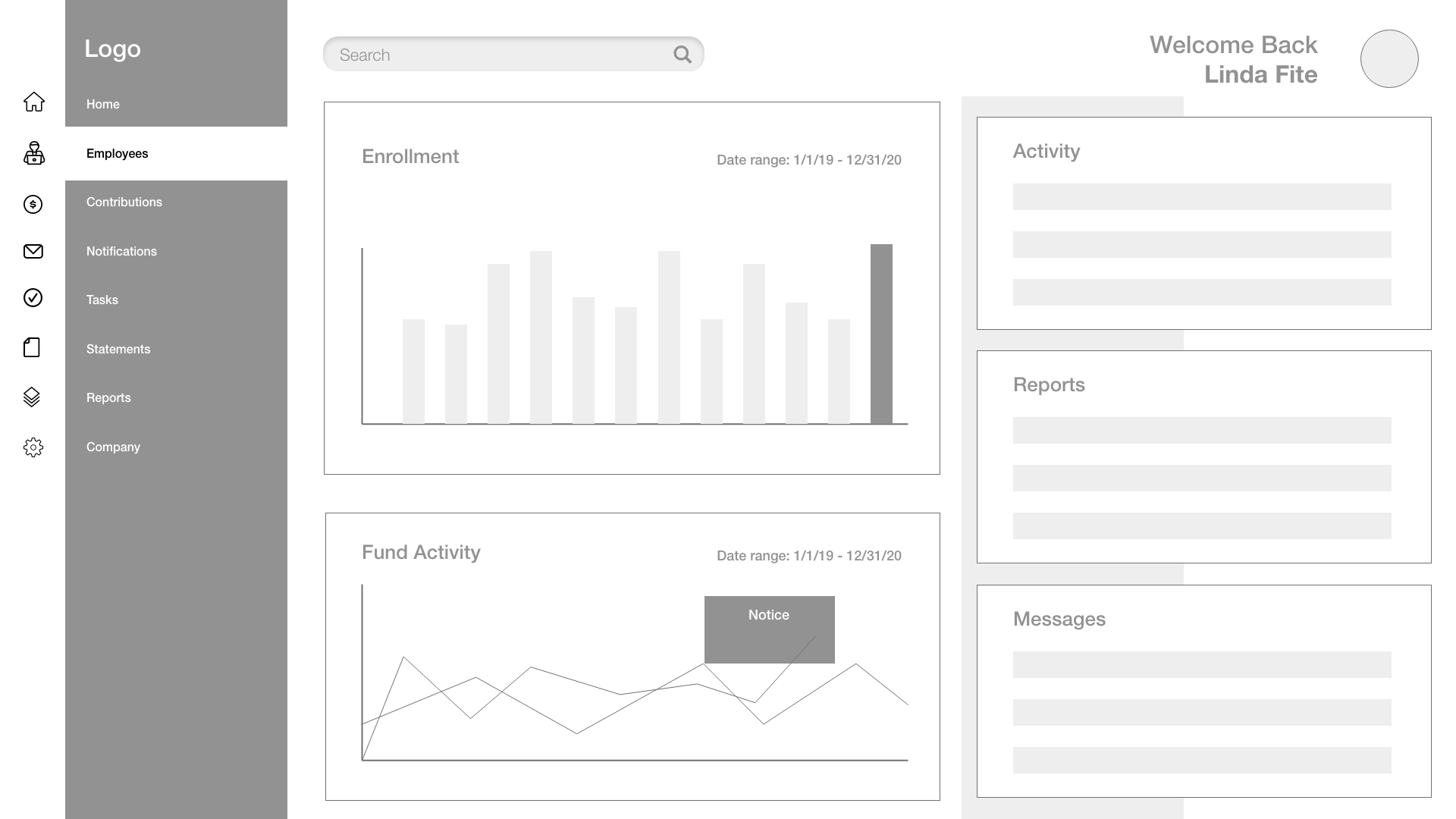
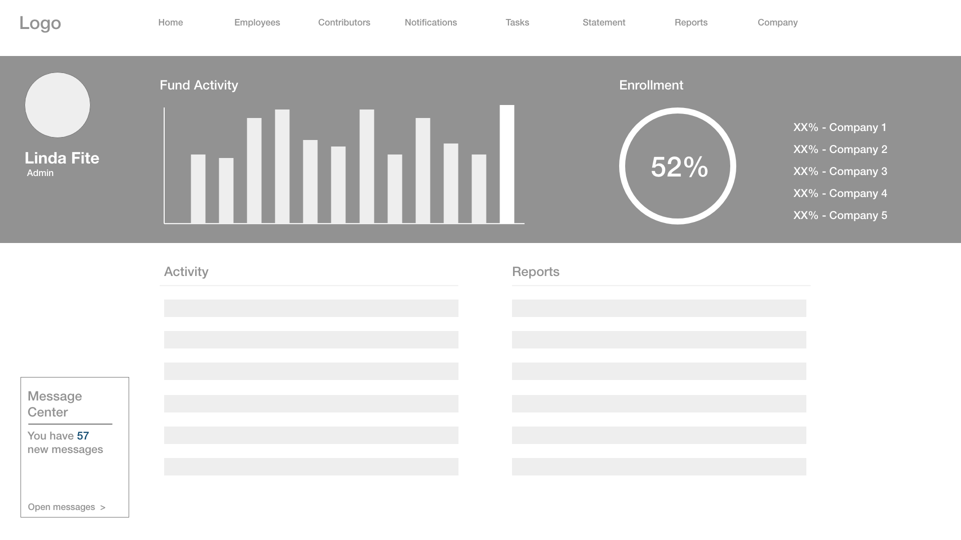
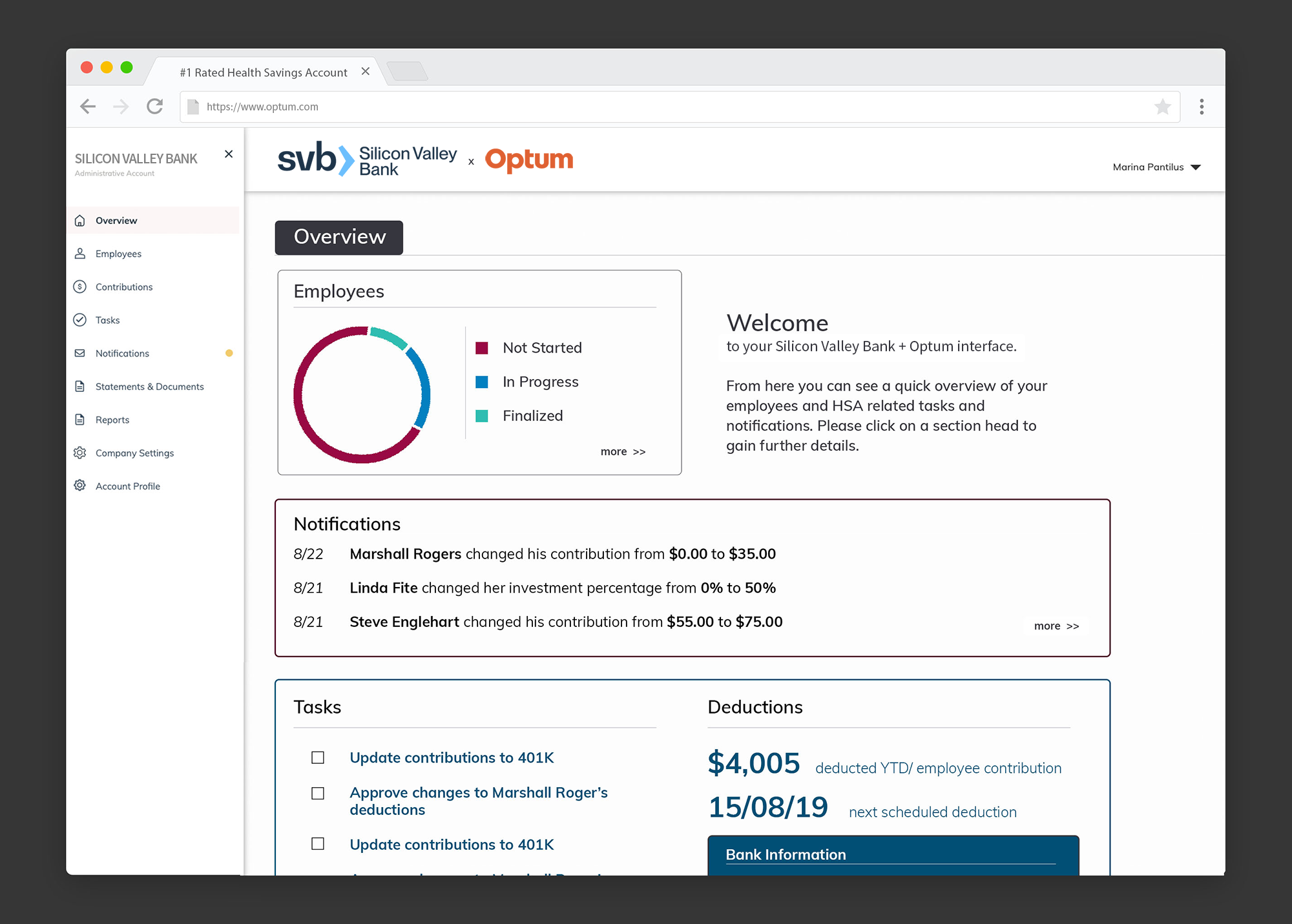
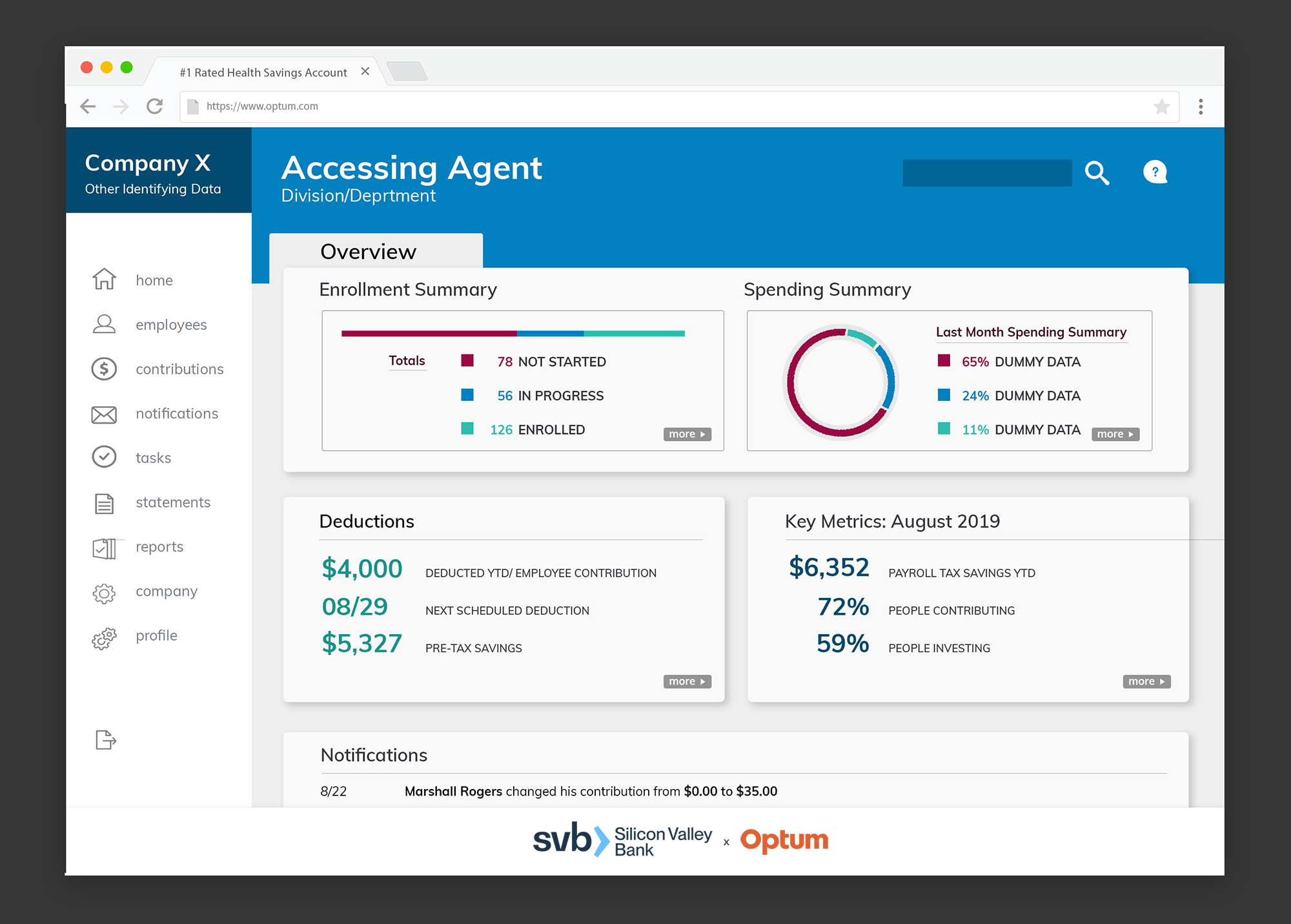
Upon speaking to different admins within the company structure, it became clear that the large corporation still oversaw a number of the businesses that they had acquired over the years as operating semi-autonomously with the overall structure. While the main success metric was going to be seen as funds under control overall, tracking, administration of different companies would each have their own “wrinkles”, so the ability to generate reports would need a sorting ability that would, at times, depend upon the admin’s permissions.
I built the ability to switch companies and to save “favorite” reports, along with general ones, even in the early wireframes. Other additions/subtractions would be the message center, and whether that would be contained entirely within the dashboard or migrated to a separate client, and the type of graphing the would prove most useful on adoption of the new HSA platform.
H3
Iterations & Additions
Body
Getting accurate feedback was one of the most difficult aspects of this project. I’m going on record now as saying it was the most difficult part of this project.
Dealing with a large bank meant that feedback could come from one of 57 different VPs of something and we would then need to pivot. There we changes to the scope and reporting parameters as well, often meaning that we would end up changing, deleting or adding back in elements of our designs… only to strip them out again.
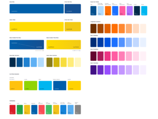
We overlapped our Agile processes, adding in UI elements so that we could generate feedback on the colors, corners, icons while continuing to work on the actual architecture of the site at the same time. The aesthetics would continue to evolve.
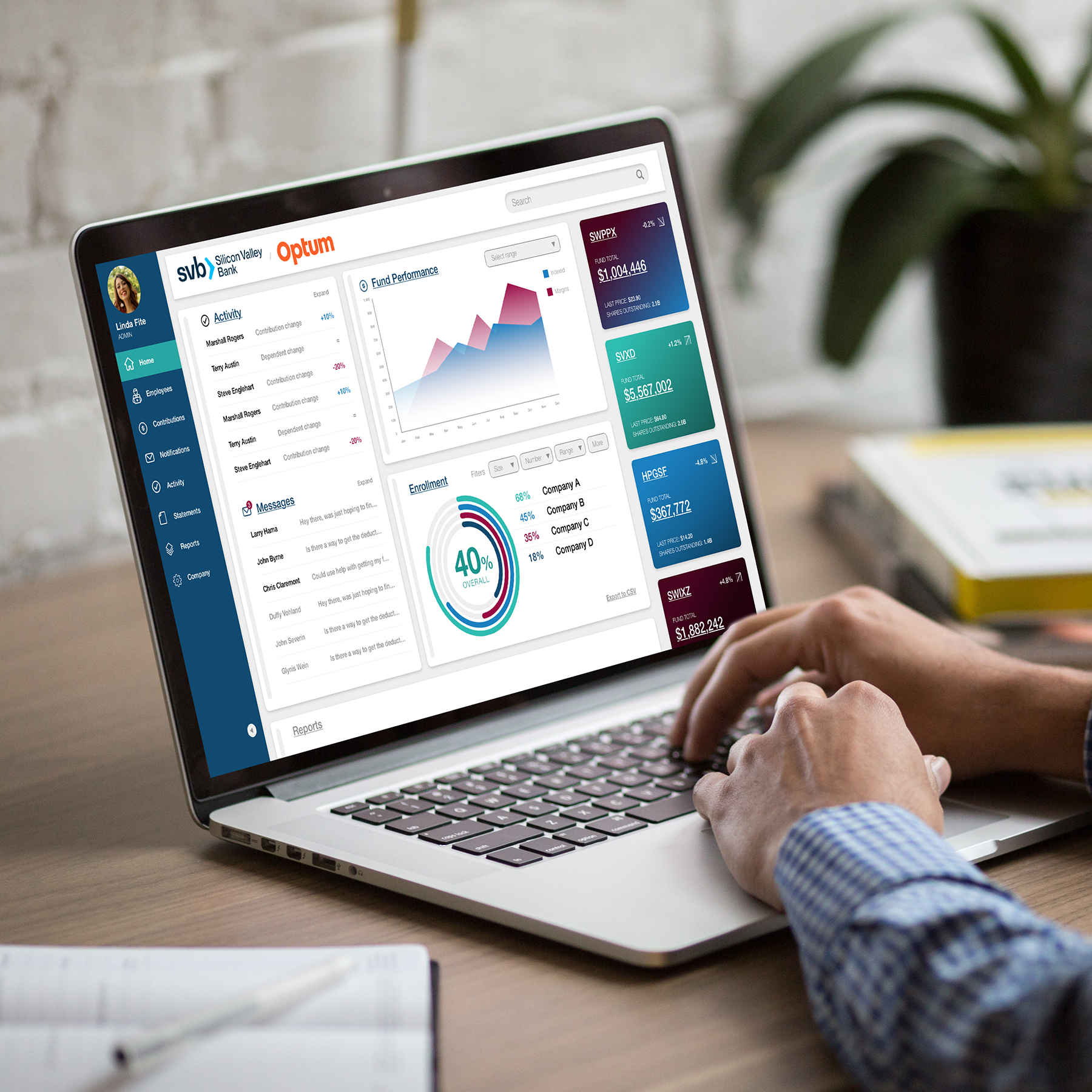
One decision that I found somewhat odd and (pushed back on) was the decision to not follow either company’s branding, but to treat the dashboard/productivity tool as a separate entity that was neither the Bank nor the HSA but simply its own thing. In the end, it became it’s own piece of software.
H3
Refinement
Body
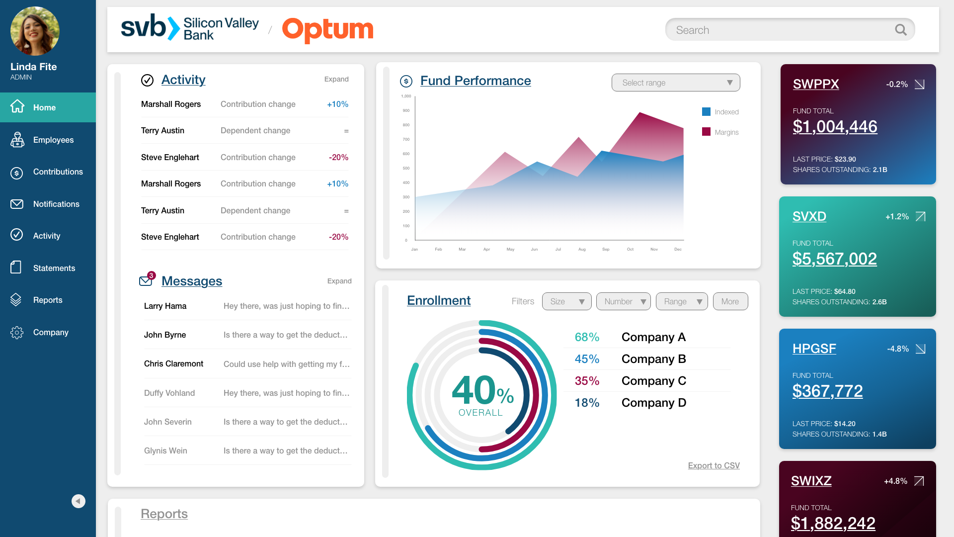
Moving to a final version allowed us to add some color pops, directing the eyes and furthering the branding of the productivity dashboard as its own entity. Stakeholders on both sides responded to the centering of the main data, focusing attention on the most important metrics of “first look”: Activity, Enrollment, the performance of particular funds, and any necessary messages from concerned or confused employees.
Subtle bolding within the message center carried over standard web heuristics of read versus unread, and the information of “unread #’s” is duplicated at the top of the message icon.
Subtle consistency was placed within the app – senior stakeholders liked the rounded corners of the containment boxes (“organisms” in the Atomic design parlance) for the components, but those corners were changed on the global search box which is consistently at the top of the header and never leaves the screen.