H2
TECO’s brand needed to be expanded and detailed for us to design our app. We built, with digital LEGO, a brand system capable of flexing and stretching to make everything we needed.
Body
While TECO has had an established brand, they did not have a mature system that could begin to accommodate what we would need for the new app. Our small team took their two colors and Interstate font and took off running.
Body
My role:
- Research
- Ideation
- Wireframes
- Design Leadership
H3
Lined up in the starting blocks…
Body
Logo lock-ups.
TECO already had an established logo, one that encompassed both the electric-only servicer, the gas-only, and then the umbrella of their parent company, Emera. Laying out a grid of variations of the logo to fit all different color schemes is a must as a starting point.
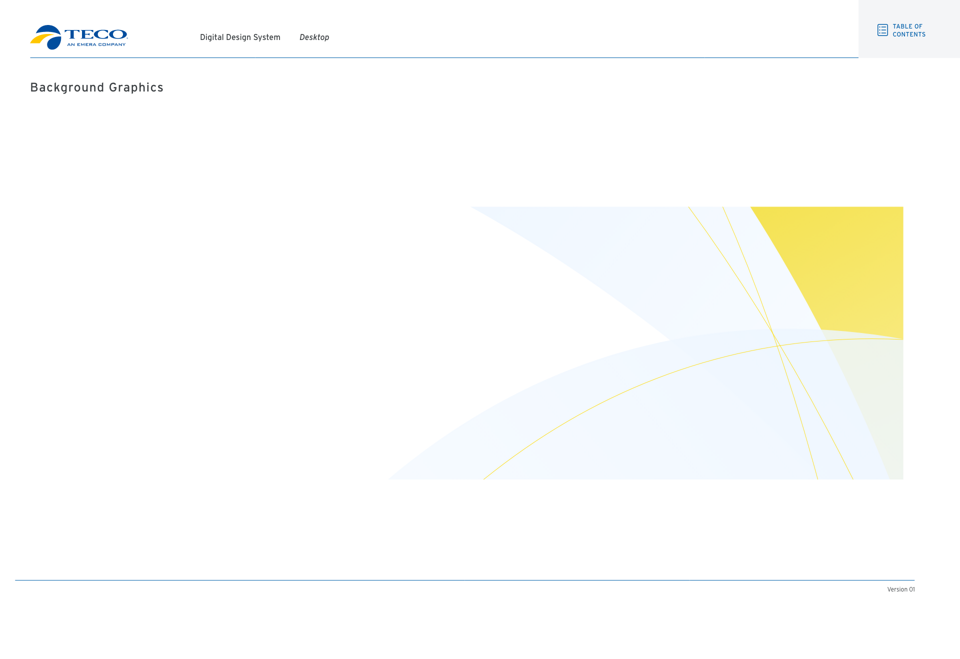
The movement in the wave/circle on the blue & yellow logo was the inspiration for a number of other additions we would make to our design system. Taking inspiration from the sea and Tampa Bay itself, where TECO is headquartered, the desire to create a graphic that would serve as a background element without sacrificing accessibility was on the forefront of our minds.
We moved on to creating the atoms (utilizing Atomic Design theory here) of our design system. We were building in Adobe’s XD as our main hub of collaboration. Later on, when a third-part developer was brought on board, we found we would need to hand off our design files for their conversion to Figma, a conversion that would add in another step to our design process.
Base Layers
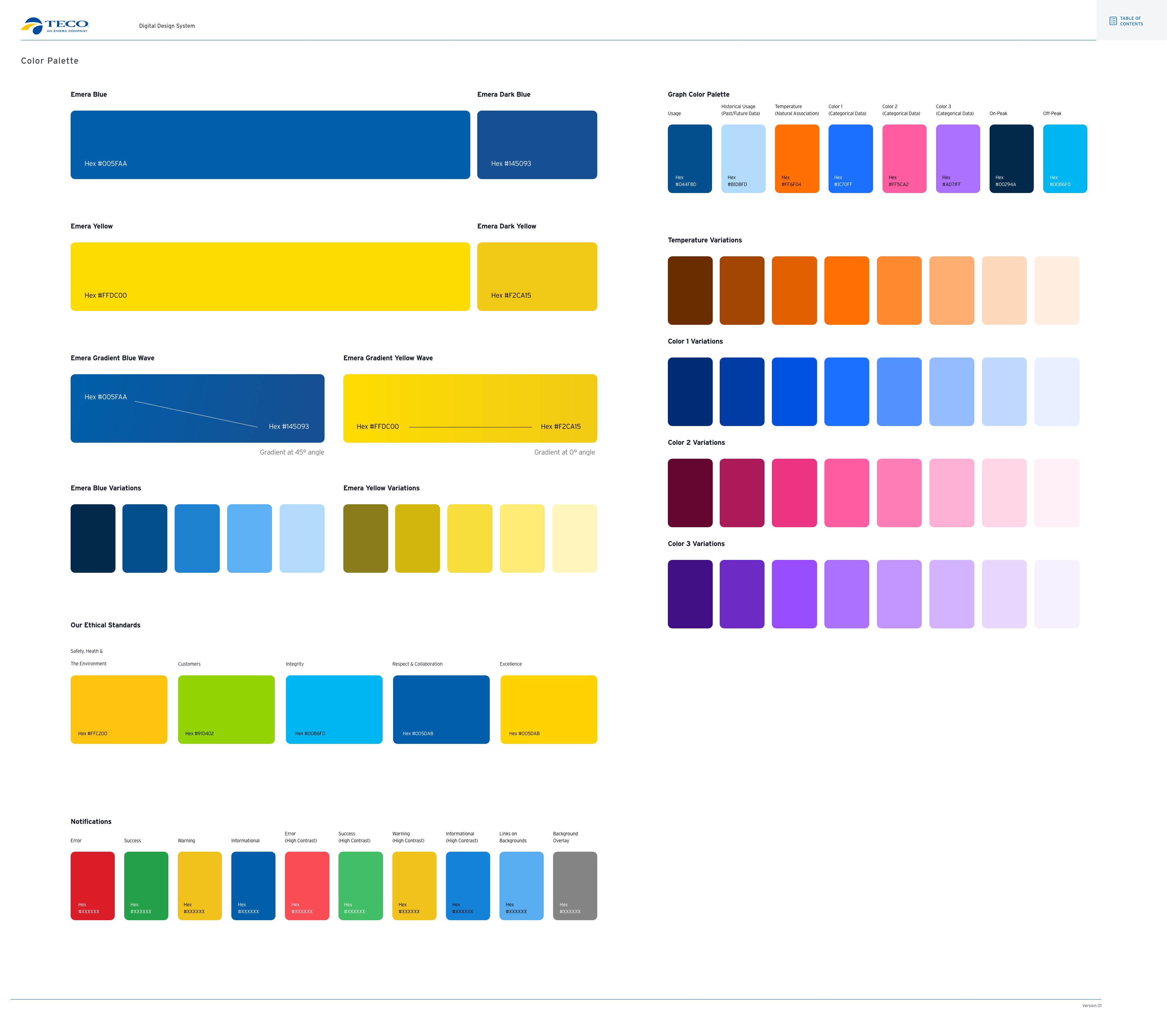
We defined our colors with an emphasis on maximum flexibility to display the variety of components that we would be making.
Key to this was the addition of other warm colors, colors that we could use to indicate alerts, attention, error states, alarms and more. The color system that we created was so robust that only did we not need to add in new colors (even as the number of bills we were solving for essentially doubled), we did not end up using all the variations shown here.
The pink and purple, while they worked with the blues and warms on a chromatic pallette, we deemed too “off-brand” and so we confined ourselves to the blues and yellows as much as possible.
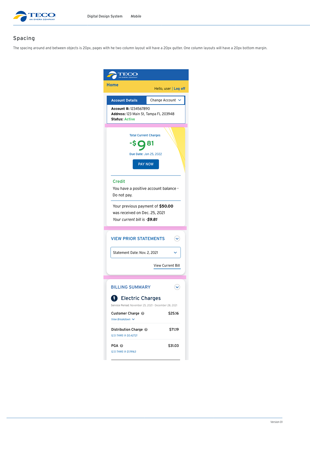
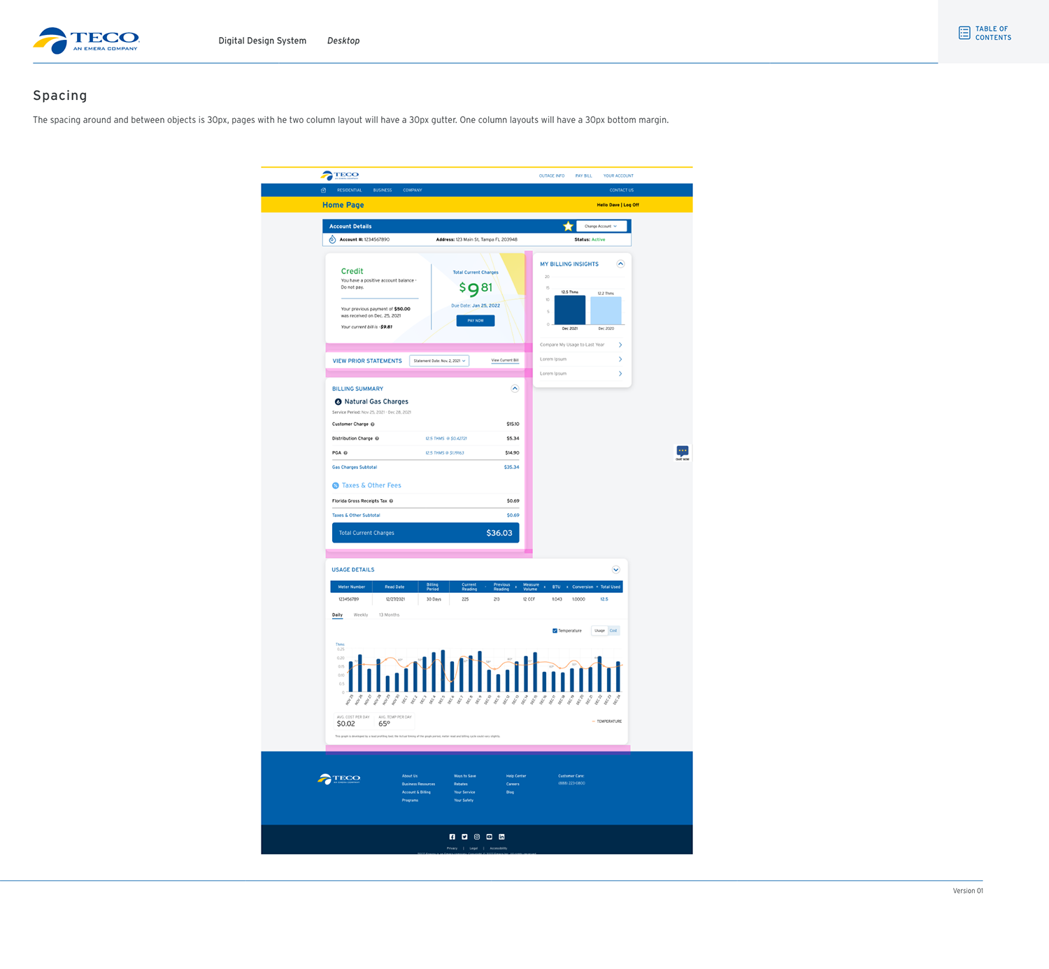
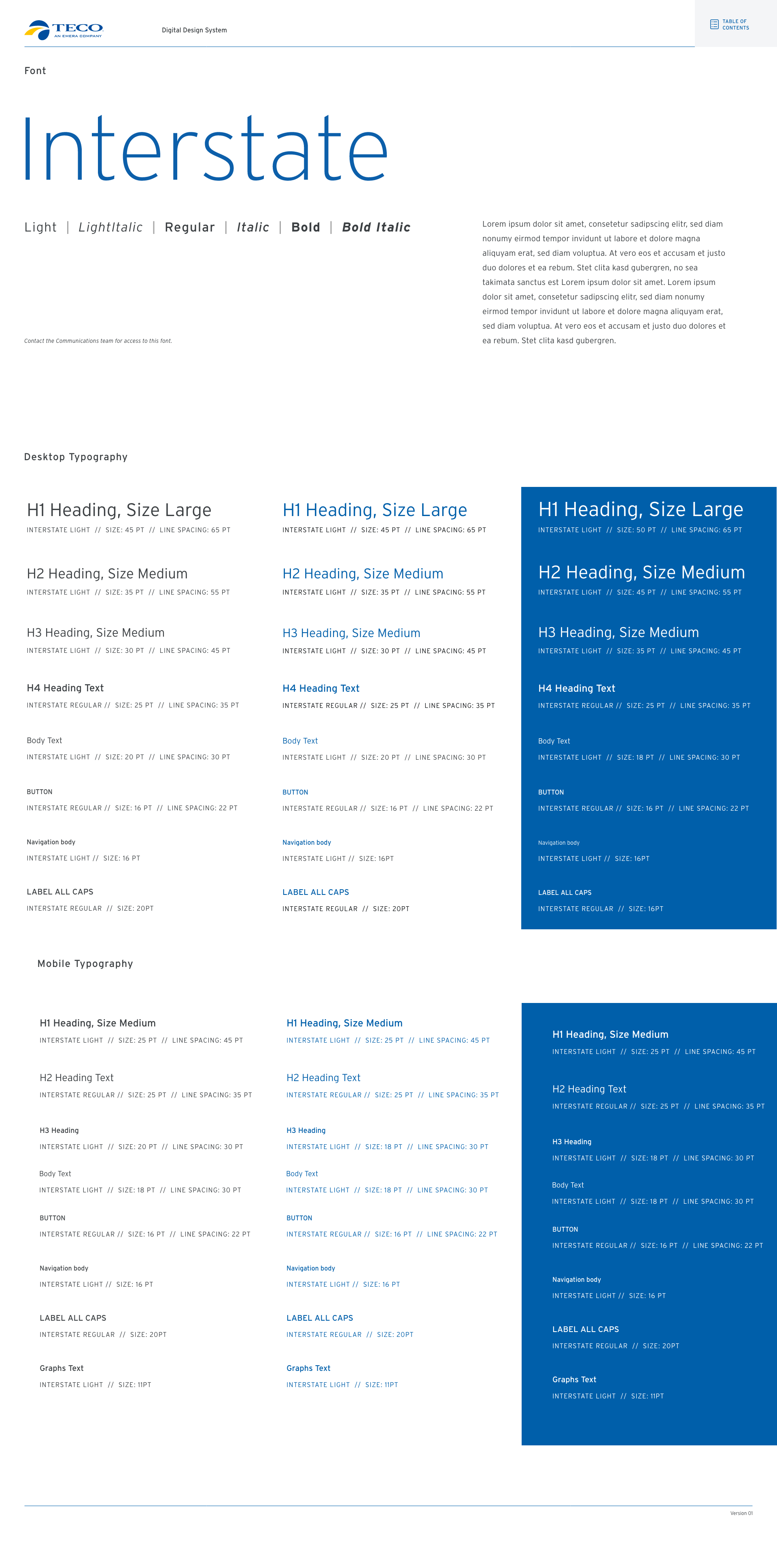
Careful consideration was given to spacing, gutters between the components determining the separation of elements, the readability, and helping establish the hierarchy of information. Working from a variation of the redesigned paper bill, we kept my two column design, and designated our spacing utilizing my favorite 8px grid for uniform separation. The two-column format stacked perfectly on the responsive flip to mobile.
The creation of a new background element utilizing the brand-specific blue and yellow tints and some opacity changes for additional verisimilitude, the seeping lines of the yellow against the expanded blue circles emphasizes the wave element even more than the original logo. We would work to incorporate the background element where appropriate.
H3
Next steps
Body
All that would remain was to flesh out the rest of the system. (Yes, I’m laughing as I type that sentence.)
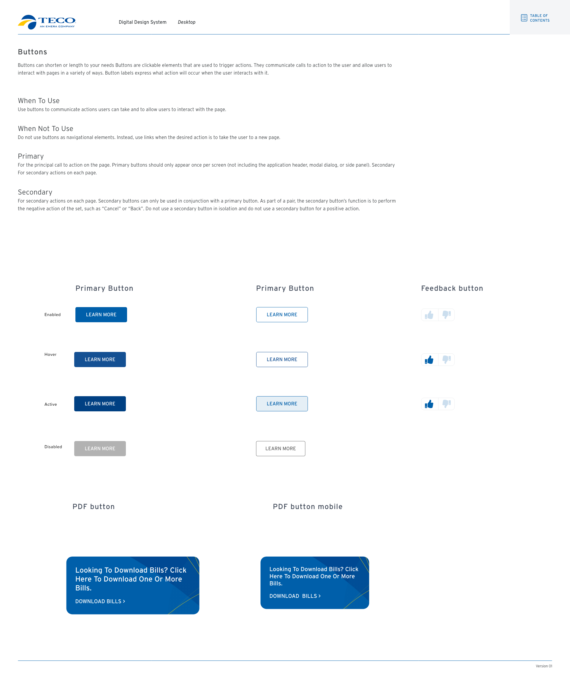
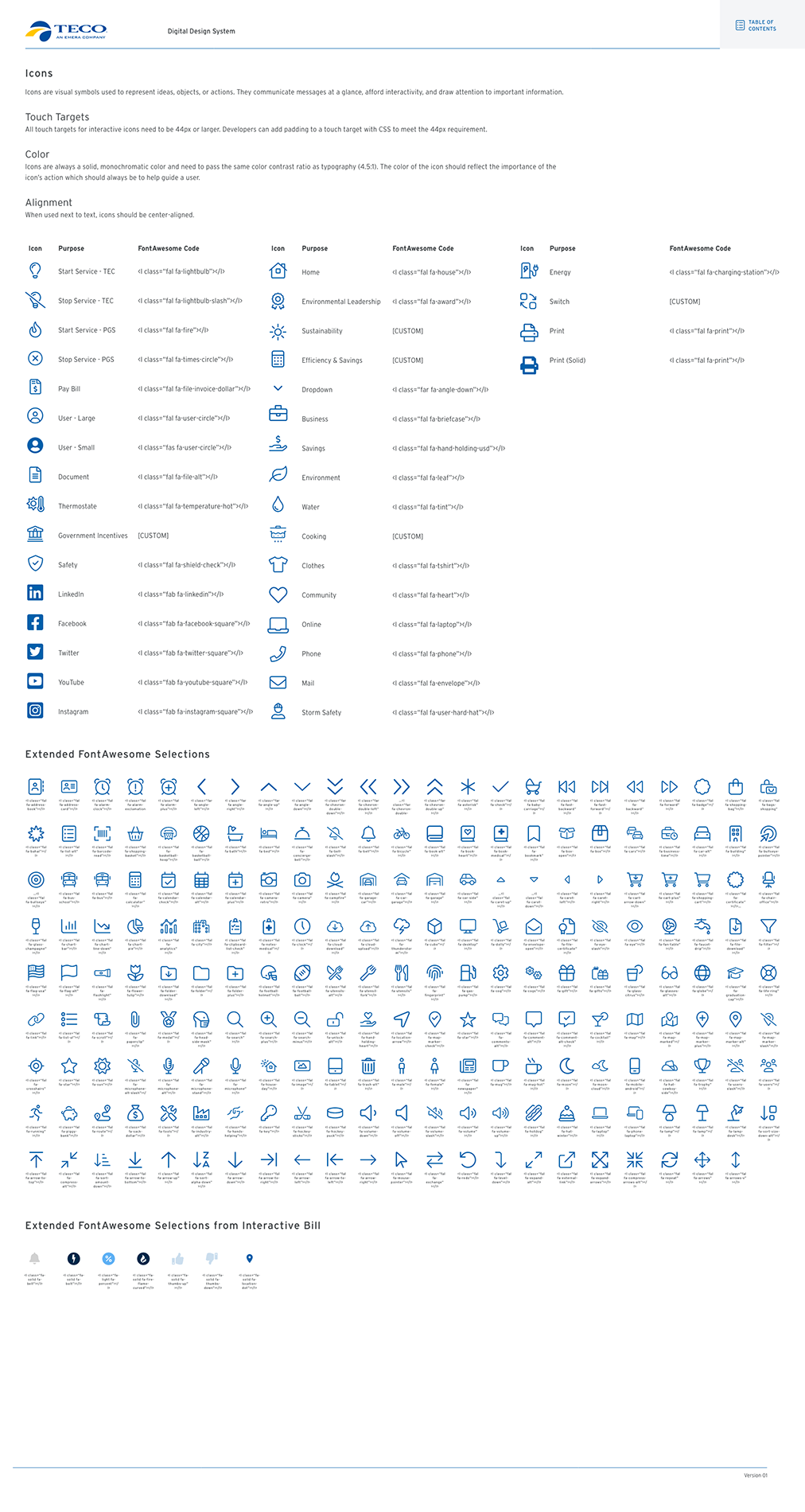
Shown below are more parts of the design system, from button states to icons to more.