H2
Heritage Running, bespoke running gear for the upscale athlete, both harkening back to an earlier era and charging forward into the future, needed a refresh of their e-commerce experience.
Body
After reviewing the current online experience, both from a usability experience standpoint, as well as an aesthetic stance, there are several small tweaks that I wanted to make to upgrade.
My role:
- Research
- Ideation
- Wireframes
- End-to-end design
H3
(Making you feel at home at) the Home Screen
Body
HR’s brand is specifically about showing the greatness of running, of training and of racing, and their products are shown off incredibly well by their photography. The essence of the brand is to make you want to go out and run, and one can almost smell the cut grass on the infield of the track while recovering from the last repeat 400m… while waiting for the next one to start.
Instead of using a white background, I wanted to use large white cards with a subtle grey backing color to pop the cards and show off the individual products. Product and brand photography abound in all areas of the home page, and the text is written to draw the user in, while not explicitly pushing for the sale… yet.
A persistent top navigation, either solid white or semi-transparent depending upon the photography used for that page, keeps the user always able to change direction and redirect their search. This standard heuristic is carried through here; there is no need to reinvent the wheel. In fact, doing so would certainly hurt the site’s functionality.
Lower on the page are links to blog entries that convey a deeper sense of the sport of running, without a direct call to action to purchase. While HR, obviously, to make sales, they are playing a longer game of establishing themselves with runners, the cult of runner, and their desire for deeper authenticity. (Heritage Running was founded by long-time runners, so connecting with the almost cult-like status among die-hard runners is second nature for them.)
Utilizing a variety of different layout options for this tier of the home page give HR multiple options to change up this section as new content is created. A standard footer would follow along the bottom of the page.


H3
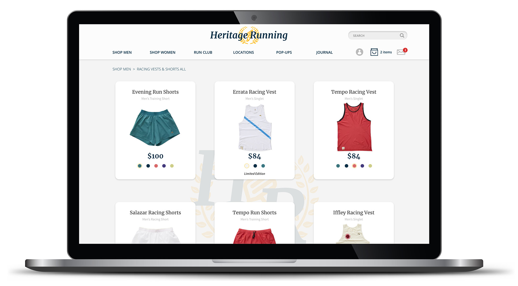
Ecommerce that doesn’t suck
Body
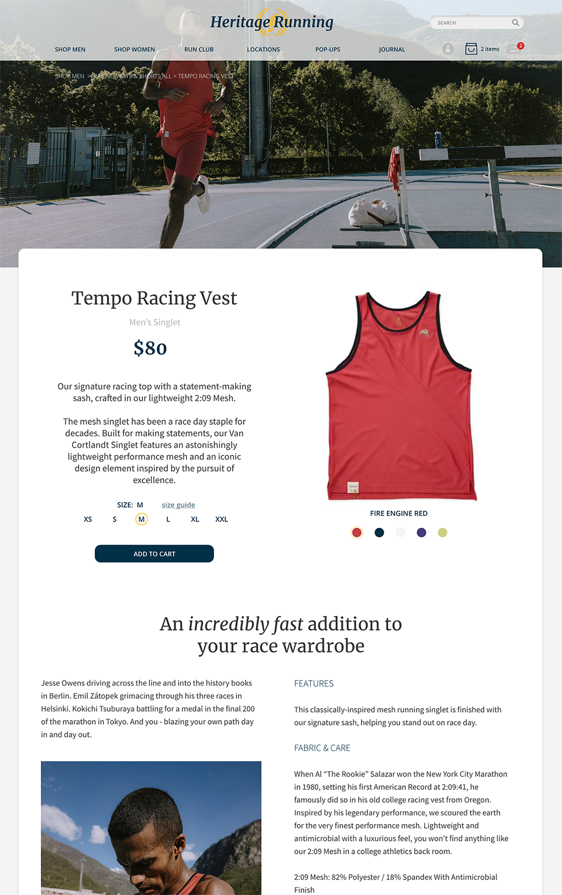
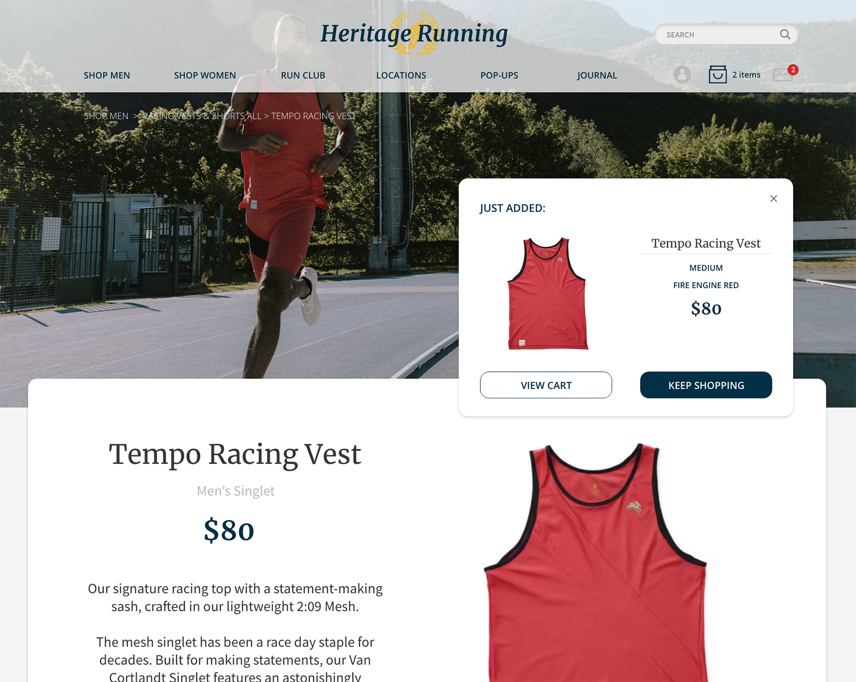
The individual product pages have been organized to offer a great deal of well distributed information, including links to sizing chart right at the size choice options.
In this case, the item image has been moved to the right side of the main column so the product information is one step higher in the hierarchy, once the image has been clicked on.
At the top of the main column, a consistent breadcrumb trail is shown throughout the shopping process, so the user always knows where they are.
Product photography is highlighted throughout, since HR spends a great deal of time and money on their photography, and the manipulation of the main header/navigation area allows the photo to show without an unnecessary odd crop, while not losing the consistent navigation.
As per the design system, main CTAs are solid navy with reversed-out text, while secondary CTAs utilize the same navy color, but only in outline form and on the interior text.
As the user scrolls down, additional validation in the form of product/mood photography as well as text content works to convince the user to add the product to their cart.
H3
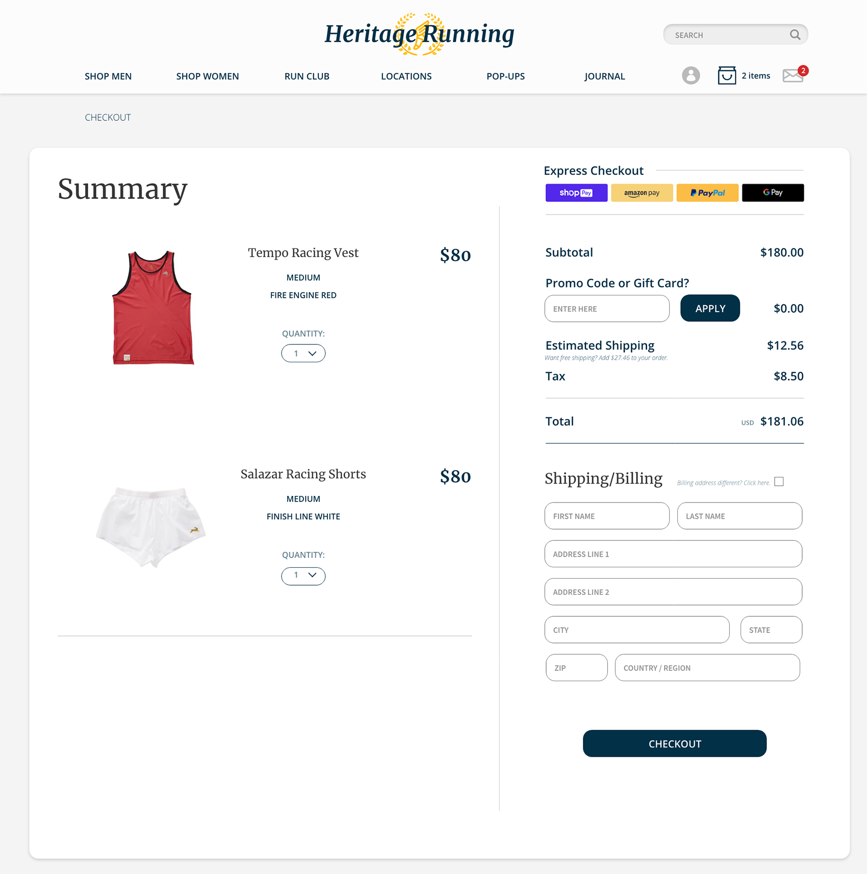
Streamlined Check-Out
Body
Looking to achieve a streamlined check-out process, I have shifted the organization so that as much information as possible was above the fold, as I didn’t want the user to have to scroll to make the final conversion to sale.
Payment is simplified, with quick links above, and if the user needs to input a new credit card, the default of CC billing address being the same as the shipping address is used; the extra input fields only show if the billing and shipping are NOT the same.
Discount codes, credits and/or gift cards are added before the user gets a final total, and all the information is shown on screen so that when the discount or gift card is applied, the user can see all the math in one area and they know that everything is being calculated correctly.
Quantity can easily be changed, and should the user pick “0”, a modal will pop up asking if the user wants to delete the item from their cart.