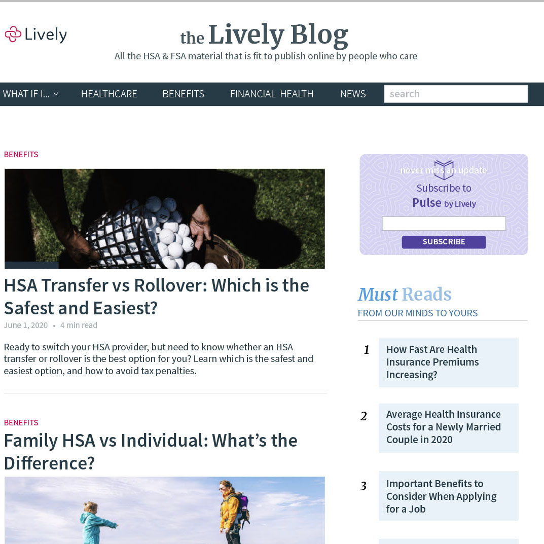
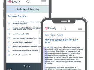
Lively’s blog needs to serve a large number of different purposes: lead acquisition, SEO ranking, informational hub and formal press release spot. The current blow was a hodgepodge of design and insufficiently appropriate to work for lead capture and SEO ranking.
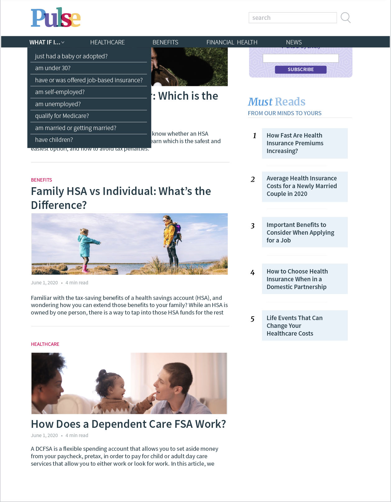
In the Fall of 2020, I collaborated with Lively’s digital marketing manager and associates, as well as data smiths and marketing leaders to redesign the blog’s pages, creating a superior user/reader experience from the home page in, all while also working to accomplish all of the other back end goals as well.
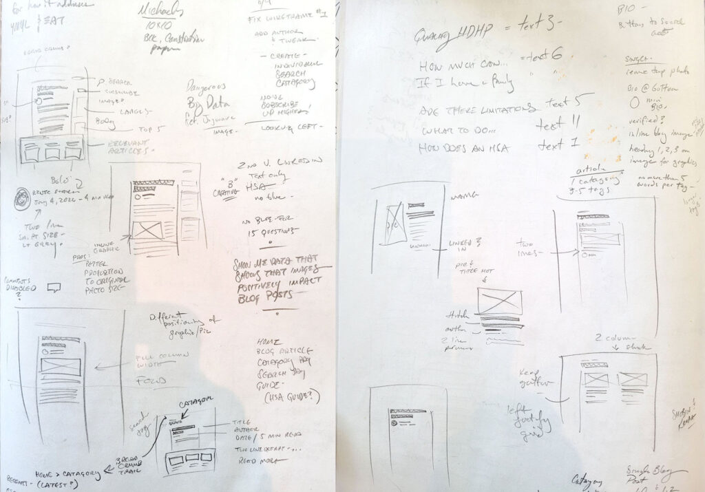
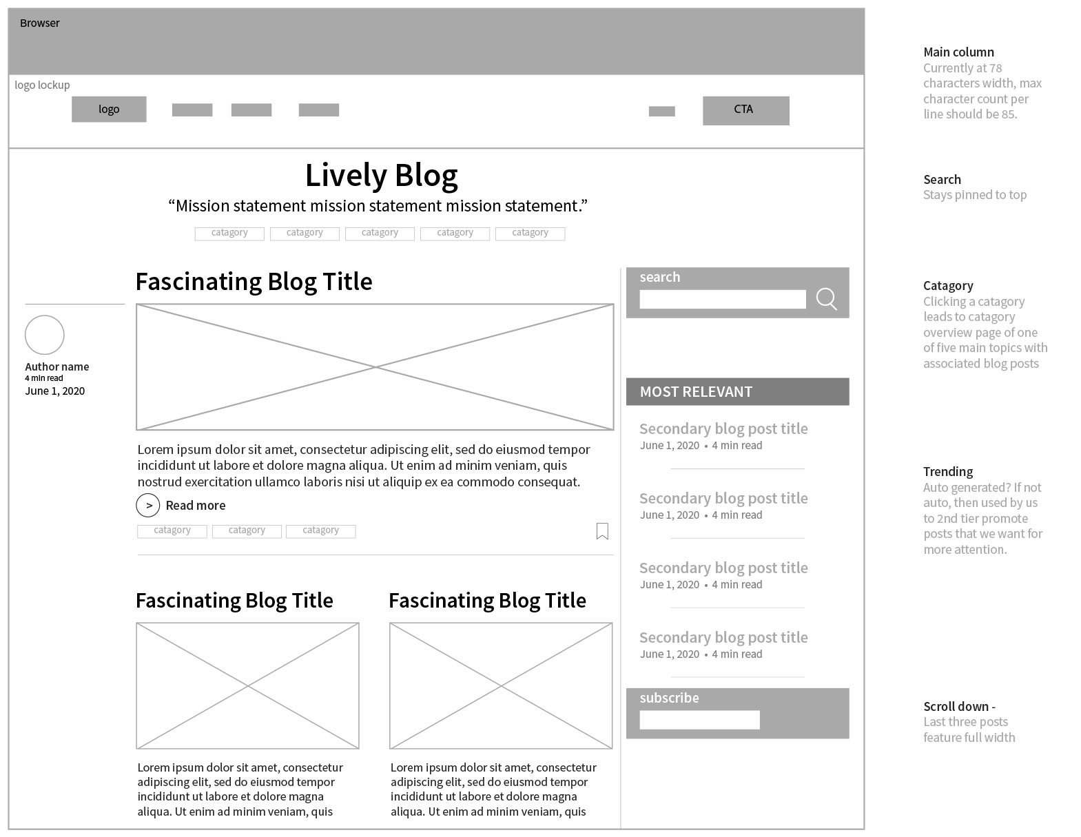
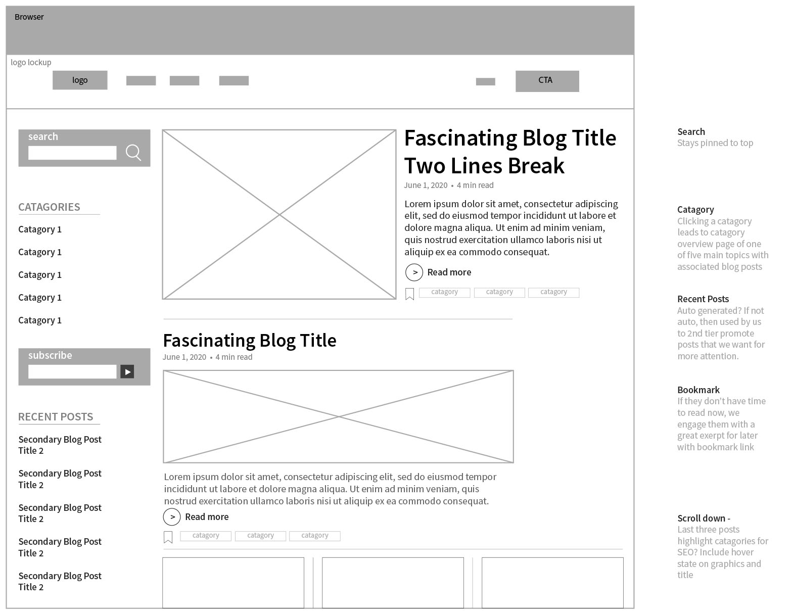
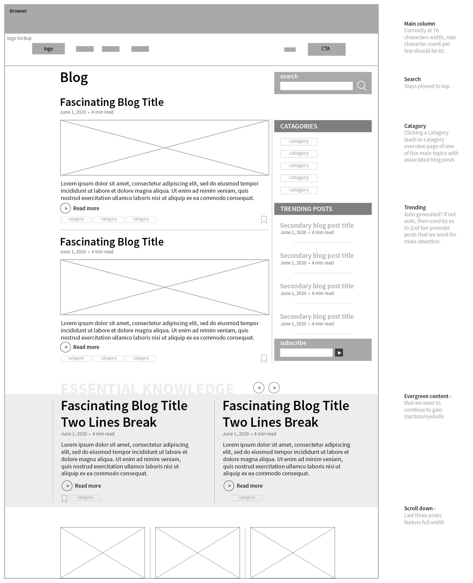
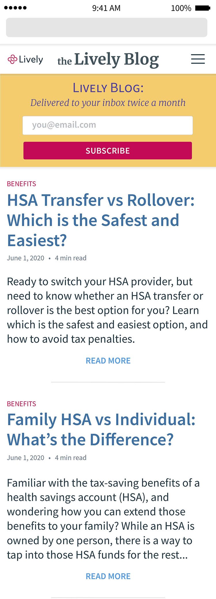
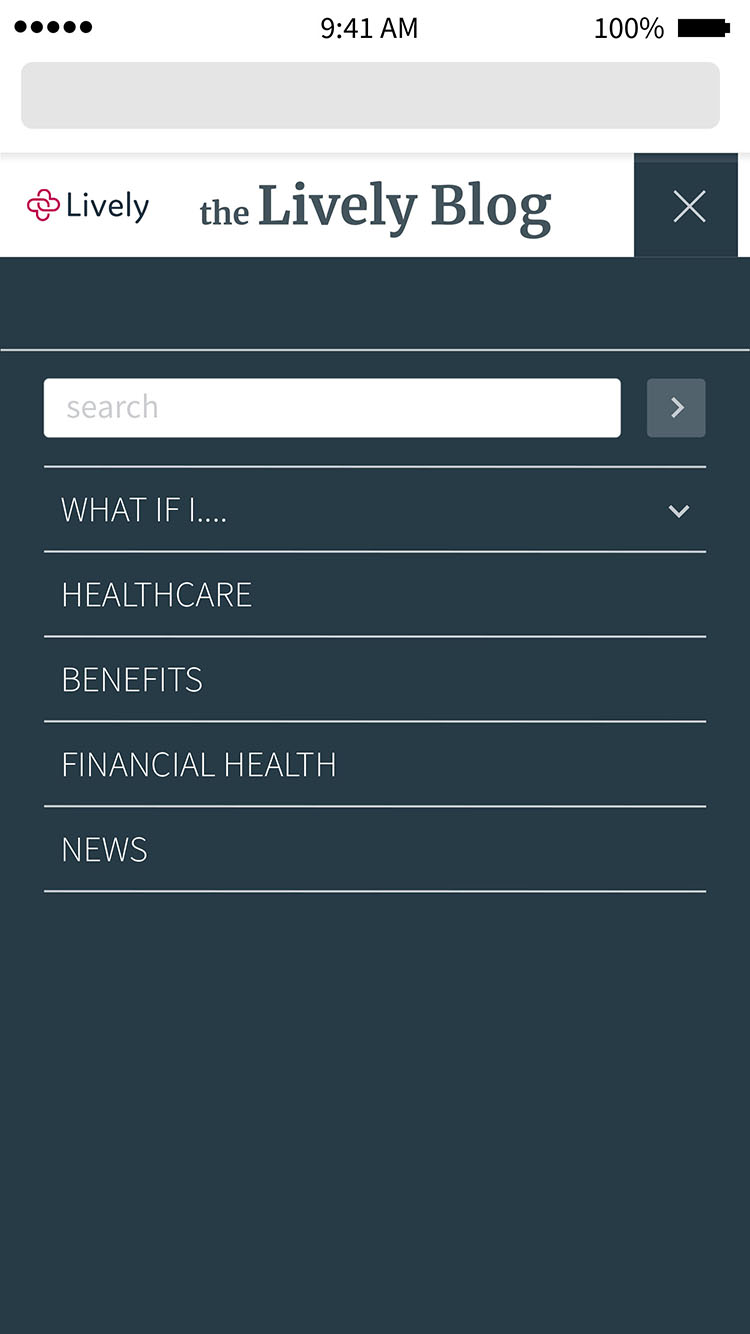
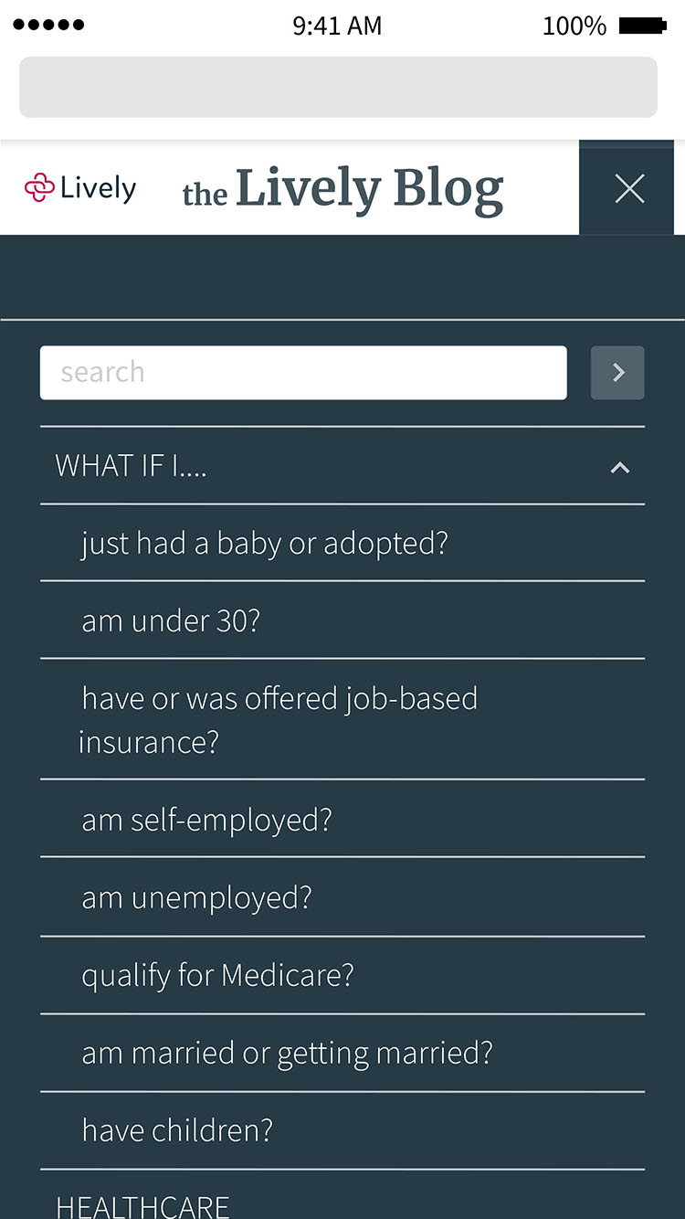
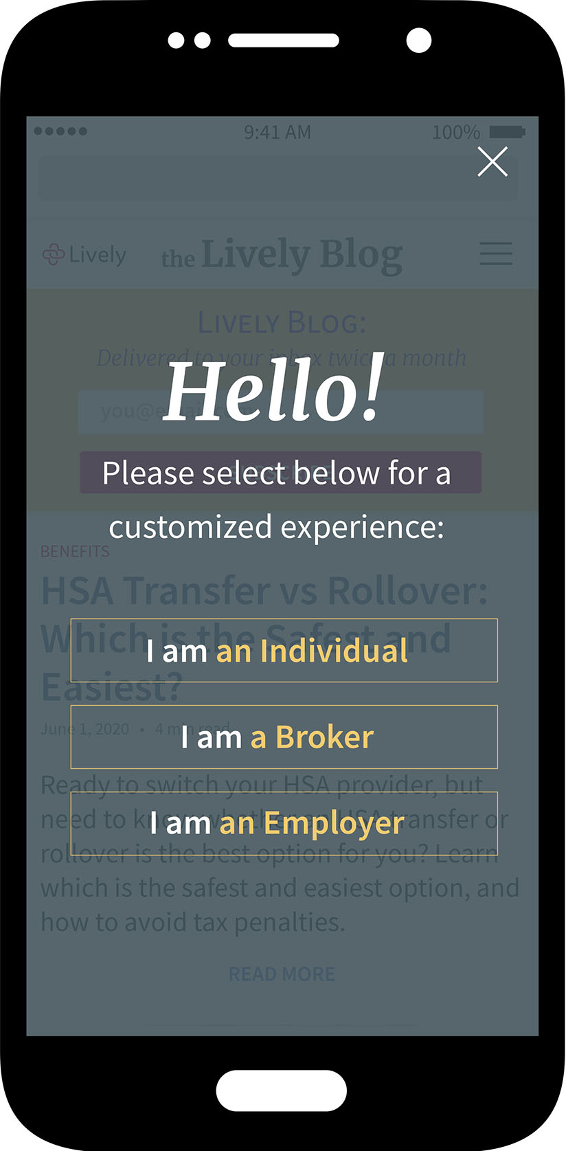
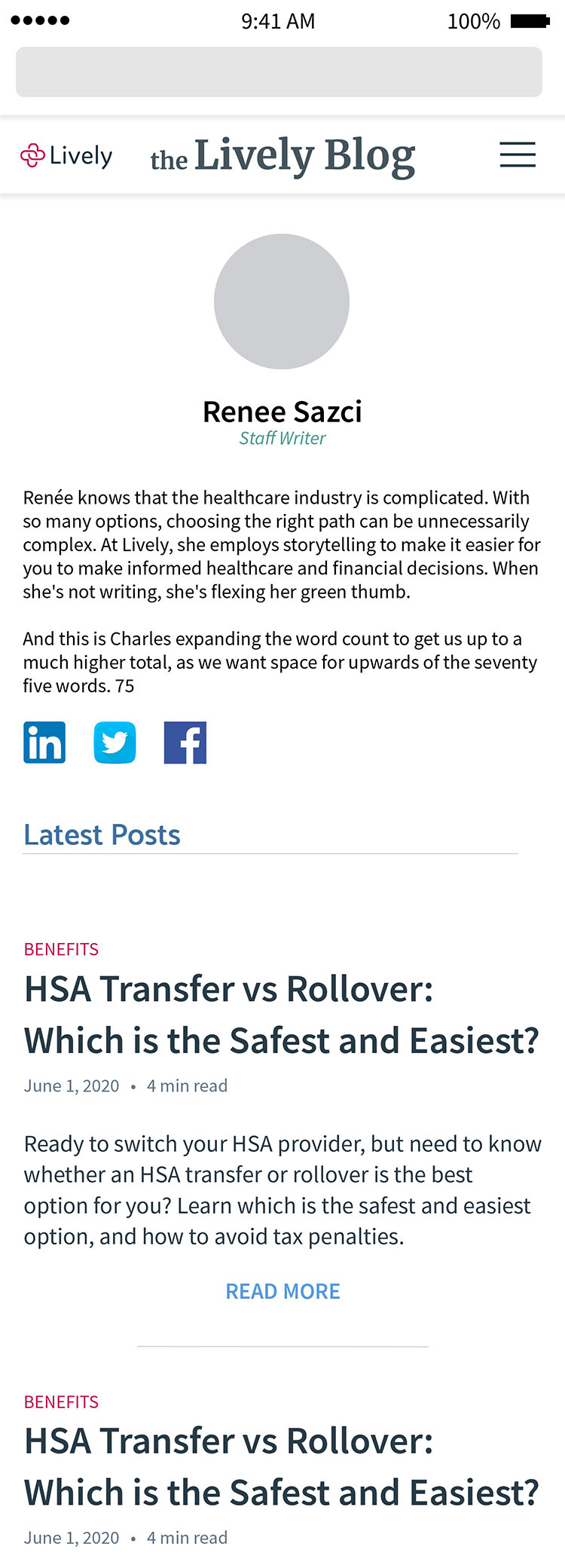
Multiple wireframes were created to support a superior search and read function, to facilitate increased lead capture as well and enabling Lively to be a self-directed resource for it’s change to stronger B2B and ABM marketing.
Great care was taken to enhance the readability of the blog, from the character count on the lines of body text, the colors being used, and the navigation elements being used. The reader’s experience needed to be of a high order, and, as you can see from the wireframes, many different versions were discussed and modified during testing.
