The Challenge
How to communicate the complexities of how a user can take advantage of the triple tax savings of an HSA?
My Role
To take Art Direct the videos and make them match up to a new aesthetic that I was spearheading for Lively.
Early Insights
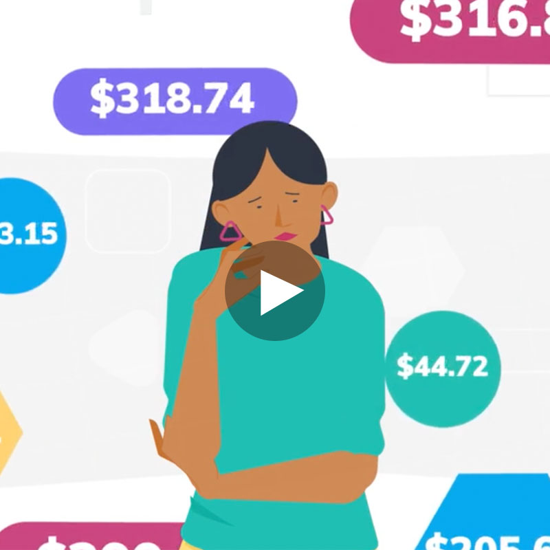
Early versions of the mood board and look and feel were agreed upon just prior to my joining the company, so a very “open and white” look had already been agreed upon. However, early versions of the videos created by the company to accompany the script had too little action. What had seemed like a good approach when looking at static frames for “look and feel” did not have enough going on to engage the viewer, nor enough to properly illustrate the vocal track.
Redesign
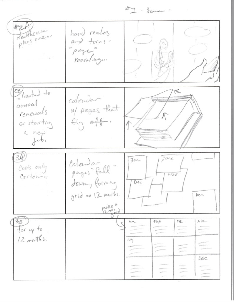
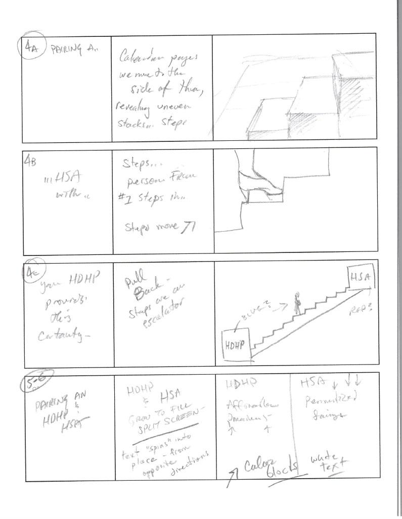
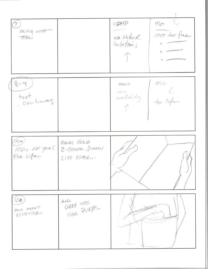
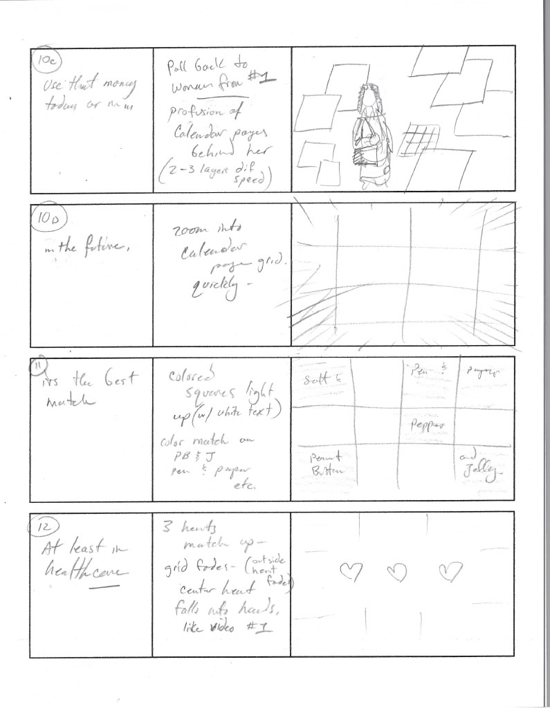
Sitting down with the script, I re-storyboarded the videos for the agency, adding complexity and movement and more than a dash of color to both keep the action moving and the screen occasionally filled with strong colors. Taking some of their initial visual starting points, I morphed the static work into a great deal more movement. At left are my pencil concepts for the agency to work from, as well as handwritten script and timing notations.
Outcome
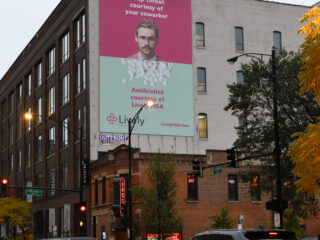
The videos, three in total, all presented here, have been viewed thousands of times, and remain available on Lively’s site to this day as evergreen resources.