Overview
Chocolateer Alisha Breese has perfected making astonishingly good chocolate bars with both classic and innovative flavor combinations in Sacramento, CA, but didn’t have a brand that reflected the superbly crafted confectionary within. I set about to change that.
(I may have made up the term “chocolateer”)
My role
Creative Direction
Design Lead
Visual Designer
Design System
Year
2021-2022
Problems
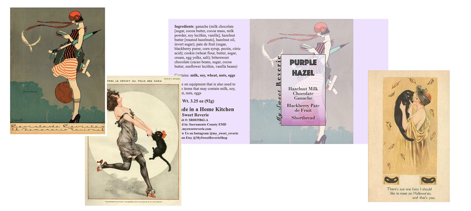
An excellent chocolate maker, and entrepreneur, but not necessarily a graphic designer, Alisha had chosen a deco aesthetic and was printing publicly available images off of her home printer. The blurry, pixelated images weren’t professional and certainly didn’t help her product jump off the shelves.
We stepped back and talked branding and identity before we could move to the labels. We needed to chart a course to align the brand and identity with Alisha’s vision of what she wanted it to, from colors to iconography and images.
We initially identified some primary aspects to focus on:
Keeping the deco motifs, while modernizing the colors
The product needed to jump off the shelves, so understanding the market was key
Cats – cats were important
The identity needed to flex to different sized and shaped products
Findings
We knew that one of the key things was to identify how crowded the high-end chocolate/confectionary market has gotten, and how difficult it would be to stand out on the shelves. This was a premium product at a premium price and the look needed to reflect that.
Deeper Insights
Since all the bars have music references in their titles, we tried tying it images on the bars to musicians as a possible change from the deco look, but soon realized that it was too “on the nose” and abandoned that approach. Circling back to the cat and deco motif, we worked on other approaches, finally abandoning the highly saturated color for a primarily white label with bright colors that would quickly stand out from her competitors.
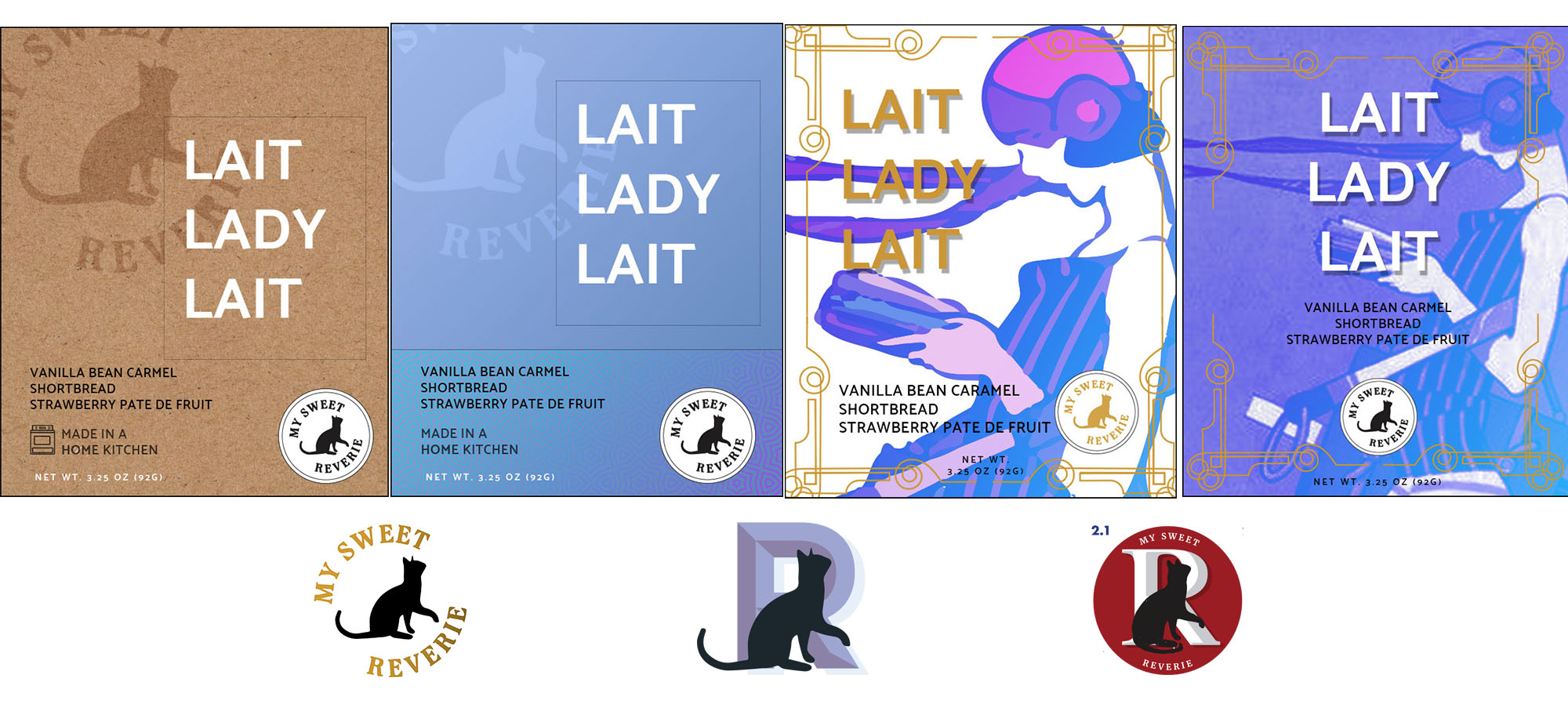
Modular Branding System
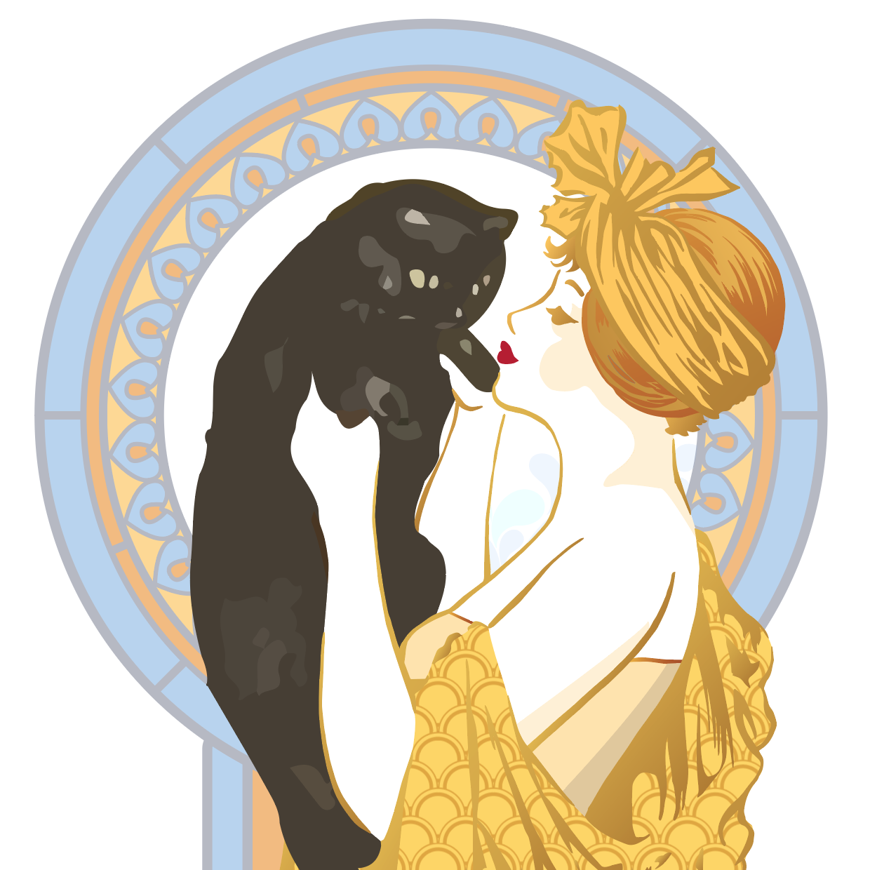
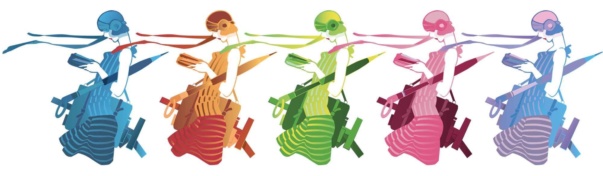
Circling back to one of her original deco images, I scanned it and made a fully vector, clean-up version in Illustrator, which allowed great flexibility in approach. I was keen to make the white background part of the branding itself, as well as the actual image, and then color coding the illustration to help differentiate the flavors of the bars.
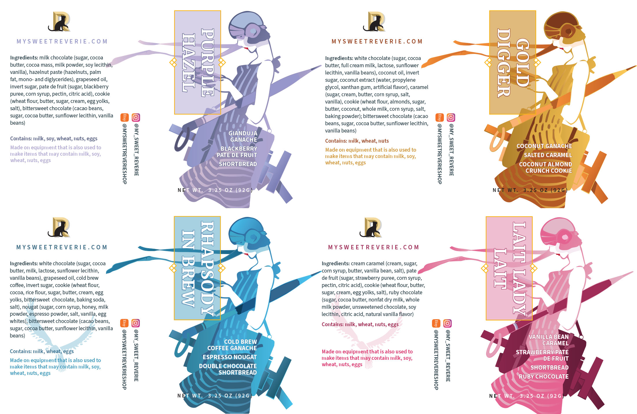
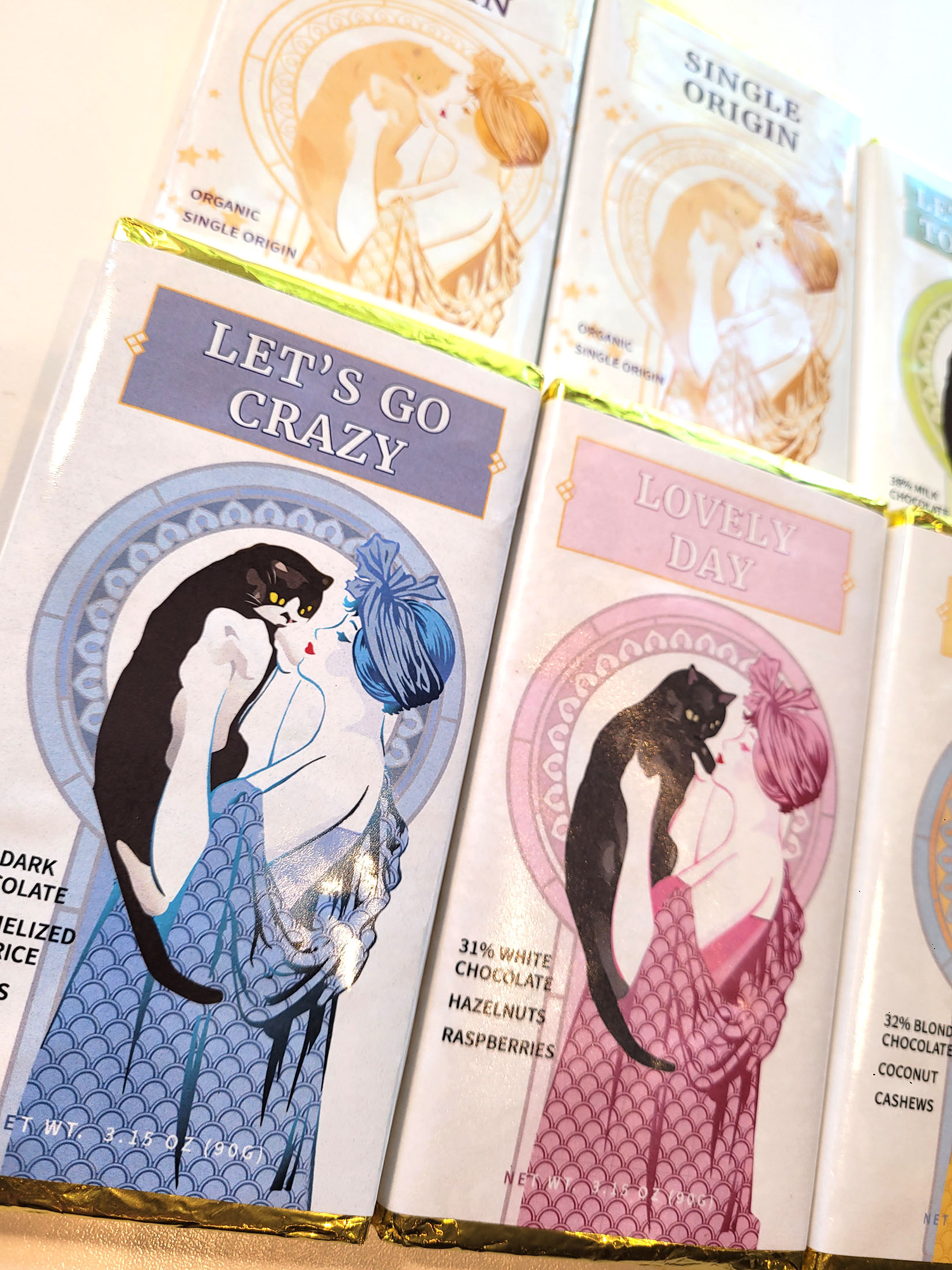
First up was making a clear number of variations for the thicker bars, with the woman packed up for a day of sketching (please note the T-square sticking out of her portfolio). Shown here are a sample of the color modifications I created for the labels.
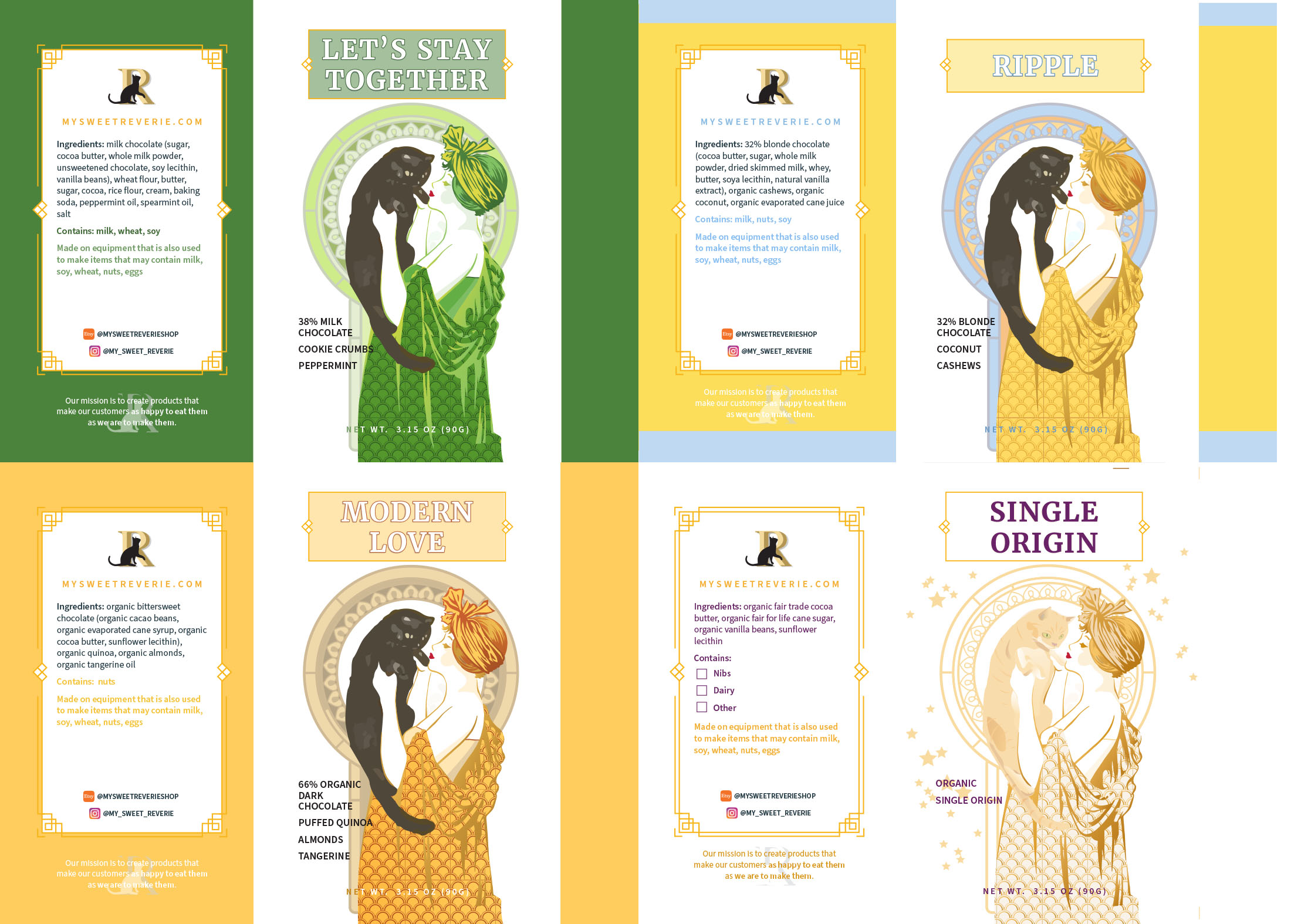
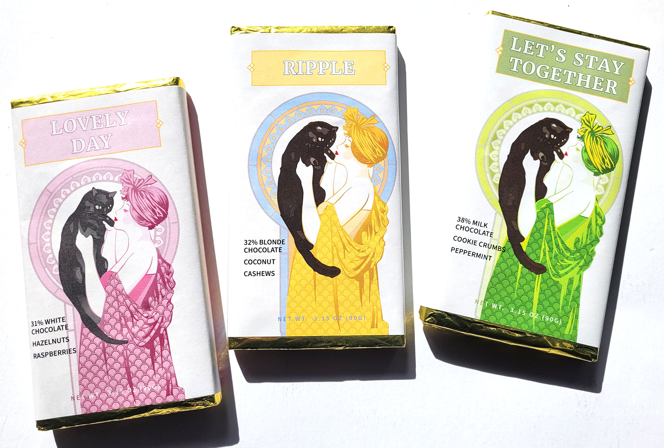
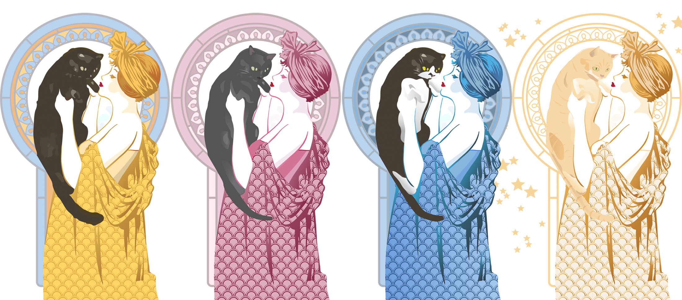
We would use the same approach for the second set of bars in Alisha’s current product offering as well. Moving away from the flapper swinging the cat image, which seemed a bit rough for a chocolate bar, we settled on a woman holding the cat, which allowed us to not only make color variations on the woman, but also on the cat, spotlighting various significant cats in some of our lives.
Shown at the right are 4 color variations for Reverie’s thinner, flatter bars, which have a very different amount of real estate on the label with which to work.
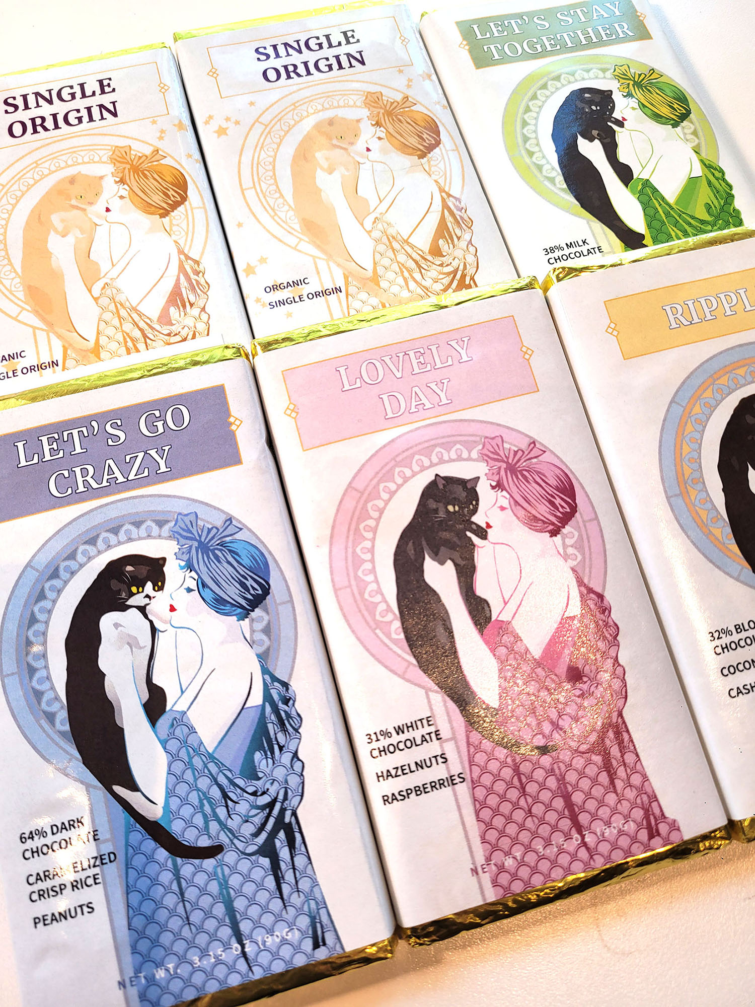
Final Designs
What we have jumps off the shelf in a crowded vertical – the white labels with saturated colors make for a premium look, exactly what we were looking for. We have an individual look that can expand to newer products (that are on the horizon) while never losing site of the individual quirkiness that helps power Reverie’s individual flavor concoctions.
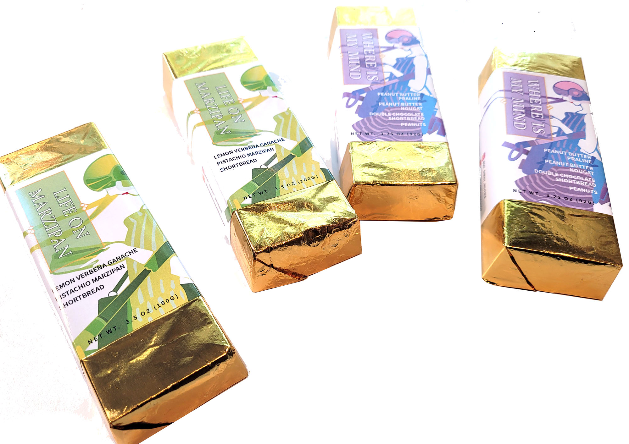
Deeper Details
Pictured to the right are samples of a number of the individual labels for Reverie’s products shown with will all details sans crop marks. The color palette is somewhat more expansive than in usual design systems due to taking advantage of the white background as a key part of the brand and the flavor color-coding, it