Overview
Versant Power, a utility company in North and East Maine, had multiple issues affecting their customer experience: a bill that was so difficult to read that the math didn’t add up, calls to their CSRs almost triple the industry average, a rapidly changing energy landscape that they were not prepared for and a customer base that simply didn’t know, or didn’t trust who they were.
My role
Creative Direction
Design Lead
Visual Designer
Design System
Year
2021-2022
Problems
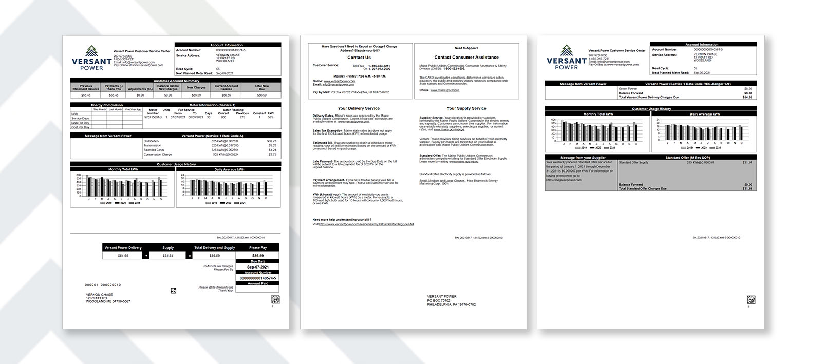
Versant knew that their bill was their primary point of contact with their customers, so that made it the perfect focal point we needed to improve.
We initially identified 4 primary issues:
Their math doesn’t add up
No branding
No communication
Doesn’t encompass their current or future state of the utility
Voice of Customer
We knew what Versant thought that they could improve. We set about to research what ways their customers wanted them to improve in. The old lesson rings true: If you don’t know what you don’t know, then how do you know?
VoC Research
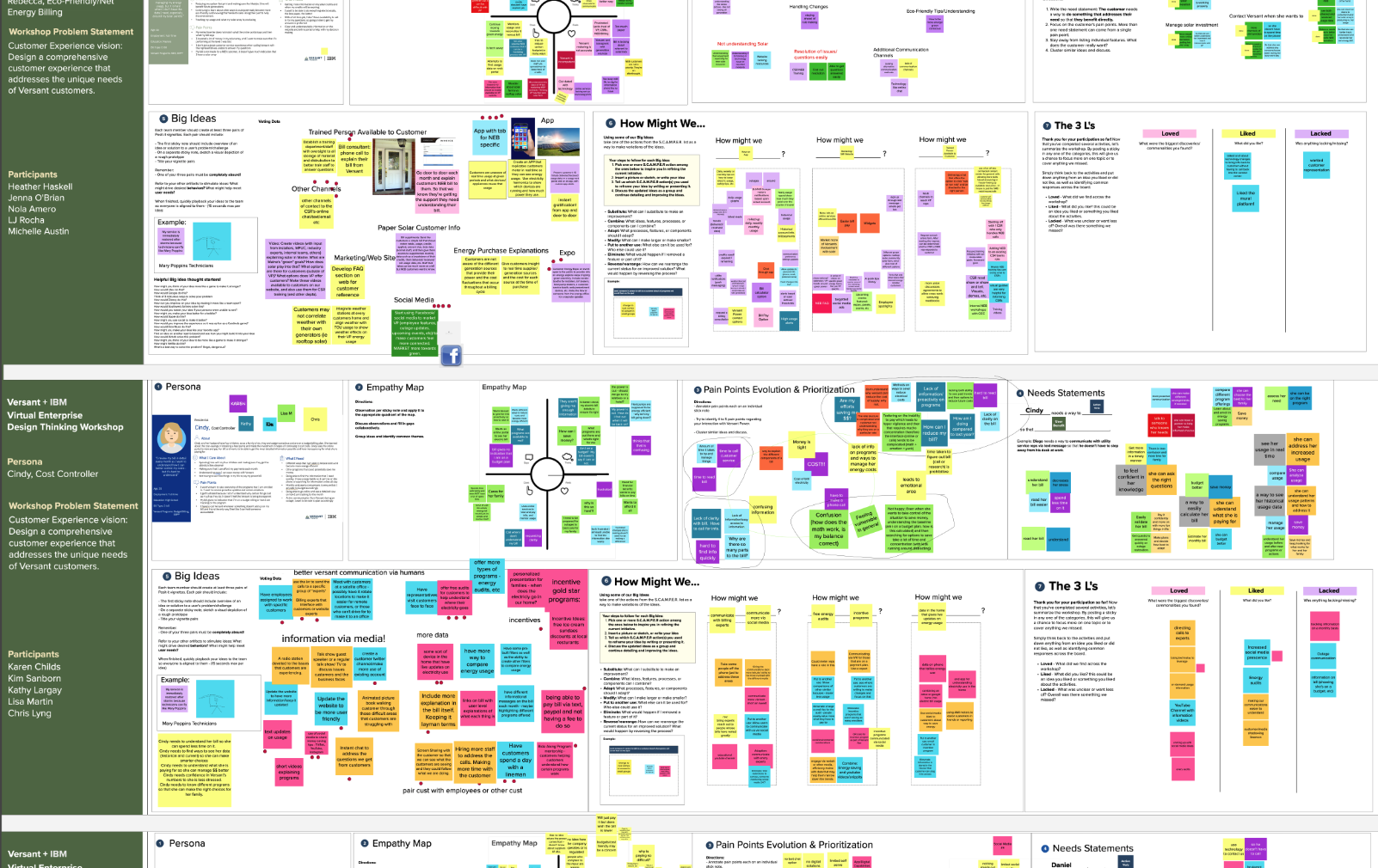
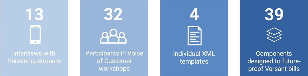
Extensive research was done with a multitude of Versant customers encompassing a wide range of utility users, a wide range of customer demographics including age, income, usage patterns, small, medium, and large commercial entities, local municipalities, state-wide charities and more.
Because this was done in the age of COVID, we held two different interactive Mural board sessions with a range of activities from voting on multiple ways to read and understand simple-to-complex information, how to different customers prefer to “read” their bill, and find out, beyond flipping the light switch, what customers actually want from their utility company.
By The Numbers
Findings
We discovered a multitude of areas in ways we could make significant gains for the Versant customers – but they were often different for each customer segment: Older versus younger, residential versus commercial, traditional power versus renewable energy. And all of them echoed: they wanted a local utility, but they simply didn’t know who Versant was.
There were multiple areas to improve. We dove in to rapid prototyping.
Deeper Insights
There were two very different ways people would read the bill: skimmers or deep divers
Commercial customers needed a very different set of data points in order for the bill to be effective
Renewable energy customers were growing almost exponentially and had area on the bill for data
People were really looking for actionable metrics and insights to lower their bill or help improve their green story
Though Versant was based in Bangor Maine, and populated by long-time Mainers, the name change had made people think that there was no local presence anymore. A simple name change had lost a huge amount of good will and connection
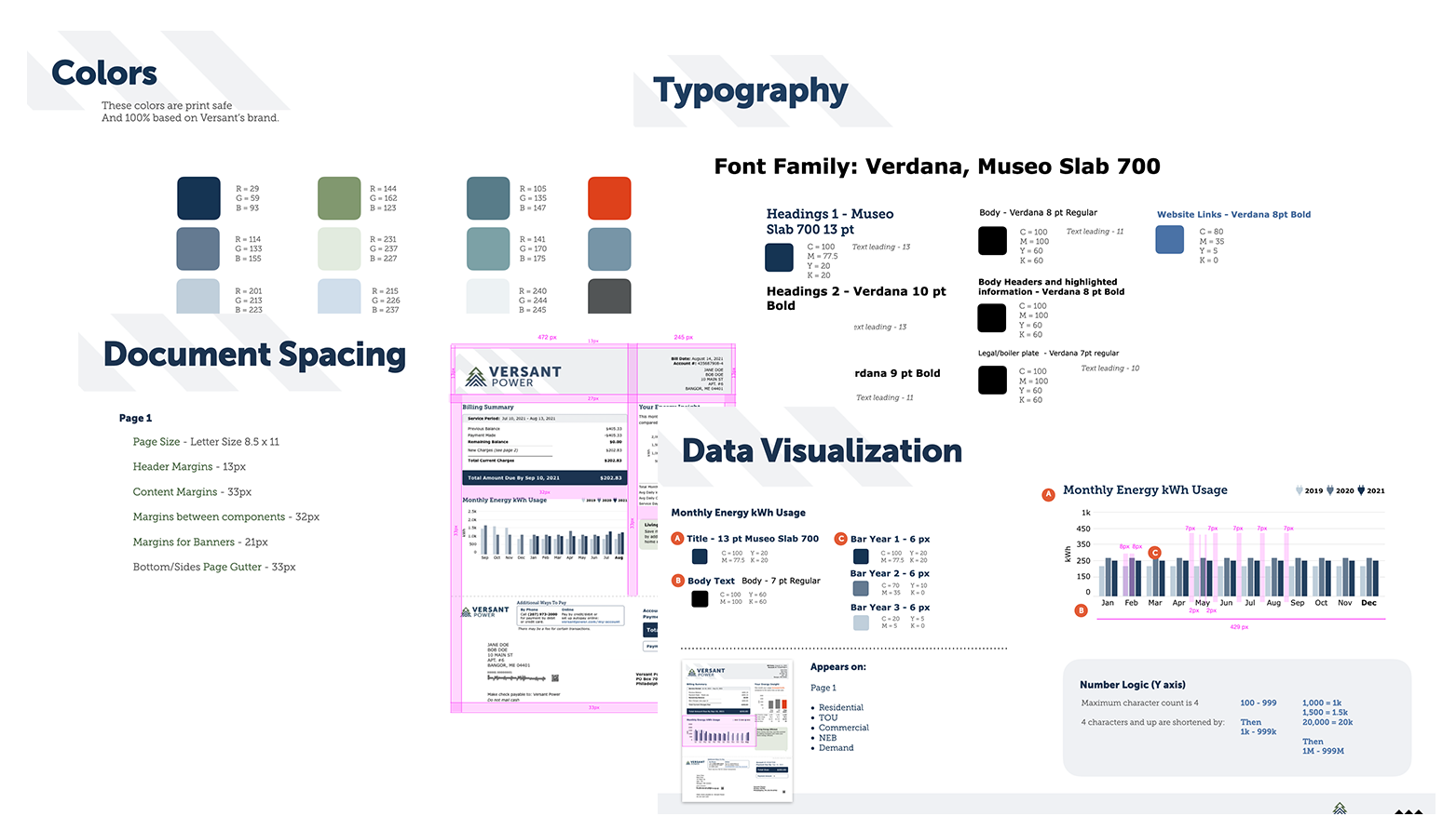
Design System
A broad color palette we developed off of Versant’s brand colors with careful consideration for both accessibility as well as CMYK printing limitations.
We worked diligently to use fonts that were highly readable and reflected Versant’s brand identity.
Pixel-by-pixel care was taken to ensure proper data hierarchy, readability and spacing. Full documentation was created to ensure as much of our data visualization could be preserved as possible during development.
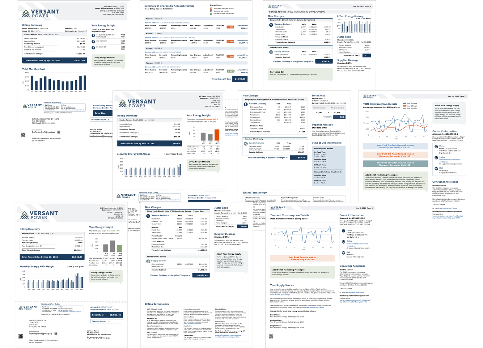
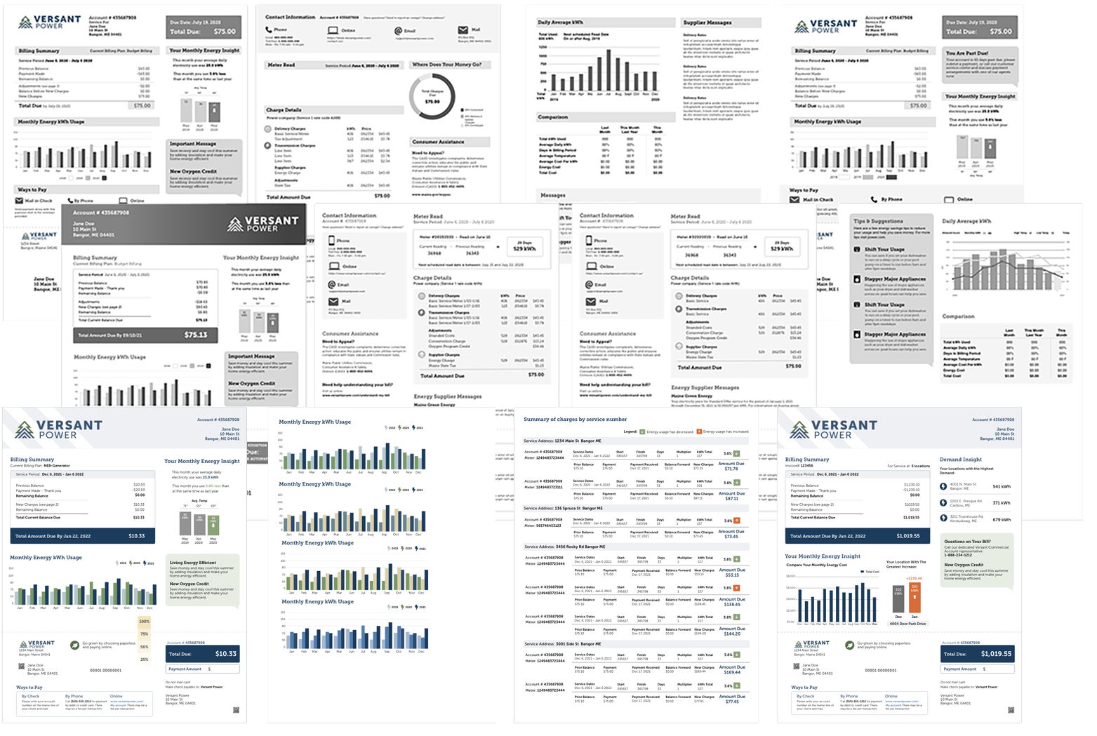
Final Designs
The final designs are an improvement on almost more levels than I can list. 39 different components, tied to the branding and design system, allow for an incredibly wide variation of billing needs, including “future-proofing” for the almost exponential growth of renewable energy in Maine.
Deeper Details
The new bill works well for both the skimmer and the deep-diver, providing actionable insights to reduce energy usage on a seasonable basis for both residential and commercial customers.
There are multiple options for communication and connection from both Versant but also the different suppliers that work with Versant to provide power.
While being more readable, the math, first and foremost, adds up on the new bill, and the components fit better, resulting in less paper usage, furthering the green story, and while reducing paper, and reducing printing and mailing costs.