The Challenge
Stitch Labs, a behind-the-scenes software that tied together the disparate software needed to run a modern retail operation: accounting, sales, inventory, shipping and 3PLs, relied on a hybrid strategy of both B2B and B2C for new customer acquisition. Getting new customers into the sales funnel via marketing leads was taking longer than it should have, so streamlining this flow was a necessity. So, in a nutshell: how to increase conversions from the intake form?
My Role
I was tasked with looking at the old flow and form and to create a number of new versions that could be tested against the old form to track conversions. Also, to bring the new form visually into line with new branding guidelines regarding fonts and colors.
Insights
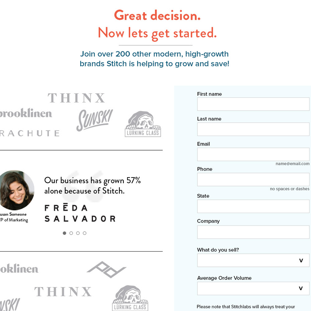
The old form was stark and stood in direct contrast with the evolution of the rest of the marketing site. Increasingly, as the Marketing team evolved the rest of the site, we found that utilizing Stitch’s customers own words and stories turned out to be the strongest validation and a key motivating factor in getting people to want to talk to sales and get a demo. Also, featuring well-known logos of Stitch customers helped along with the confidence factor.
The old flow had far too much friction when it came to getting people into the flow. I found that, utilizing heat maps and Hotjar recordings, we lost more people than we should have during that “high friction” process.
During initial testing, users were shown to choose the “busier” with logos and customer quotes, and when asked why almost universally said, “Knowing that these brands were using Stitch was a motivating factor.”
Redesign The Process
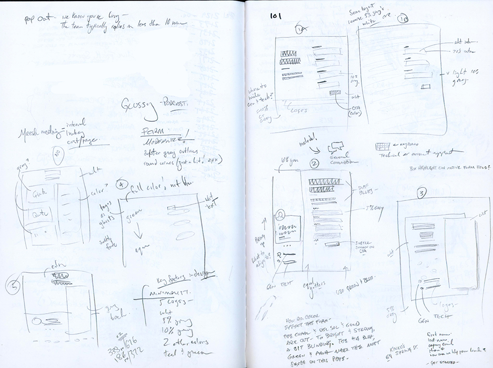
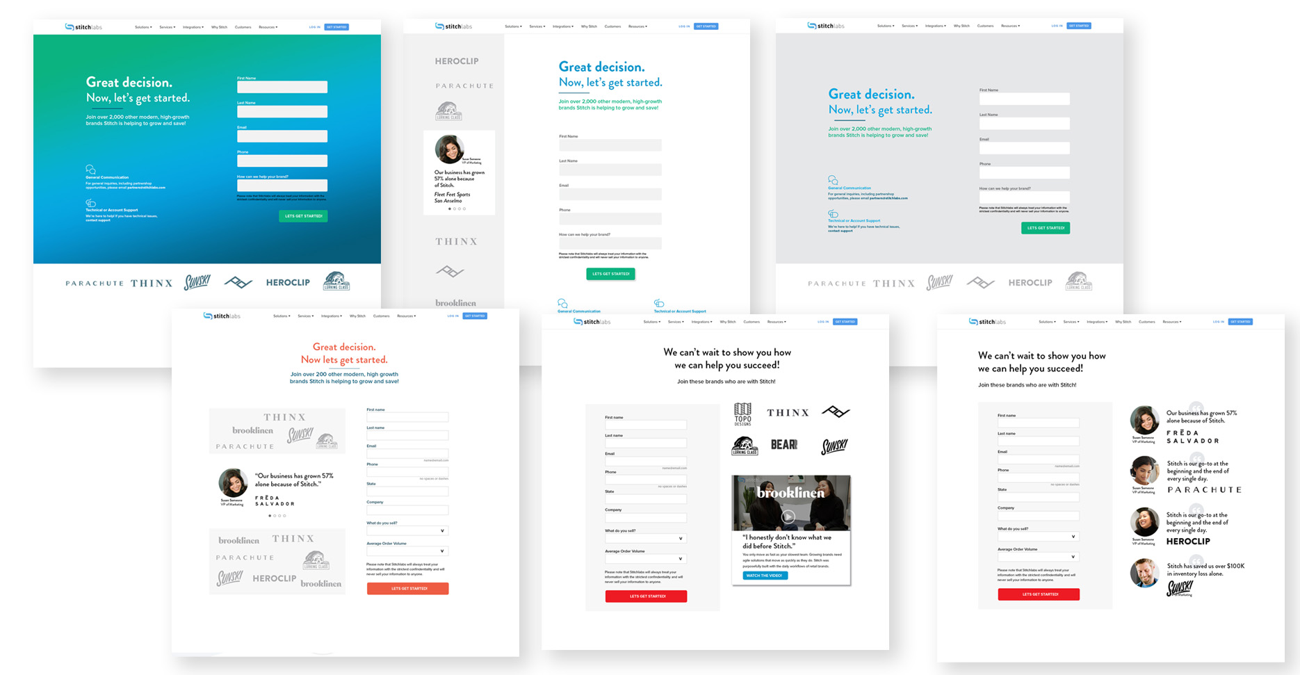
Key comps were created, changing the number fields on the form, as well as testing the validation on the left and form on the right, as well as reversing the fields. Certain fields were eliminated as well as others designated “not required”.
Implementation
Two versions of the form were launched with the idea of running a 6-week A/B test to gain enough impressions to demonstrate significance: the original version of the form and a new version utilizing all our new learnings. Within a little over two weeks, the new version of the form was up by 3% on conversions – a significant enough gain that the test was stopped and the new form fully implemented.